The problem of portraying screen-based interactions was a real design headache for Jason Reitman's latest movie, on the topic of social media. Luckily, specialist studio Smith & Lee had the answer.
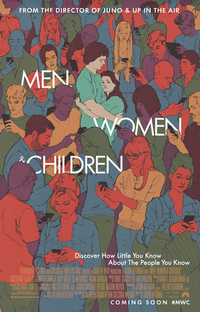
What was the initial brief that you were approached with? Jason Reitman, the director of Men, Women and Children , visited us while we were working on another film, Draft Day ; he told us he was working on a project that had a lot of onscreen interactions that were vital to the storytelling. He was interested in treating the movie screen like the desktop of a computer – not as if we were looking through a translucent surface – but simply overlaying the graphics, text, cursors, etc. He wanted to allow the audience to watch the actors’ performances at the same time as watching their onscreen interactions. Until recently, this would usually consist of an insert shot of a computer screen (or smartphone), then a cut to the actor’s reaction. But audiences are now accustomed to engaging in dense graphic environments, and can process both images simultaneously. It seemed more economical and elegant to avoid traditional screen insert shots considering the amount of graphics in this film.
VIDEOWas it a difficulty to weave these graphic elements into the narrative in a way that felt natural? How did you work with others in the film's production team to resolve that problem?
Before the film was even shot, Jason gave us some sample video clips for us to experiment with. We placed simple graphics on these shots to see if the idea would work well for the film, and it looked great. This early process helped Jason and the director of photography (Eric Steelberg) frame and light shots to accommodate the graphics during the shoot. This pre-planning was essential to the process.
The main challenge in post production was to figure out how long graphics needed to be onscreen for the audience to process the information, how quickly graphic interactions should take place, and how the graphics interacted with the linear editing of the film.
Typically graphic overlays like this will only appear on a single shot and then disappear, along with the shot, on the cut. But in a few instances we were able to have a single graphic extend over several shots in sequence to give it a more natural visual flow.
During post production we worked in the same office as Jason and the film editor. The scenes were constantly workshopped back and forth between us and the editorial team. This proximity allowed us to explore ideas quickly and to always be available when new ideas needed to be discussed.
Were there several concepts at the beginning or did you arrive at the final implementation pretty quickly?
We arrived at this concept pretty quickly. It’s a fairly straightforward concept, so our time was largely spent exploring how much information to show onscreen. We often would start with entire user interfaces on a shot, then would remove elements, piece by piece, until we were left with the minimum elements required to tell the story.
The shots that took the most time for development were the wide shots where you see dozens and dozens of graphics over the heads of the actors. We went through a lot of explorations to figure out how much information to include in each interface. When we were working on those shots we came up with little mini backstories for each character in the scene.
I've heard that audiences can sometimes be reticent to read within a cinematic context? Do you believe that? Was it a consideration and if so how did that alter the final design?
I think when text is presented like this, in a format that the audience is accustomed to reading every day, then they’re comfortable with reading text on the movie screen as well. We were careful to not show too much text, to make sure that the onscreen, written dialogue was short and to the point (and often abbreviated according to text messaging norms). The longest bit of reading in the film is when Tim Mooney is typing out a message to Brandy. The message is shown over a number of shots, breaking up the reading into smaller pieces.
Readability was our primary concern with the graphics, so we worked a lot on making sure that the text and interfaces were the just the right size to be easy to read, but not “clunky” looking onscreen.
Were there any important precedents that you looked at and that informed your work?
We were fans of the graphic overlays that appeared in House of Cards and Sherlock . Each had a very different style and approach. House of Cards looked streamlined, sophisticated and uniform. Everyone’s texting looked the same, and it looked great. Sherlock was minimalistic, stripping out all interface details so we were left with just the text to read.
While we’re fans of the approaches these two shows used, they weren’t appropriate for Men, Women & Children . We needed to capture the variety of interfaces that the characters were using, and to embrace the lack of sophistication of some of these interfaces. We never wanted the audience to see a text message and to think, “wow that looks slick.” Instead it needed to capture some of the banality of everyday internet communication.
Have you had any feedback from audiences on your contribution to the film?
So far the feedback has been very positive. I’m mainly happy with the fact that they get it, and accept the style as part of the storytelling very early on in the film. Our goal was always to serve the story and to be true to life.
With the increase in use of smartphones and social media, do you think that it is inevitable that this sort of graphic overlay will become more and more common in film production? Is it possible to accurately represent modern society without it?
I absolutely think it’s inevitable that this kind of graphic overlay will be very common - and it’s already showing up all over the place. I think shots of computer screens and smartphones can be cinematically dull, so why not show the information over the shot of the actor instead? It’s nice to be able to see a reaction while you’re reading the text along with the actor.
I also think it’s much easier to read information as an overlay than as an insert shot of a screen. When you show a shot of a computer screen, you have to see the entire interface – including the information that’s irrelevant to the storytelling. With graphic overlays you can remove the unnecessary information and just show what you need.
Has the process increased/decreased your appreciation of contemporary UI design?
I suppose I now appreciate the tremendous complexity of a lot of UI design. In my line of work, which is linear in nature, I don’t need to worry about accounting for every possible graphic reaction to a user input. So when we needed to animate custom interfaces for a number of the shots, I was amazed at how much detail we needed to include in order to make the interfaces feel believable. smithleedesign.com