
A strength in identity design and typography has led this Glasgow-based designer on a journey from small-scale local projects to commissions for the Tate, all within a year of graduating.


Tell us about a recent project that you have particularly enjoyed?
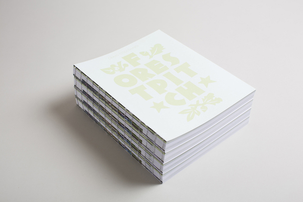
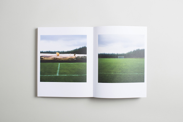
After I graduated last June, I ended up working with a Glasgow-based designer called Emlyn Firth at A Visual Agency. At the time he was working on a book about one of the 2012 Cultural Olympiad artworks, Forest Pitch, by Craig Coulthard. In brief, Craig created a football pitch in the middle of a commercial forest and hosted two matches between teams of recent British citizens. The book was a documentation of the project and of the match day itself, including a wide variety of content and some really great images. The book itself was coverless with an exposed binding, intended to be like a slice of the forest that was cleared during the project. We also used related typefaces like Rudolf Koch’s Neuland, which he designed by carving directly into wood. It was the kind of project I like, with subtle, well thought-out elements, building up to a beautiful result. As with all of the best projects, it was pretty stressful up to the line, but it was well worth it in the end.
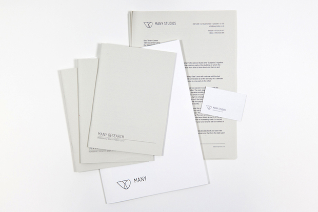
What was the design thinking behind your identity for MANY Studios?
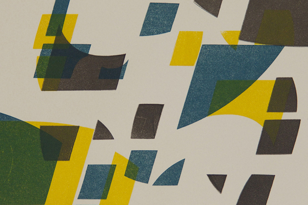
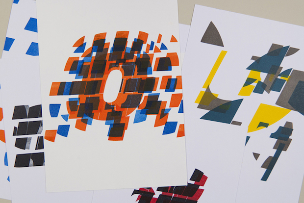
MANY Studios is a creative organisation based in central Glasgow. They are primarily a studio provider, offering affordable spaces to recent graduates and those at the beginning of their creative careers. Our idea stemmed from architectural planning and drafting, in relation to the tenants being at the beginning of their careers. From this we created a clean and simple solution that allowed for the layering of other content from the variety of people that use the space. Using architectural drawings as a starting point provided various visual elements which we then built upon, including the typeface, which is a revival of ISO 3089, the standardised architectural drafting typeface. The mark itself came from a prism made up of the basic geometric shapes (square, circle and triangle), linking both to drafting and ideas surrounding the basis of creativity and so on.
What are you working on at the moment?
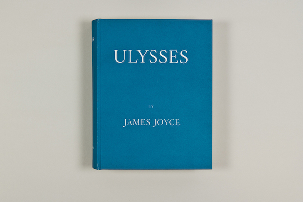
I am currently working at Studio Fernando Gutiérrez. Right now, I am busy designing a couple of exhibitions, some catalogues, and a few wine bottles. Previously we’d been working on the Richard Hamilton catalogue for the Tate exhibition though, which was stressful but good fun. I landed on my feet somewhat.
What has been the defining moment of your career so far?
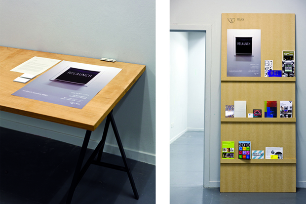
Seeing your work out in the wild is always a big one, especially having just left art school where nothing is ever that ‘real’. So seeing the MANY Studios guys using our identity was interesting and finding Forest Pitch on sale at the Art Book Fair was good. But I suppose the biggest defining moment was the Richard Hamilton opening at Tate, with everyone wandering about with the catalogue, or walking into Blackwells and seeing a solitary copy of it sitting on the shelf. I never really thought that I would see my work on sale in Blackwells - not yet anyway.
What do you think are the key elements to a successful typeface?
Personality. It needs to have a voice even if it is a quiet one. Otherwise why would you ever choose to use it? It’s the beautiful little quirks that make a good typeface enjoyable to use, to read and to be around.
Describe your work in three words.
Slowly getting better.
michael-gibb.co.uk


