The three sides of Hato's business – the graphics studio, digital service and print press – have come together on its latest typographically driven project for the Wellcome Collection
What’s the background of this project – how did the commission come about?
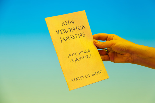
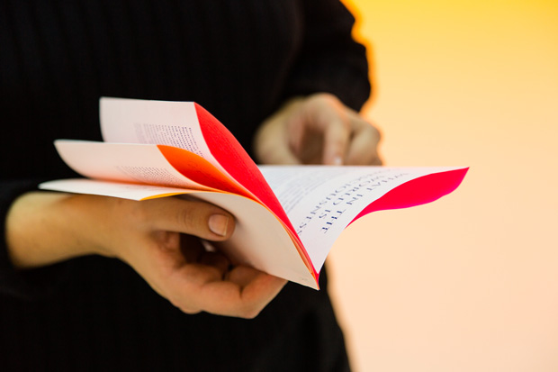
We had been in communication with the Wellcome for a few years now in doing an exhibition design for them, in fact our first ever proposal as a design practice was with them. The needs for the States of Mind show in particular seemed to have fit Hato’s work quite well: a collaborative effort to deliver a strong visual language, printed materials, spatial design as well as a digital learning resource.
Hato has a lot of experience working with cultural institutions – what has been distinctive about the relationship with Wellcome?
What has been most distinctive is that most exhibition designs will start with the architect or 3-D designer and then a graphic design studio will be brought on board. However for States of Mind we began the project with the Wellcome Collection as we had both felt a strong typographic identity was needed to connect the two parts of the show. Subsequently, it's meant that we have been working with the curator Emily Sargent and Luke Currall the project manager intensely as well as the marketing and in-house graphic departments of the Wellcome Trust.
How do the three arms of Hato (Studio Hato, Hato Press and Hato Labo) come into play on a project like this?
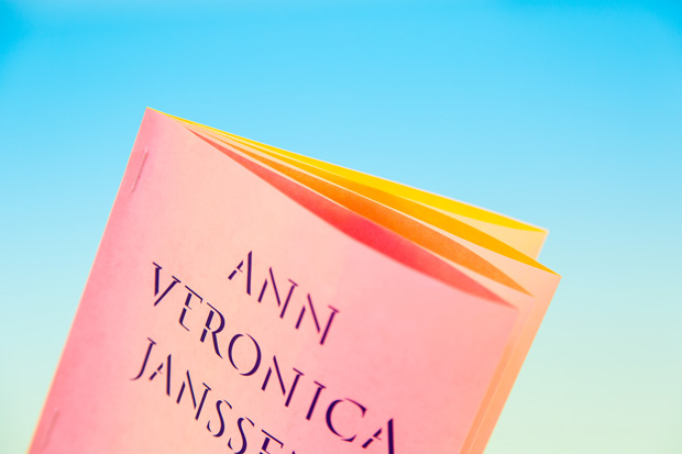
Hato is beginning to grow as a single entity and projects such as these help define what Hato can offer to cultural organisations. States of Mind pulled together everyone involved at Hato; from our designers, interactive director, animation director, programmer to our printing press.
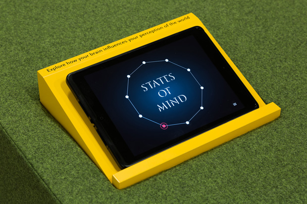
As well as the exhibition identity, graphics and publication we also worked closely with neuroscientists to develop a new interactive learning resource to explain and re-imagine optical illusions. This built upon our credentials as a studio that deliver holistic education experiences.
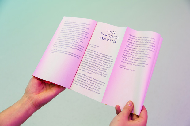
When we come together for such events there is a different structure to the studio. Everyone works on their own part of the project, which is then packaged and delivered to Wellcome as a cohesive service.
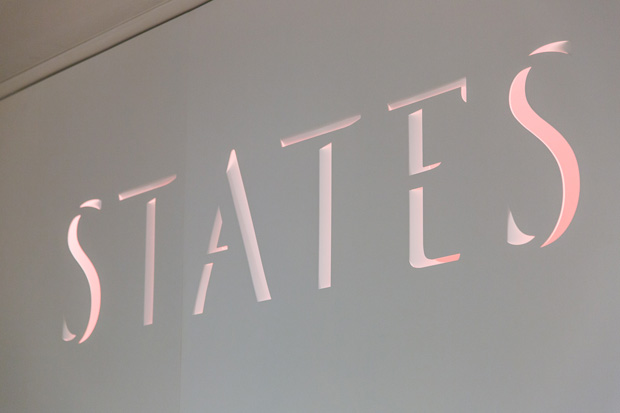
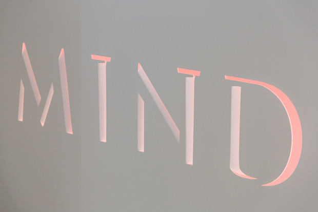
Tell us about the bespoke typeface that is the back bone of the project and how it is executed across different media…
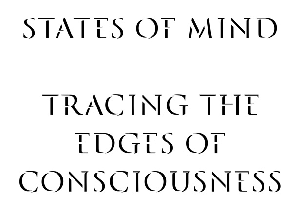
The typeface is a visual reference to Gestalt, a psychology term which means a ‘unified whole’, essentially it is a theory of visual perception of organising visual elements into a group, in this case a typeface. Visually speaking, there are two typefaces that exist in both the positive and negative space.
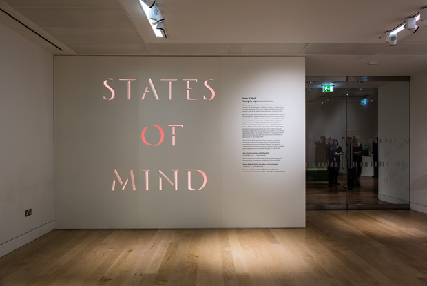
In the 3D environment this effectively extended the original gestalt reference and really highlights the importance of white space and lighting.
Use of colour is at the core of the artist Ann Veronica Janssens' work – how did you go about interpreting that in the identity?
This was a pleasure to work with, as Ann Veronica Janssens' art is exceptionally visually strong. And you can see from the marketing material that the installation shots speak wonders for the exhibition. There is something quite ‘floaty’ in her work so it makes it a perfect support to integrate the negative space of the typeface.
What has been your personal highlight of the project?
For us definitely the entrance signage, where the typeface we’ve designed has been made into three dimensional object. Is great to see our initial paper mock-ups turn into giant folded metal sheets.
See more of Hato's work here.
Read Grafik's Profile on Hato.
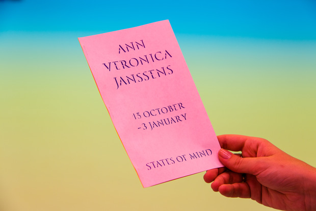
States of Mind is a two-part exhibition on show. The first part opens with Ann Veronica Janssens at the Wellcome Collection in London
15 October 2015 – 3 January 2016


