
Meryl Vedros' father left a rather unusual legacy, a collection of matchbooks that would act as as a visual spur to the young graphic designer as well as an invaluable archive of past attitudes.
These matchbooks are unique time capsules that reflect a past characterized by contradiction, naivety, and male dominance. My father, an avid collector and photographer, originally bought these covers at a garage sale for $10 in Kansas City, Missouri. They later served as typographic inspiration during my time at Parsons School of Design. As a graphic designer, I was immediately drawn to them by their strong use of colour, expressive typography, and interesting depiction of that era.
It wasn't until working at Mucca Design that Matteo Bolognia recommended we curate them on a website to share with a larger audience. During the research phase of the project I quickly became interested in the history behind the illustrated matchbook ads. The Golden Era’s main outlet for advertising was through the use of matchbooks since almost 70% of the population were smokers, a majority being men. The matchbook designs of this era turned an object that makes fire, a necessity to survival, into novel entertainment for selling haircuts and alcohol. It was not uncommon during this era for one smoker to light another's cigarette and have conversation spark from the humorous subject matter of the matches. Below i’ve chosen five from the collection that are as graphically fascinating as they are morally questionable.
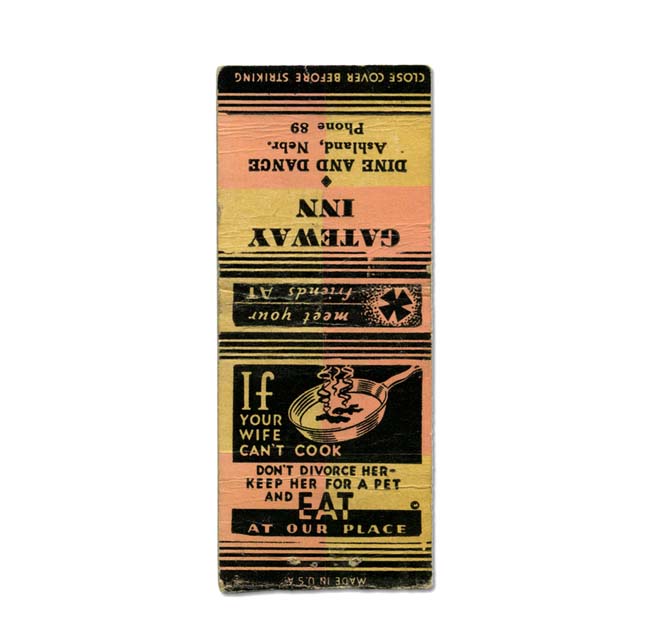
I am drawn to the matchbooks expressing the chauvinism of this time period. It's difficult not to picture a man sitting at a diner smoking a cigarette, lit with matches from this book, pestering the attractive waitress while his wife sits quietly next to him watching the children.
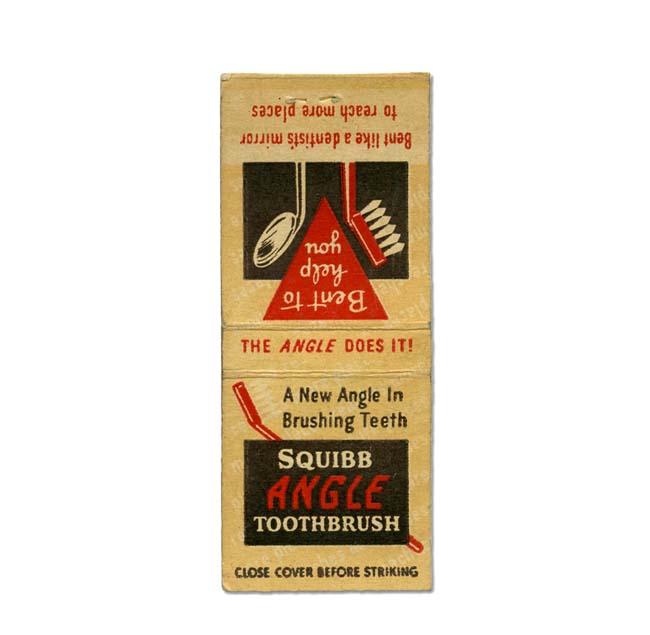
During the Golden Era people were unaware of the effects of cigarette smoking. A doctor would often smoke while working with patients. This design expresses the irony of that time, in which healthy brushing habits were advertised to smokers. I especially love the expressive typography in the word “angle”, which helps the viewer understand that this toothbrush can reach places only a dentist could get to otherwise.
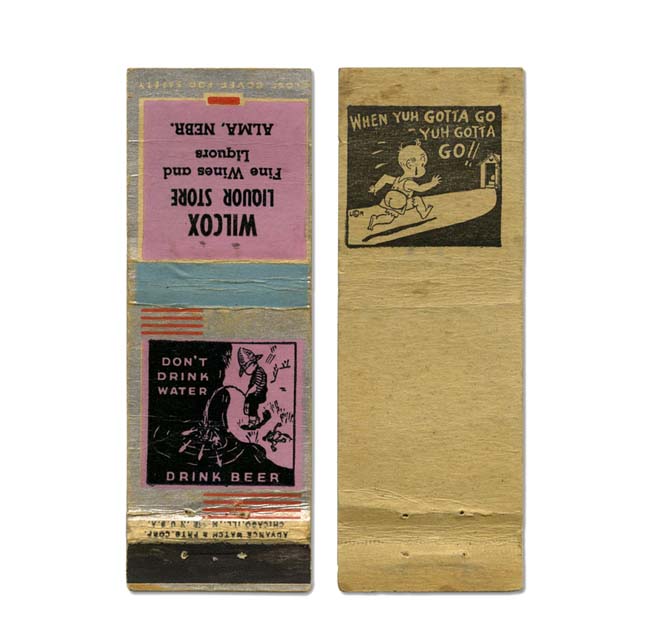
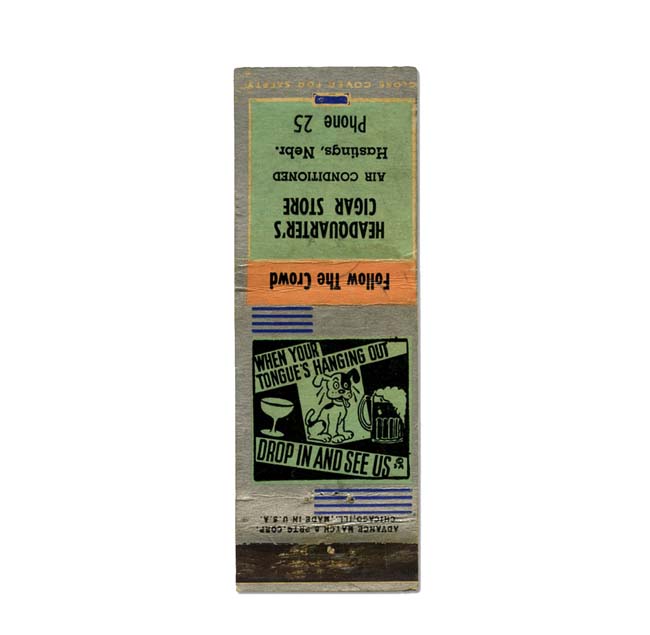
Alcohol consumption was a large part of the smoking culture in the 40’s and 50’s. Men seemed to have taken great pride in childish behaviour and enjoyed laughing it off over a smoke.
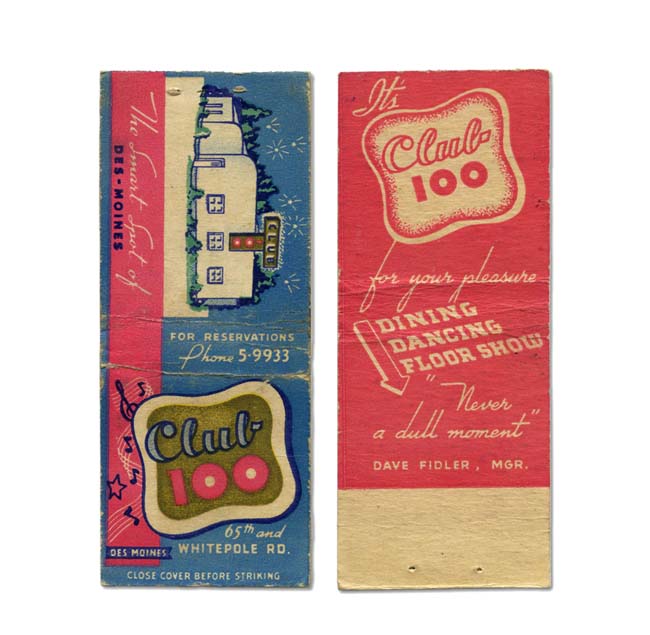
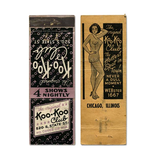
Reminiscent of the later designed Hooters logo in 1983, the “100” numerals visually allude to breasts. The playful use of colour and googie style typography make sure this design doesn't lack any “dull moments.”
Matchbooks of this era became shared design experiences. One can only imagine that the kitschy matchbook cover designs provided the sort of humour and irony that was a source of conversation for smokers when asking for a light.
merylvedros.com
mistermatchbook.com