His illustration hero was responsible for numerous classic covers during his tenure at Penguin Books, but one in particular holds a lasting fascination. Here Steve Wilson he talks Clockwork Orange, J G Ballard and the hugely talented David Pelham.
David Pelham is an illustrator and designer and was the art director for Penguin Books between 1968 and 1979. Publishing is an area that I have probably done the least number of commissions in so to choose someone whose career is largely based around the publishing industry may be a bit of a strange decision, but I have long held the design of books along with music packaging in high regard.
The permanence and longevity of books and album covers is something which really appeals to me as an antidote to the throwaway and transient nature of much commercial illustration. Artwork in those disciplines will have an association with a particular album or novel forever. Now, more than ever with the advent of the digital age it feels good to contribute to something which people may actually want to keep and treasure. Music albums and books are also the work of another creative person and producing a design for something which the author may well have spent a number of years of their life on is a big responsibility.

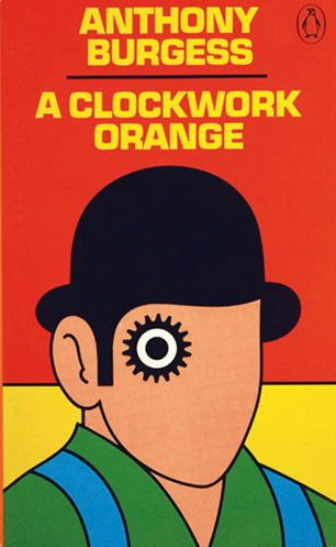
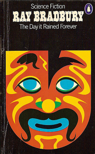
During his time at Penguin, David Pelham designed and art directed some of the publisher’s most celebrated fiction covers. I have bought the books on a number of occasions purely because of his cover designs. He often oversaw 20 covers at any given time, this must have come with immense pressure and of course all without the speed and convenience of the digital age. I’d like to first concentrate on the covers he designed and illustrated entirely himself. There are the obvious examples such as his iconic piece for Anthony Burgess’s A Clockwork Orange. A design which is bold and simple, it’s an iconic piece of illustration and design which has stood the test of time, it is one of the few pieces that has remained a constant on my pinboard for the last ten years. It still looks fresh today even though it’s over forty years old and I think it’s influence can be seen in a lot of current illustration. All the more impressive was that he has been let down at the last minute by a well known illustrator whom he had commissioned for that cover so he created the illustration himself in a very short space of time, a matter of hours, finally sending off the artwork by courier at seven in the morning having stayed up all night working on it. It often seems to be in those moments when you are pushed to the limits that you are able to create your best work.

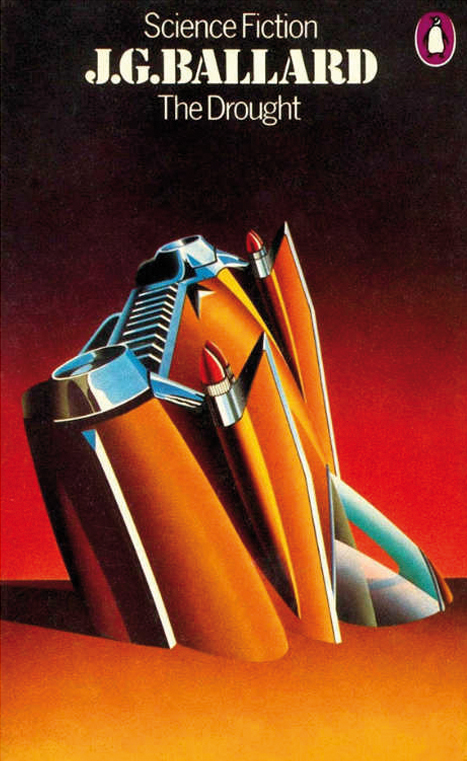
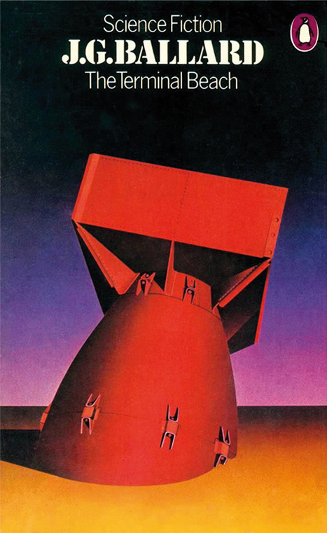
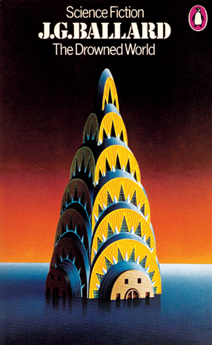
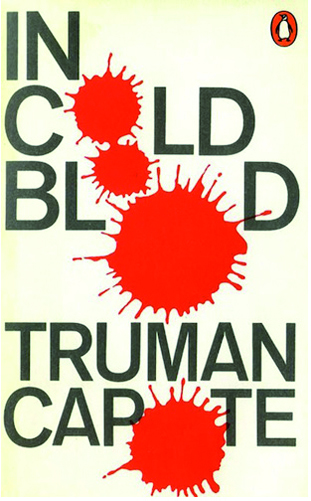
Then there are the J G Ballard covers which he illustrated in a different style, they are painted and although a little more representative of the zeitgeist of the time in terms of style they show an incredible amount of technical skill. These are just a few of the well known pieces that exemplify the diversity of his hand that is evident across all of his output. Purely as an illustrator he has the ability to adapt accordingly to achieve the result he needs for any given title. He is not only a highly skilled illustrator but also a brilliant designer, art director and creative thinker, a one man design team. If you look at some of the conceptual ideas in his typographic covers and Roald Dhal’s Switch Bitch artwork it shows yet another facet to his skill set. He seems to have thrived on the diversity of the projects that came to him, with his capacity to solve a problem either through his own illustrative and design skills or through his ability to recognise the right person to commission for the job in his role as art director
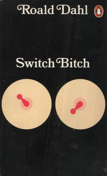
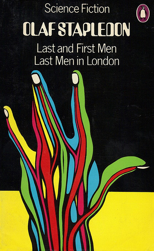
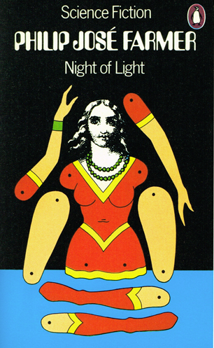
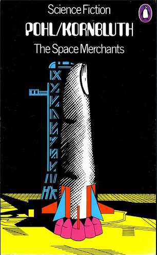
It is the multidisciplinary approach that I particularly admire. To control all aspects of a project from concept through to the execution. Of course he was privileged to be in a position to have that level of creative control. So many briefs I receive are style-led now, with clients specifically asking for an illustration similar to a previous piece I have done, as though you are buying something off the shelf. My most successful projects are when you are asked to solve a problem. Take some text or listen to an album and go and create a reaction to that in whatever way you feel best and who knows, maybe even try something new and experimental along the way. The fear of failure is understandably too great for some clients with deadlines often so short but I think David Pelham is a good example of the results you might get if you allow an illustrator more freedom in the entire creative process. He seems to have used his experience as an illustrator to educate his decisions in his role as art director. One of the things he did was to introduce a minimal grid with the penguin logo appearing at a set size in the corner allowing a maximum blank canvas on the front for creative.
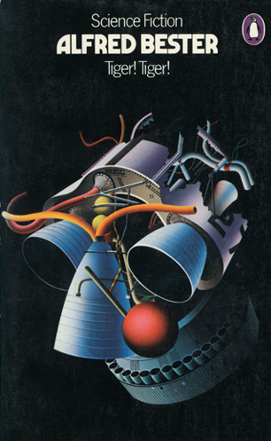
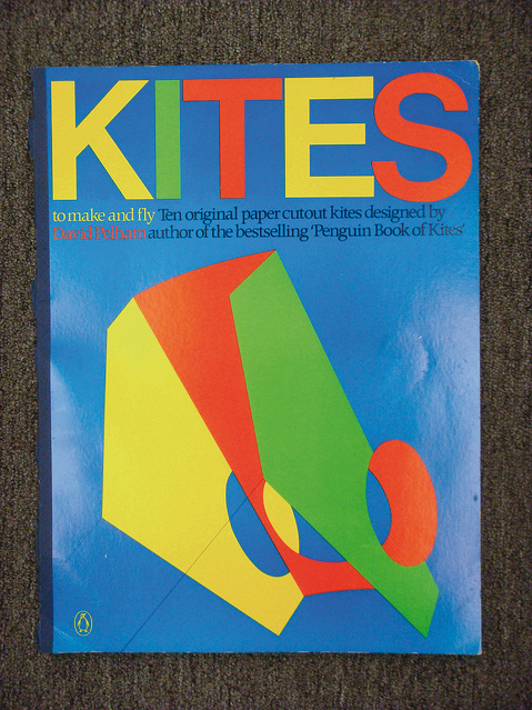
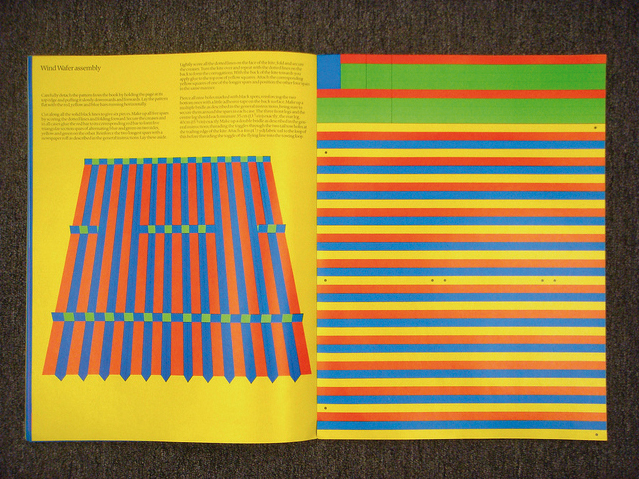
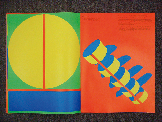
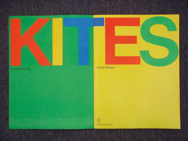
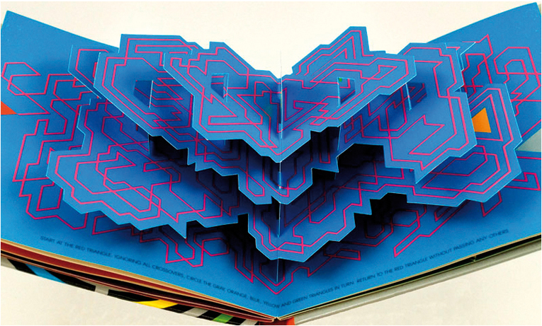
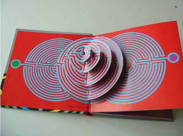
I am equally in awe of some of his output since leaving Penguin in 1979, having become disillusioned with some of the covers being passed at that time. He has gone on to produce some original and beautifully designed books. A couple of great examples of this are his Kites to Make and Fly and Dimensional Mazes: An Entirely New Way of Losing Yourself in a Book. Both contain some timeless graphic illustrations and again showcase his all round skill set as an illustrator, designer and art director, as well as his enviable capacity for original thought.
I feel like his work has a real legacy to it. The fact that the illustrative and design work itself still stands up today, it’s association with some of the most renowned authors of our time and it’s permanence on books that people want to keep will mean it will continue to inspire.
