
Daniel Buchholz and Jan Wagner-van der Straten from German studio NEU share their appreciation for an unsung and thoroughly modern logotype that’s barely changed in almost a century.
For us the Nivea logo instantly evokes childhood memories. By simply looking at it, the cream’s distinctive scent reaches your nostrils. Since 1925 the logo has only been altered fractionally. It must count among the most consistent corporate identities ever created: white type on a deep-blue background. That’s it.
Contrasting the clear, blocky ‘NIVEA’ lettering with the human, rounded cursive of the word ‘Creme’ gives the wordmark an emotional, and in some ways, maternal touch. The logo transports nostalgia without being old-fashioned, it beems confidence without appearing arrogant or pretentious. It is a loyal and reliable companion that needs no effect or visual trick – something which cannot be claimed for comparable brand’s logos.
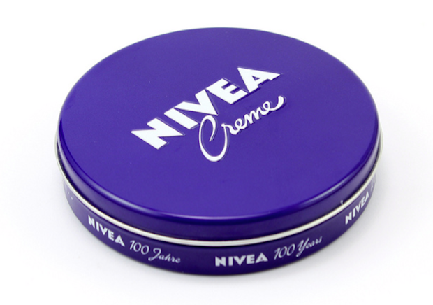
There was a redesign of the logo in 2012 when the classic Nivea lettering was placed in a deep blue circle, which has since appeared in this form on every new product of the Nivea range. This design decision was quietly inspired: it plays on the German population’s nostalgic childhood memories of the blue vintage cream container. For the German market the typeface is exceptional too. Since 1935 Nivea has stuck to its logo typeface, which comes very close to the well-known Futura. Still today, although not quite as much as in the past, Germans attach great importance to traditional-looking designs for their products. placing a starkly modern piece of type, without any form of imagery, on a plain blue cream container is a design decision which can only be called absolutely brave, despite being made over ninety years ago. One might say the logo was already well ahead of its time back then.
To this day the logo works perfectly well. It appears clear and modern, with the slight design alterations so marginal that few would have even noticed the difference. When it comes to identities, Nivea shows it is possible balance nostalgia and contemporary tastes in a single logo.
buero-neu.de
Neu Buero of Communications
... is based in the Ruhr area of western Germany and was initiated in 2013 by Daniel Buchholz and Jan Wagner-van der Straten. They offer a versatile expertise in various disciplines across print, digital and identity design.
Nivea
… has recently employed three Liverpool FC football players to star in their most recent TV advert trying to encourage British men to use their products. Fortunately, they’re only required to speak one unconvincing line between them.

