On the eve of the much-anticipated Somerset House exhibition on The Jam, we caught up with Anthony Burrill, who has created a series of striking typographic posters especially for the show.
How did you get the job? It must be many (Jam-loving) designers’ dream commission…I was first contacted by curator Claire Catterall at Somerset House. Her email was quite cryptic, she asked if I was a fan of The Jam. I answered that I could be if necessary, The Jam were always my sister’s band, I preferred the more esoteric charms of Kraftwerk and The Human League. I had a meeting with the curatorial team at Somerset House and ‘Team Weller’, to look through the exhibition content and curatorial aims. It was interesting to look at the vast collection of the band’s archive, there are over 500 objects in the exhibition, from flyers, posters, guitars, drums to Paul Weller’s school books complete with drawings of scooters and early versions of The Jam’s distinctive logo.
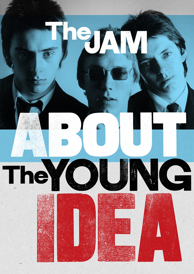
What was the original brief and did it change at all? The brief was to create a distinctive identity that reflected the content of the exhibition. The aim was to present the band in a fresh way, avoiding the mod cliches that were much more about their later career, focusing on their early punk roots. The title ‘About the Young Idea’ was used to emphasise the astonishing youth of the band, they all look incredibly young in the early press shots, but still have the swagger and confidence we associate with the music. The band split as the members reached their mid-twenties, it was a conscious decision. The Jam were always meant to be a youthful band.
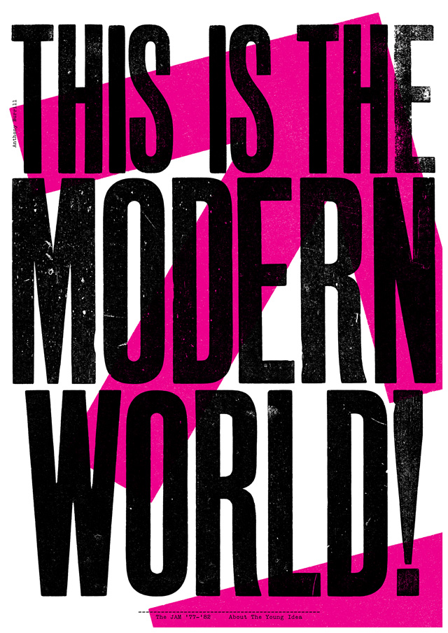
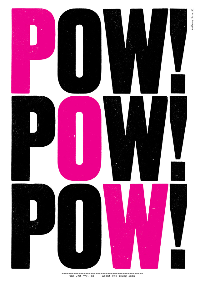
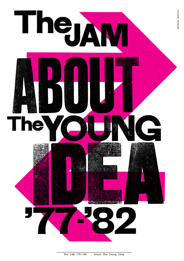
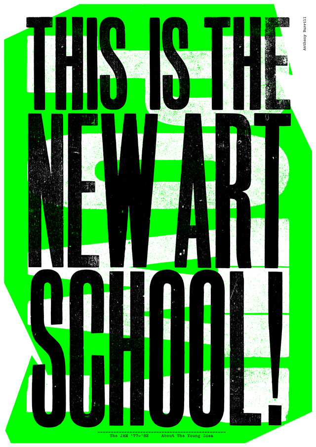
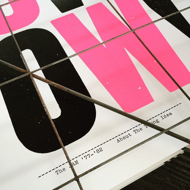
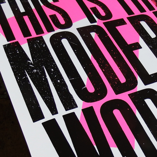
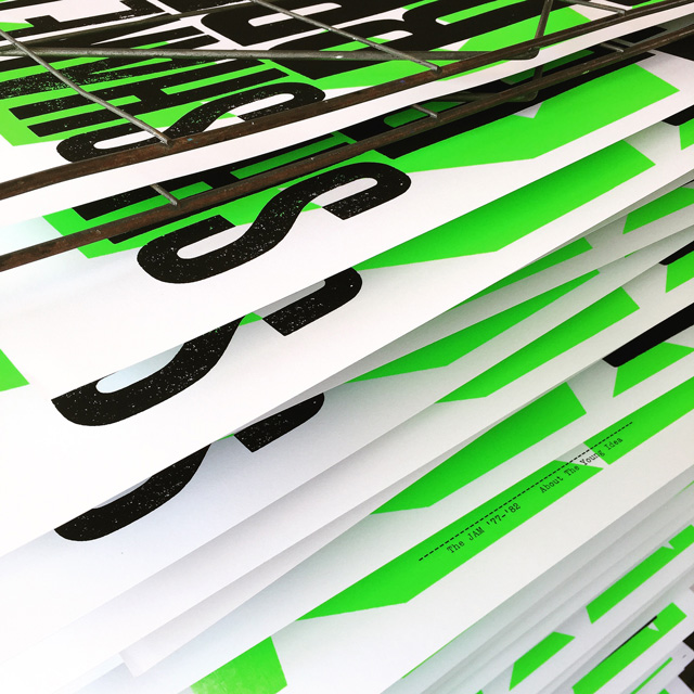
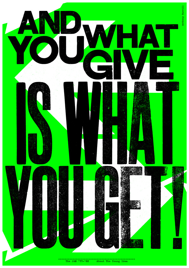
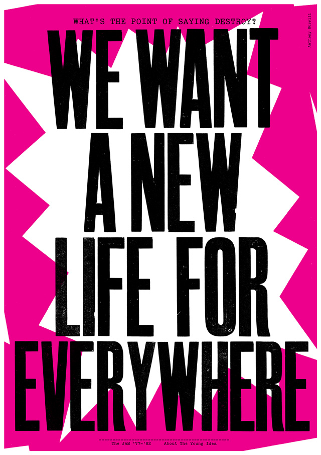
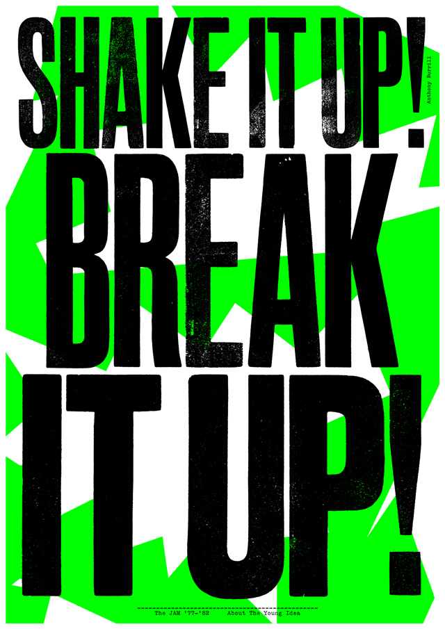
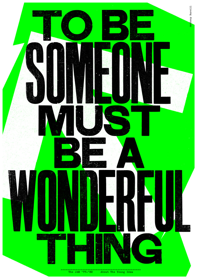
Does the subject matter present any particular challenges, and if so how did you get around these? I knew I wanted to work with letterpress and wood type to give the identity a lo-fi raw quality. This was informed by the printed material in the band’s archive, because it was from the seventies it had a handmade analogue feel. The ephemera has a raw energy, I wanted to reflect. I chose not to use the band’s logo, this was to give the exhibition its own identity, to look at the band in a new way. The Jam were a very visual band, the record sleeves, promo videos and press shots all have a very strong look. I didn’t want to pastiche this in any way, my aim was to be sympathetic to the subject matter, but still work with my own approach.
How did you go about selecting the lyrics for the posters? The lyrics were selected by the curators, I had a short list to choose from. I then picked the lyrics that I thought would work best as posters, avoiding the more obvious lines and choosing an interesting selection.
Which aspects do you think have worked particularly well? What’s your favourite element?I like the contrast of textured wood type and bright fluorescent backgrounds. It’s the first time I’ve worked this way, printing the individual words, then scanning in the proofs to produce artwork for screen print. It freed me up to be much bolder and expressive with the type and backgrounds. I listened to the back catalogue when I was working on the layouts to help give the posters a feeling of energy.
What’s been the response from the band so far?I haven’t heard directly from them, but so far everything has been approved.
What’s your favourite Jam track? START was alway my favourite track and still is, I like the sparse taught production and lyric. It feels very tight and anxious, coiled up and angry and it’s a great rip from The Beatles.
What are you up to in Cannes?
Working on Google Beach, the complete opposite of The Jam. It’s been interesting juggling both projects over the past few months.The Jam: About the Young Idea
26 June – 31 August 2015
Somerset House, London
somersethouse.org.uk
In celebration, Universal Music is releasing a limited-edition CD of the same name on 22 June.