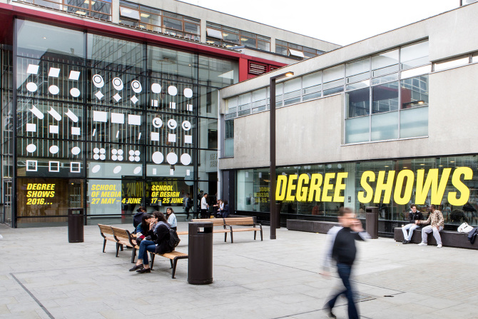
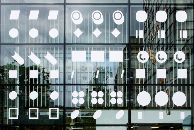
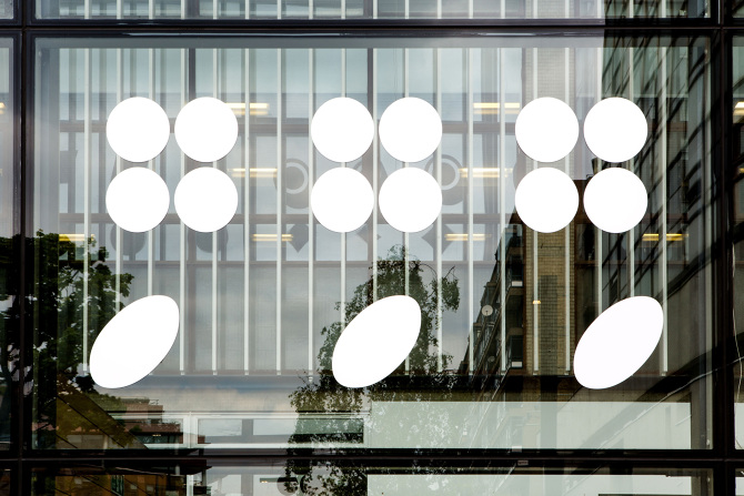
In today's Letterform, Tara Hanrahan looks at the ellipsis – exciting and suggestive, it's a character which is the typographic and literary equivalent of an Eastenders doof-doof. An ellipsis is a triple-dot punctuation mark, which according to my well-thumbed Elements of Typographic Style by Robert Bringhurst, is “the sign of elision and of rhetorical pause.” It is the latter purpose, when used with suspense, or to trail off intriguingly, that interests me most about this mark – when it becomes an aposiopesis: a deliberately unfinished sentence where the ending is supplied by the reader’s imagination. Like the philosopher Theodor Adorno, who described them as “an infinitude of thoughts and associations”, I find these dot-dot-dots exciting and suggestive – the typographic and literary equivalent of an Eastenders doof-doof. Inspired by this, I used a combination of ellipses to represent the collective futures and creative potential of design and media students graduating from London College of Communication this summer.
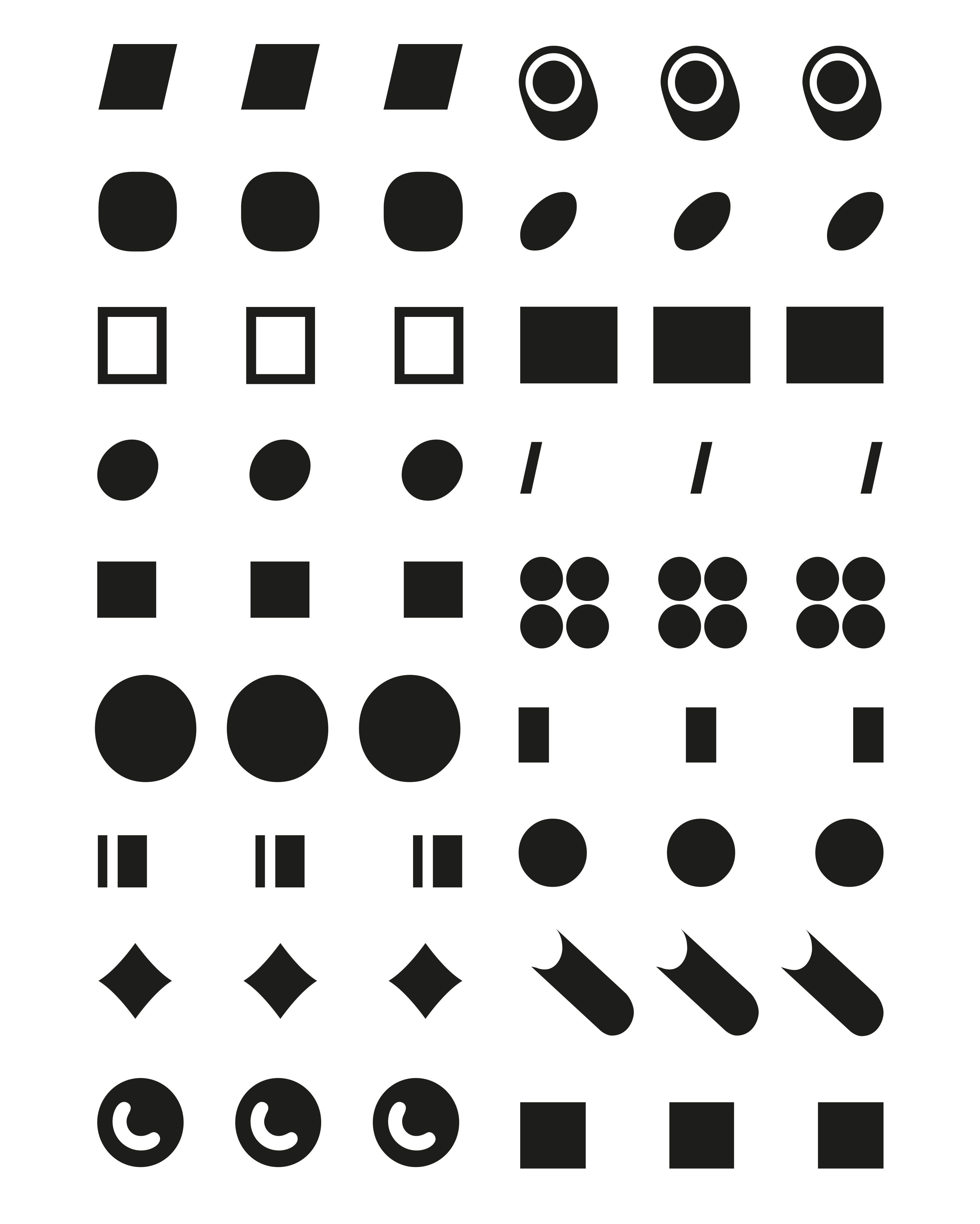
Ellipsis in English Literature: Signs of Omission, states that “Punctuation marks can have a pictorial quality when looked at outside their verbal contexts … The visual dimension of punctuation can help a thought take place … Or a thought can give punctuation a particular shape.” I wholeheartedly agree. When selecting the typefaces I parked any design snobbery, instead focussing on how the mark was rendered with personality. In doing so, I found joy in their forms – both in the reduction of each face down to a single dot and then by the momentum gained from the repetition of that mark. The final mix are all characters (excuse the pun), some are bouncy, some are sharp and most are directional. Sometimes they appear to protrude telescopically and at other times they seem, like Wile E. Coyote’s ACME black holes, to have the potential to lead you to another place….
Visit the LCC Degree Shows, School of Design: 17 to 25 June: arts.ac.uk/lcc/events/
The typefaces used in the LCC Degree Shows 2016 branding are: Berthold Akzidenz Grotesque, Extra Bold Condensed Italic. Victorian Inline Shaded, Plain. Omnes, Medium. Edwardian Script ITC, Regular. Univers LT Std, 65 Bold Outlined. Rockwell, Extra Bold. Avenir, Medium Oblique. Helvetica Neue, Ultra Light Italic. Foundry Gridnik, Bold. Dot Matrix, Two Extended. Cooper Black, Regular. Grotesque MT Std, Light. Zeppelin CG, Regular. Century Gothic, Bold. Lucida Blackletter, Roman. Gill Sans Shadowed MT, Light. Frankfurter Highlight, Plain. Franklin Gothic Book, Regular.
Tara Hanrahan…
… is a designer, educator and researcher. She can either be found making and directing under the title Think/Do, tutoring across the creative disciplines at various institutions, or researching ways to integrate sustainable thinking into design education at London College of Communication, University of the Arts London.
Ellipses…
…were first used n the English language in 1588. In the 17th Century, ellipses were often known as eclipses – signifying a moment of darkness (a gap, or the unknown). Typesetting an ellipsis is fraught with different opinions – depending on preference, one can set the dots flush or kern the spaces between to greater or lesser extents.