Illustrator Steve Simpson had always admired the Arts & Crafts movement but when he discovered William Morris's pioneering designs it inspired a revolution in his work. What more could you ask from a hero?
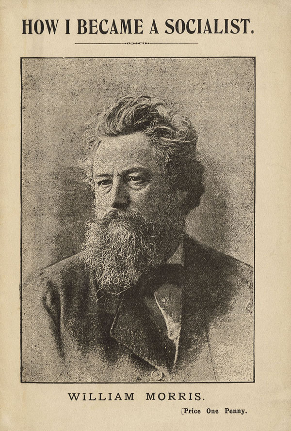
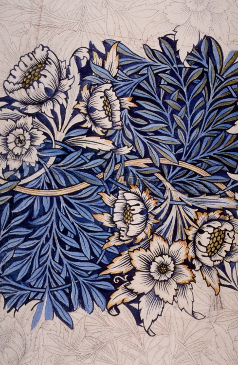

I have fond memories of poring over a library book on William Morris and the Arts and Crafts Movement, as a teenager. At the time I was more interested in Art Nouveau and in artists like Henri Toulouse Lautrec, Aubrey Beardsley and Gustav Klimt. Art Nouveau had it’s roots in the Arts and Crafts movement and I wanted to know more about this period. I knew very little about design or illustration in my teens, my interests gravitated towards painting, but a fondness for Morris and the Arts and Crafts Movement took root and has stayed with me over the years.
I’m always looking for a fresh approach or a new perspective on my work. In 2010 I travelled to Los Angeles to ICON, the illustration conference, in search of inspiration. I’m not great at taking notes but am often inspired to doodle my way through presentations in my sketchbook. During the conference the phrase “embrace what you love” was one that particularly resonated and took hold. I’m not sure who said it (I should probably take notes) but it’s become a bit of a mantra. For me, it means simply to allow my many varied interests to more fully permeate my work and to create ways for these passions to influence my projects.
For me, Morris is the great-grand-daddy of graphic design. With this in mind I found myself revisiting Morris and discovering how he’d influenced the earliest days of commercial art. I’d never studied Arts and Crafts in design history, so this was the first time I’d really made the connection between Morris, graphic design and me. It was, of course, obvious when I thought about it but all that time I’d had him in the wrong box. He was actually an illustrative designer.
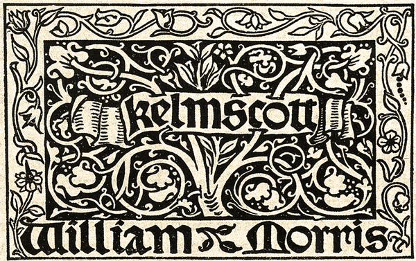
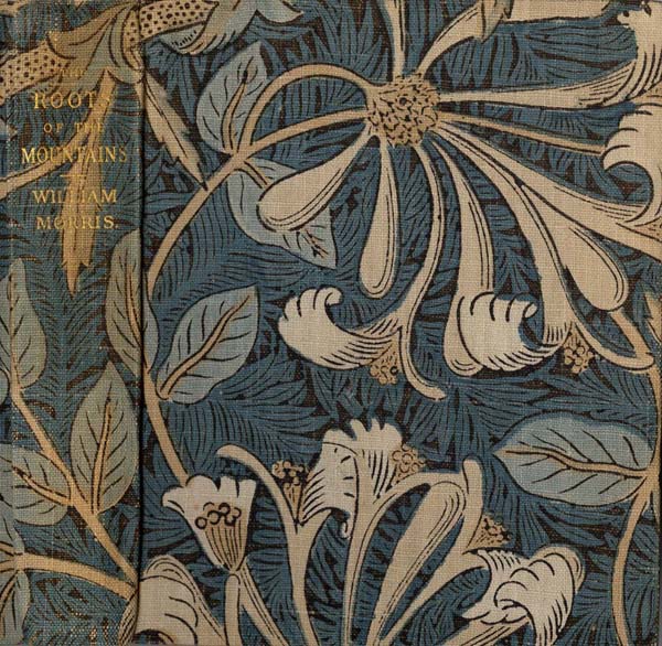
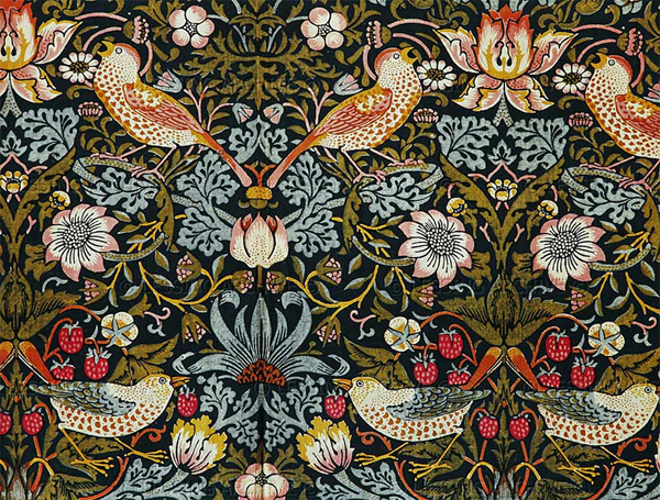
William Morris, born in 1834, was an artist, writer, poet, textile designer, architect and socialist. He was associated with the Pre-Raphaelite Brotherhood and, along with John Ruskin and Augustus Pugin, a founding-father of the Arts and Crafts Movement. The ‘Arts and Crafts’ movement was a revolution, a reaction to steam-powered industrial mass production and the low quality of factory-line produced wares. As Arts and Crafts was a movement, not a style, it set down the ground rules which led to a gothic revival, celtic ornaments and a revival in folk art.
But for me, Morris is the great-grand-daddy of graphic design (even though the term ‘graphic design’ wasn’t coined until thirty years after his death). Morris’s flat and simplified natural motif designs were a graphic reaction to the realism seen in the fabric and textiles on show at the Great Exhibition of 1851.
His typefaces live on today, reproduced in many digitised forms based on Kelmscott Golden Type, Troy/Chaucer and others inspired by his illuminated capitals.
His textiles and wallpaper patterns have been a huge inspiration in my sketchbooks which, in turn, influence my commercial work.
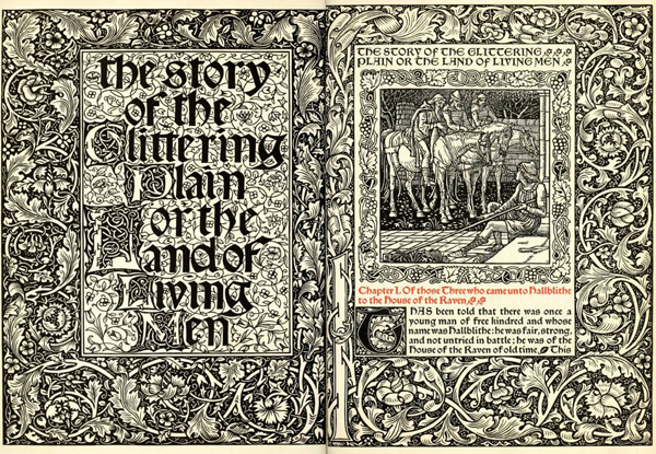
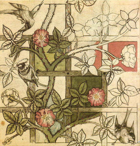
My own background is an odd mix of technical graphics, illustration, animation and comics. However, for the past twenty-plus years I’ve been working in print as an illustrator and designer. Up until the time of my re-discovery of Morris I’d sometimes struggled to get my quirky illustrations and grid-based graphic design to look cohesive — the two elements were at odds with each other. I worked at imposing design restrictions on my illustrations, but with unspectacular results.
I don’t think Morris would be appalled by our digital design methods today, he wasn’t completely averse to technology. On a packaging job for a start-up client, Mic’s Chilli, I decided to experiment. Instead of thinking of it as a graphic design job that would also require illustration, I decided to treat it as one big illustration. This was a huge breakthrough for me. Suddenly I was free of my perceived design restrictions and could look at design from a purely personal aesthetic. I started using more and more hand lettering, only relying on fonts for body copy, ingredients etc. I hand drew the main characters, the logo, motifs, the decorated borders and even the die-cut. The only thing on the label that looked like it had been designed by someone else was the barcode. Indeed, it had been designed by another hand. Someone had made the decision on how to integrate the bars with their number string font choice. I researched what is actually required for a barcode to function and what can be altered, adapted and illustrated (I’ve compiled a list of tips on my website).
You might say that in true Morris fashion I’d attempted “to make the the smallest detail relate to the total concept”. Of course this isn’t a new approach, this is the way the commercial artists of the 1950s and 1960s worked in simpler times, before the computer gave us all labels and put us in boxes.
I don’t think Morris would be appalled by our digital design methods today, he wasn’t completely averse to technology. He once said “…be the masters of our machines and not their slaves.” I think he would encourage us all to remember that the computer, and all its wonderful apps, are just tools and that it is good to get away from the big screen occasionally. In what has become an increasingly digitally driven design environment, perhaps it would be good for all of us to look back over our shoulders to a time when printers were graphic designers, designers were illustrators and illustrators were designers? Steve Simpson

