
Choosing fonts for a book called Why Fonts Matter is always going to be tricky. Read on to discover how author Sarah Hyndman selected the book's various typefaces, and to find out how you can get your hands on one of ten copies we have to give away…
I have found type exciting since I was a child. I used to love going to the sweetshop after school to look at all the brightly coloured lettering on the packaging and I would go home and make my own versions. Then later my schoolbooks were covered in meticulously redrawn logos of my favourite bands and song titles. These early experiences inspired my interest in the expressive qualities of type and I wrote Why Fonts Matter to share this.
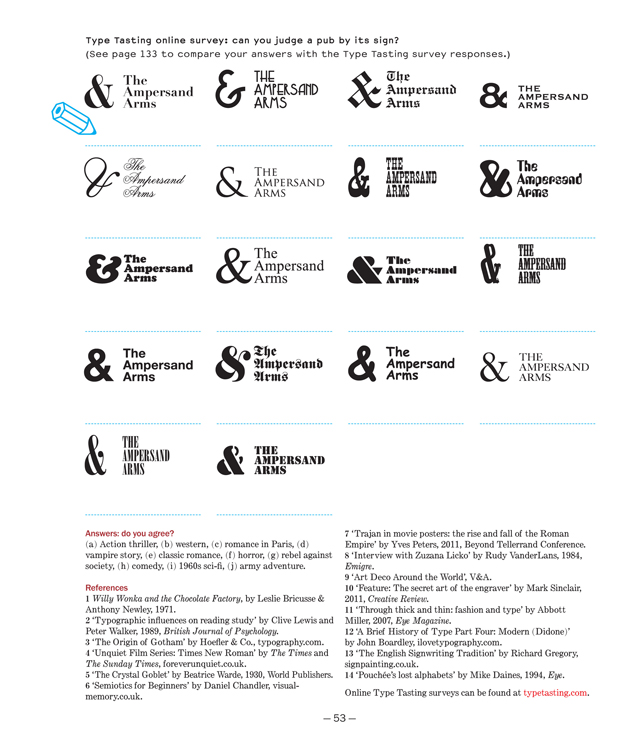
The shapes of different typefaces each have their own personalities. These create a first impression before we even start to read the words, in a similar way to the clothes you wear or your body language – they can all be considered as forms of non-verbal communication.
I had this in mind when choosing the typefaces for Why Fonts Matter – each is matched to the type of content it is to communicate within the hierarchy of the book. From the headings, which provide way finding and need to grab the attention, to the references that link to more in-depth information, the function of each level is indicated by the typeface.
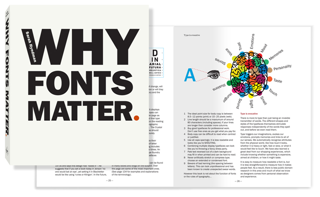
The chapter titles are in Balega. This a solid, chunky display face by Jürgen Weltin (2003). It is robust and eye-catching, and I think its curves and points give it character. It looks interesting but also feels challenging – the book is intended to be a little provocative. Weltin suggests that if it were a sound it would ring with the “fat sound of a Jimi Hendrix guitar.”
The main body of the book is written in Franklin Gothic, originally designed by Morris Fuller Benton (1902). I chose this because it is a readable classic, and as a sans serif it is neutral enough to sit alongside the cast of typefaces appearing throughout the book. However, it has a double-storey ‘a’ and ‘g’ that hint at the intellectual tone of voice of a serif. Styles like this were used for early American tabloid newspaper headlines, and this populist association reminds me not to take myself too seriously when I write.
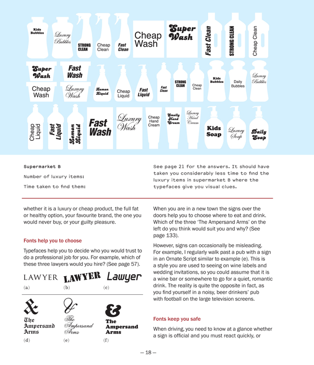
The instructions for the games and the data are in Courier sans, which has big, open letterforms that feel clear and uncomplicated. This is based on the Macintosh system font with the serifs removed, designed by James Goggin (1994 to 2001). I selected this because sans serif typefaces are shown to be associated with a task being easier to do – I want people to engage with the games in the book, and for the data to be accessible.
The reference notes are a link to much more in-depth information. I flag this up by using a traditional serif typeface, which is a style associated with knowledge and information. I chose Monotype Century Expanded, designed by Linn Boyd Benton and T. L. DeVinne (1894), because it has the right tone of voice and elegant italics.
Finally, the cover (top) is designed by Two Associates who used a headline version of the Franklin Gothic body copy. I think the bold, tabloid newspaper style suits the title well.
We have ten copies of Sarah's fantastic new book to give away to ten lucky Grafik readers. To be in with a chance of winning, send an email with 'Why Fonts Matter' in the subject box to giveaway@grafik.net, telling us the name of Sarah's highly entertaining TEDx talk. Deadline is 12 February 2016, and don't forget to include your address details.
If you can't wait to get your hands on a copy, Sarah's book is out today and available to purchase here.
See more of Sarah's research at typetasting.comPlease note that by entering this giveaway you are consenting for your email address to be added to our weekly newsletter subscriber list. Please unsubscribe if you do not wish to receive the newsletter.