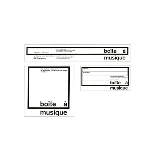
Karl Gerstner’s logo for Boîte à Musique was one of the first instances of a flexible, responsive visual identity, and an extremely successful one argues Lizá Ramalho of R2.
Unlike the famous logos of certain large international companies, whose design excellence is allied to their business success, the logo of record shop Boîte à Musique is recalled exclusively due to the interest of its visual identity. Today the shop no longer exists. It operated in the 50s and 60s, in a shopping centre in Basel and was managed by a gentleman called Derrik Olsen; here you could buy vinyl records of any genre. The shop's visual identity was designed by the Swiss designer Karl Gerstner: it’s a pioneering and emblematic project, an early example of a flexible visual identity and perhaps the first responsive identity.
The Boîte à Musique logo reflects Gerstner's interest in geometry, mathematics and computer systems. The relationship between the verbal language and the typography engenders a new interdependent unit, which is more than the sum of its individual parts (1). The logo of Boîte à Musique establishes evocations between the shop's name, which is already so suggestive (it translates as ‘Music Box’), and its visual representation. The logo constitutes a visual identity that reflects its designer's global thinking, and which stands out because its minimum unit (the logo) enunciates the entire logic of the system. Its potential to be deployed without the addition of further graphics confers the tremendous coherence of the project.
This is a dynamic logo, whose recognisability remains complete in its different versions. It’s a functional system in which the logo reacts to the different formats and media, and which introduces the concept of responsiveness applied to a graphic project. The project's apparent simplicity belies complex typographical games – the composition, formats, contrasts, form and counter-form, while the grid employed confers visual and 'acoustic' rhythm to the project.
(1) Gerstner, Karl (2007). Designing programes. 3rd edition. Zurich: Lars Müller Publishers.
r2design.pt
R2
…was started in 1995 by Lizá Defossez Ramalho and Artur Rebelo, and is a design studio located in Porto. R2 develops projects such as editorial design, visual identities, signage systems, posters and exhibitions, as well as web design projects. They recently won Gold at the European Design Awards for their exciting, vivid identity for Um Segundo Films as well as their design for architectural magazine Jornal Arquitectos.
Karl Gerstner…
was born in Basel in 1930 and was highly influential in the establishment of what we now consider Swiss design, Indeed from a young age he found himself at the centre of the modern design movement. He went to visit Cassandre in Paris and also knew Jan Tschichold and Max Bill. At the tender age of twenty-five he was offered the chance to design and edit an entire issue of Werk magazine that helped to established how we view Swiss modern design to this day.


