As Oliver Bothwell points out, Gerald Barney's logo for British Rail is a true design classic. Created at a time of great optimism, it still cuts through the visual chaos which now permeates Britain's rail system. Perhaps unusually for someone with a background in branding and identity design I think the importance of the logo is often overrated. A company’s success rarely relies upon this symbol. The hidden arrow in FedEx doesn’t tell you they’re a delivery company; Nike’s ‘swoosh’ is just that, Coca-Cola’s success is down to clever marketing and ubiquitous availability. But I’ll admit there is something incredibly satisfying about a clever logo, Alan Fletcher’s work for the V&A is about as good as any symbol could be.
However, for me, the truly inspirational projects come from something bigger than just a symbol. In 1948 the railways in Britain were nationalised, what was once run by four companies merged to become British Railways. The system was modernised, moving from steam to diesel and electric. The liveries were updated and a series of logos were developed, ‘flying sausage’, ‘cycling lion’ and ‘ferret and dartboard’. In the 60s, when the trend to adopt bold sans-serif typography and move away from illustrated motifs was at its peak, Design Research Unit were commissioned to overhaul British Railways.
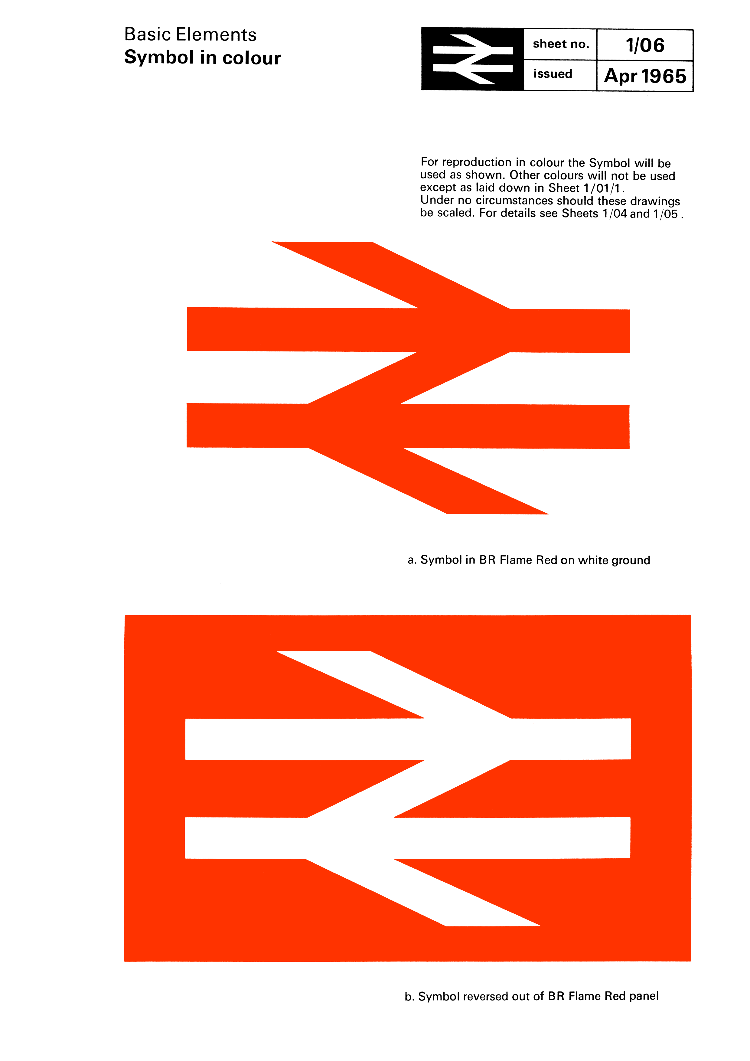
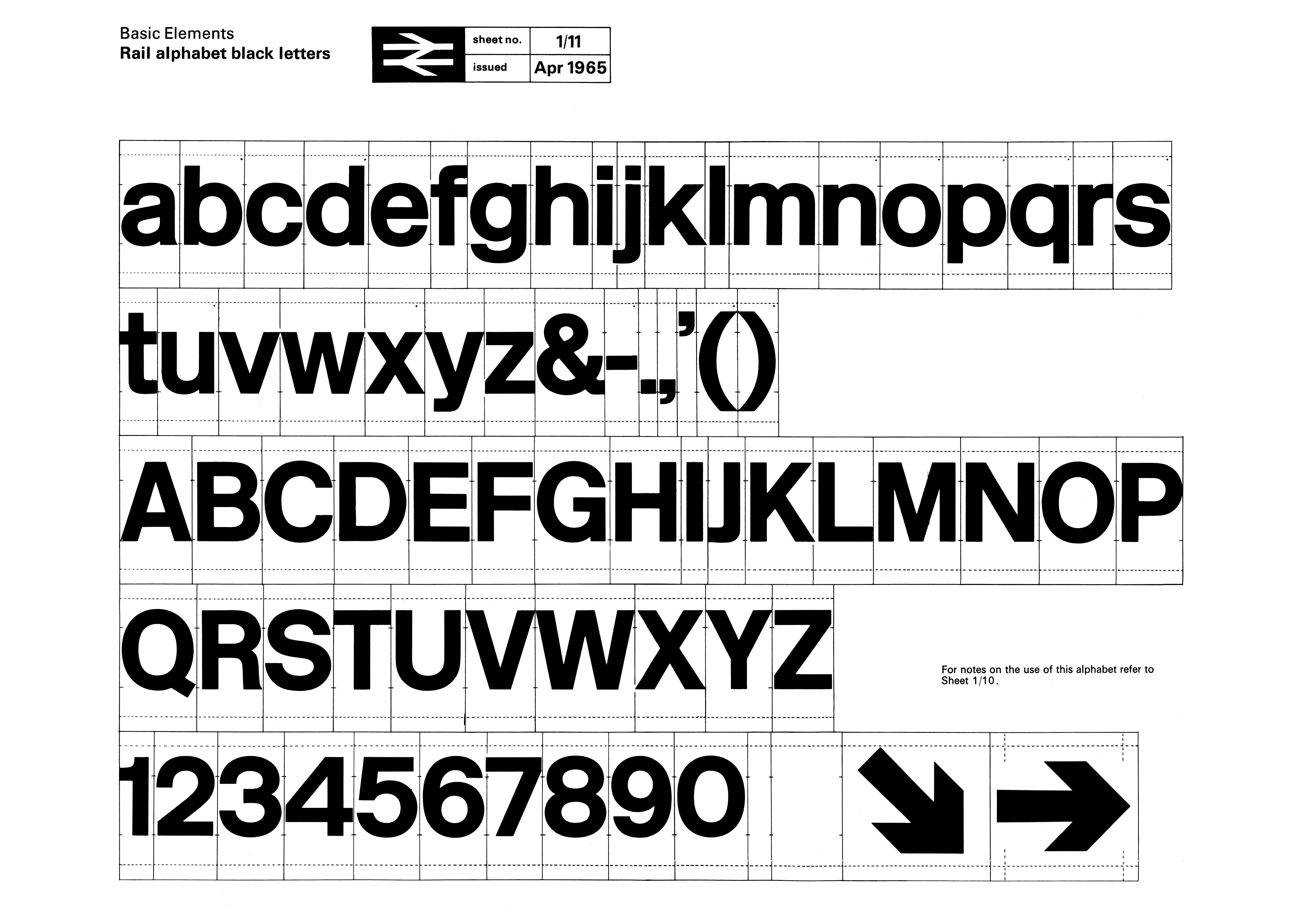
DRU, one of the first design consultancies combining architecture, graphic and industrial design, standardised British Railways’s output. They created the Corporate Identity Manual, a coherent system for the whole network; and commissioned a bespoke typeface, Rail Alphabet, designed by Jock Kinneir and Margaret Calvert. This was a railways system for modern Britain, clear and simple. The ‘Double Arrow’, designed by Gerald Barney encompasses all of this. It’s bold, easily decipherable and clever, incorporating tracks, arrows and a bolt of lightning. It’s as modern as the system it was designed for.
This all encompassing work with an ambitious scope was bigger than just a corporate identity project. It demonstrated what is possible with collaboration and design thinking. A system that works and looks the same whether you are in Carlisle, Crewe, Cardiff or Canterbury. In today’s privatised landscape with convoluted ticketing and a mess of franchises run for profit, the old logo still shines over our railways as a beacon for what is possible. What’s more inspiring than that?
oliverbothwell.co.uk
Oliver Bothwell…
…is a former graduate of LCC who now resides in New York. Oliver has worked on various editorial design projects for The Times, The Telegraph and The Guardian, and for design studios such as North, Mark Porter and Base Design in Brussels. Recent projects include the identity of RTL nieuws across TV, web and app (designed with Mark Porter).
Gerry Barney…
…was only twenty when he joined DRU as a lettering artist. His design for the British Rail logo (sketched on an envelope on the way to work), was one of two shortlisted from around 50. After the other design was leaked to the press, it was Barney's unmistakeable double arrows which were chosen to represent Britain‘s newly nationalised railway system.