
In this first instalment of our archive piece we revisit the fascinating A-Z of Typography which first appeared in Grafik 171. Here we look at letters A through to H...
A
Fraser Muggeridge
A is for Asymmetrical Typography
I often compare typographic design to the occupation and responsibility of a hairdresser. Scissors and combs replaced by a range of typefaces in various sizes, with the job of arranging letters, words, sentences and paragraphs on a page.
How would you like it done today, sir? Up, down, left, right? Symmetrical or asymmetrical?
Jan Tschichold’s 1967 book Asymmetrical Typography seems like a good place to start, so I borrow a rare copy from a friend. I am surprised and rather let down as the book makes little use of asymmetrical page arrangements, with a more general content than I had hoped for. I later learn that the translation from the original 1935 German edition, Typographische Gestaltung, translates as Typographic Design.
While symmetrical typography is arranged on a central axis, asymmetrical typography is constructed with unequal horizontal and vertical spaces between elements to create a dynamic tension. Similarly, in an asymmetric page design, the spaces between the inner text margins of a double-page spread are not equal.
Neither is better nor worse than the other, and in many instances they can work together, complementing each other in the same design. The trick of a good typographer is knowing what to use in each distinct circumstance, perhaps like the hairdresser choosing a centre or side parting. —
B
Ian Styles
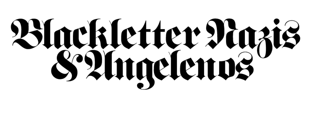
Blackletter – Banned by the Nazis and now by the Angelenos
Back in 1992, a seemingly ordinary day trip would turn out to be the start of an intriguing journey. The trip in question was to the John Rylands University Library in Manchester, to not only see but also to touch the Gutenberg Bible – a publication of major importance within the history of printing.
Since then I have always loved Blackletter. Each character is exotic, authoritative, strong and intricately crafted. I think no other style of font commands quite the same respect; you take it seriously, you can't ignore it, it demands to be read. Fully justified and typeset by the true masters of their art, it looks amazing. Johannes Gutenberg's forty-two-line Bible is testament to this.
Blackletter has history (and lots of it). It was favoured by hand scribes from 1200; the first ever newspaper, The Relation, was published using it in Strasbourg in the summer of 1605. Printed entirely in Fraktur (a particular cut of Blackletter so commonly used that the two have become synonymous), it has endured well, so much so that newspapers to this day (including the New York Times) still bear it on their masthead.
In 1941 the Nazis banned Fraktur under Hitler's orders, inaccurately reporting it to be of Jewish origin. Ironically, the decree itself was partly set in Fraktur type. After the war the Allies reinstated Fraktur, using it on the new stamps, money and post-war publications of occupied Germany.
Today the use of Blackletter continues to be controversial, provoking responses from diverse corners of the globe. The latest being that it is now banned in Los Angeles, where it is seen as a sign of gang activity, most notably that of the Nuestra Familia – this from a city where almost anything goes.
—
C
John Morgan
Class Consciousness
Author, publisher, printer, typographer. I’ve chosen occupation in this case to be an indicator of social class (there are many others: income, education, wealth, taste etc). At what point did the ‘typographer’ emerge? Joseph Moxon in his Mechanick Exercises gave us perhaps the very first definition: “By a typographer, I do not mean a printer, as he is vulgarly accounted, any more than Dr Dee means a carpenter or mason to be an architect” (1683–84). This sets the tone.
Following the 'master printers', the editorial function was separated from the print house and subsequently the typographer took the design function away from the compositor. White-collar gentleman-typographers (a male preserve) gave instructions to blue-collar comps. This is mostly a British issue
– the history is one of cosy private gentleman's clubs and private presses, the catholic mafia of Morison and Meynell, the Double Crown Club – a world of gentle refinement and ‘men of taste’. That’s over, thank God.
Where does it leave us now? Typography sits somewhere with the reduced status of a ‘vocational’ course. Within the design/craft field, pottery and textiles have always had a strong middle class following and there’s the occasional semi-aristo who is ‘good with his hands’ but this is not the preferred route. There’s a class-biased sorting mechanism for entry into certain jobs. Kids from wealthy families can take unpaid internships or spend a year abroad. Their consciousness is formed in large part by public schools and select universities. They tend not to become typographers or graphic designers. If you are lucky they may employ the services of a typographer. It’s good at least to know this. Class consciousness matters.
—
D
Anthony Sheret
Display and Bespoke Typefaces

I admit I was slightly apprehensive about writing this piece. I have never been formally trained in typographic rules – I left university at the beginning of the second year, opting to define my own path and create an environment of collaboration and experimentation.
I started to attempt to draw my own faces at the age of sixteen, and subsequently the lovely people at Grafik profiled me at the age of seventeen. These faces, all naïvely crass, had one thing in common – they were designed as display type, and for a single use.
Display typefaces, especially bespoke faces for individual projects, allow the designer to create specific moods in headings and titles. For bespoke faces, sometimes only the intended characters that will be used are drawn. This almost disposable and single-use approach is fascinating, and gives the ability to completely mould characters around a concept or mood.
I have to make more time during each project to draw bespoke typefaces, and I would love to see more bespoke type around me – but with the current climate, it might be wishful thinking.
—
E
David Pearson
Indispensable 'E'
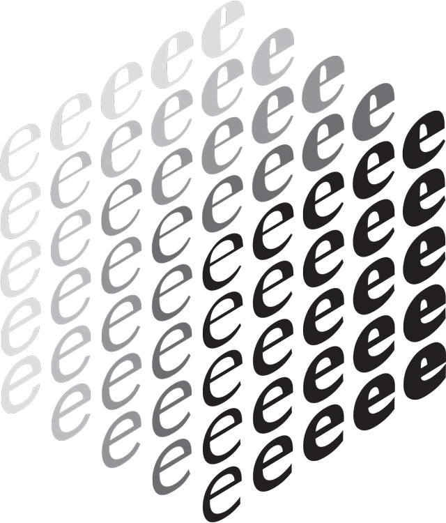
The most commonly used letter in the English language is the letter ‘e’, with a 12.7 per cent frequency. This is the case in fiction and non-fiction writings, journalism, religious and scientific works and even Morse code.
Letter frequency in the English language: e t a o i n s r h l d c u m f p g w y b v k x j q z
Letter frequency in journalism: e t a o n i s r h l d c m u f p g w y b v k j x q z
Letter frequency in religious writings: e t i a o n s r h l d c u m f p y w g b v k x j q z
Letter frequency in scientific writings: e t a i o n s r h l c d u m f p g y b w v k x q j z
Letter frequency in general fiction: e t a o h n i s r d l u w m c g f y p v k b j x z q
Letter frequency in Morse code: e t a i n o s h r d l c u m f w y g p b v k q j x z
With ‘e’ appearing so frequently, you might think that it would begin the most words. Unfortunately for ‘e’, it is rather far down the list of English-language word-beginners, ranking fifteenth (the five most common being ‘t’, ‘o’, ‘a’, ‘w’ and ‘b’).
It’s not all bad news, though: ‘e’ is the letter that most commonly occurs third in a word and is the third most common second letter in a word, behind ‘h’ and ‘o’.
Approximately half the words in the English language end with the letters ‘e’, ‘t’, ‘d’ and ‘s’, with the greatest share of words ending in ‘e’.
The letter ‘e’ features 113 times in this article. —
F
Jonathan Ellery
F is for Farrow
Design studio Farrow has been around for quite some time now. From a core team of Mark Farrow, Gary Stillwell and Sabine Fasching, fantastic contemporary work is consistently produced.
Their work is always beautifully art-directed, they're very good with colour, the type is always razor-sharp and it's always intelligent.
One could make the mistake that it was all perhaps about an aesthetic, but underneath there is gentle, quality conceptual thinking going on. On top of all that, it's always got a sexy 'rock 'n' rollness' to it… if that makes sense.
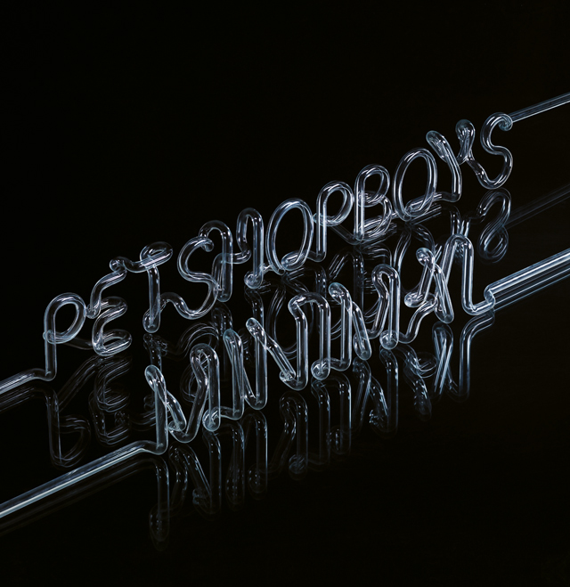
In many cases they like to treat their work and type sculpturally. For the Pet Shop Boys’ Minimal single packaging, neon type is used, the colour is removed and it’s art-directed in a studio.
More recently, for publisher Fiell, a typographic identity takes on a 3D quality by creeping around the corners of books and signage.
With Disco Four, again by the Pet Shop Boys, strip lights are used as numeric type.
For Spiritualized’s A&E packaging, medical needles are used as the sculptural element sitting alongside a medically informed typographic aesthetic.
When an exhibition of their work materialises in the future, this sculptural aspect to their work will perhaps steal the show —
G
Julie Kim
Lost in Translation
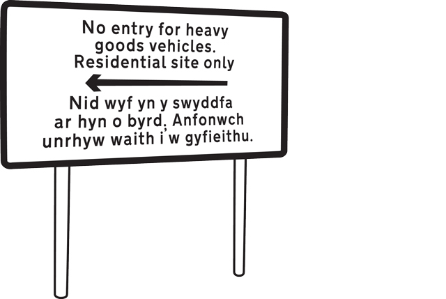
A couple of months ago a story caught my eye. Swansea Council had erected a bilingual road sign barring heavy goods vehicles in the Morriston area of the Welsh city, or so they thought.
An English- speaking Swansea council official had emailed the in-house translation services requesting that the message “No entry for heavy goods vehicles. Residential site only” be translated into Welsh. Back came an automated email response but, unable to speak Welsh, the official assumed that this reply was the required translation and had the message printed under the English.
Confused Welsh-speaking road users were confronted by a sign that read: “I am not in the office at the moment. Please send any work to be translated.”
Recently, I attended a one-day conference at St Bride Library titled The Form of the Book. One of the speakers journeyed through her work produced while working with Herbert Spencer.
After her presentation, a member of the audience commented how one of the posters she had presented included a small font anomaly.The poster was set in Bembo but the ‘g’ used with this font was in fact the old face Baskerville ‘g’.
He pointed out that in the days of photo lettering, when letters were photographically reproduced, the specimen provider Conways must have got things mixed up, so that a fragment of the old face Baskerville had become embedded in this cut of Bembo.
These stories remind me that we can never entirely give up responsibility for verifying what we are given. In graphic design, as in Wales, we always need a discerning eye – one that is literate in the native language.
—
H
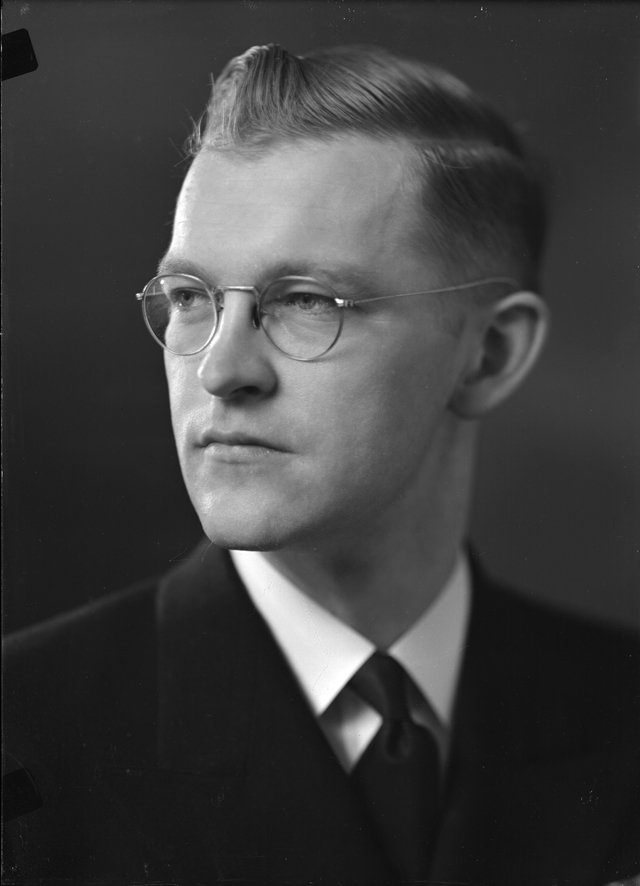
Freda Sack, Foundry Types
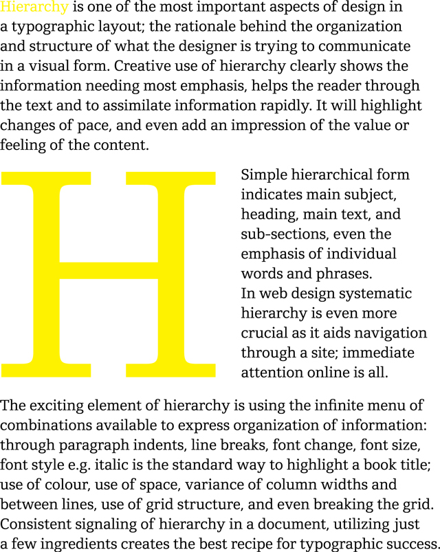
Hierarchy
This article first appeared in Grafik 171, March 2009