
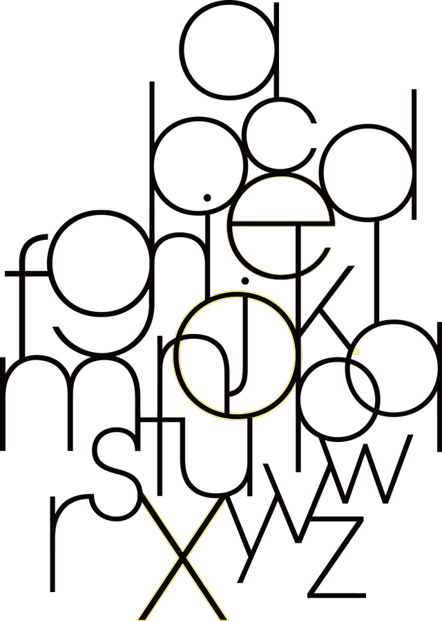
In this second instalment of our archive piece revisiting the fascinating A-Z of Typography which first appeared in Grafik 171, we look at letters I through to P...
I
Susanna Edwards
Imprint
It was whilst working on some letterpress printing at New North Press that I first met Lisa Rahman. We were interested in each other’s work and started to talk type. Graham Bignell of New North Press runs letterpress workshops for students at Chelsea College of Art and Design with Nigel Bents and Lisa was one of the students who passed through the Press.
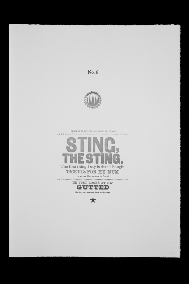
The Travelling Barmaid was a response to a college brief to create an illustrated book about herself or someone she knew. Ewelina, a friend of Rahman’s, is a travelling barmaid. Sometimes it took something as simple as a bottle cap to set Ewelina off on one of her humorous stories. These stories have now been made into a run of artists’ books published by New North Press.
Most of the typefaces used came from type that had been saved and found by two printing firms: J.M. Welbourne of Southend, Essex and the Cathay Press in Hillington, Middlesex. Both printing firms were concerned that their type should not end up as scrap. In passing this type on, they have made the book possible.
The book consists of twenty pages of text with an explanation about the type used in the book and includes fourteen typographically illustrated stories printed in colour. Each story is decorated by a hand-coloured printed bottle top. It was printed on an Albion Press by Graham Bignell in a signed and numbered edition of 135 copies and was launched at On the Fractured Stage of the Book at the Eagle Gallery EMH Arts.
—
J
Matt Willey
Edward Johnston
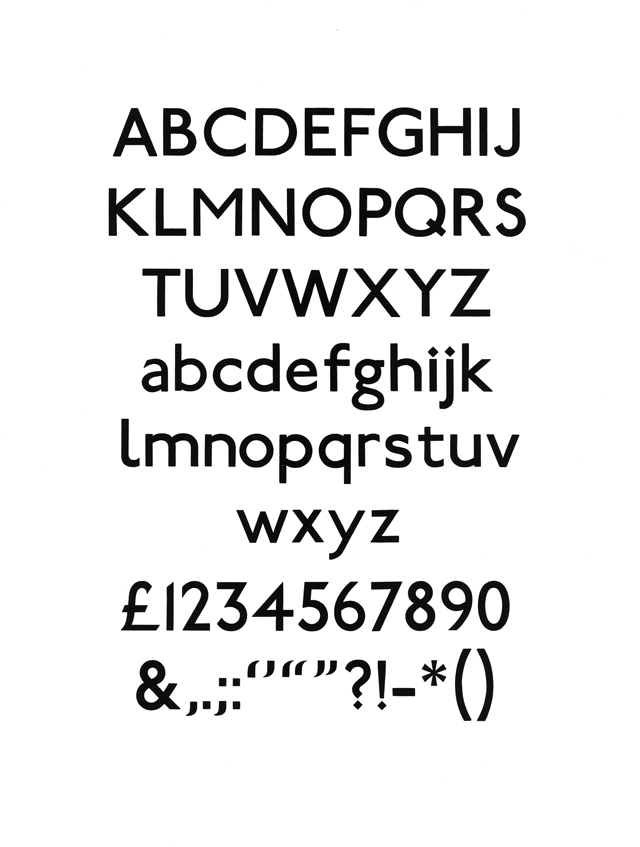
It is hard to think of London, of the identity of this city, without thinking of the blue and red roundel symbol, and the crisp white type, that make up the London Underground signs. It’s almost become a logo for London. The roundel and the sans-serif typeface were both designed by Edward Johnston under commission by Frank Pick, the bold and inventive managing director of the London Passenger Transport Board.
The typeface, now called Johnston Sans, was designed in 1916 and the roundel, whose dimensions were carefully worked around the typeface, in 1918. It's a brilliantly simple and elegant system that dates back to a proud period of history, overseen by Frank Pick, when the LPTB were commissioning some of the best artists and designers in the world.
Johnston Sans is a wonderful typeface based on squares and circles; it comes from a clear need to be legible and modern, and it does both brilliantly. The typeface has endured 'tweaks' (it was reworked by Colin Banks in 1979) but essentially this system has remained the same for 90 years.
Edward Johnston taught at the Central School of Arts and Craft and at the Royal College. The typographer and sculptor Eric Gill, only a few years younger than Johnston, was a pupil at Central and helped on the early stages of the Johnston typeface. It is easy to see the influence of Johnston’s work in Eric Gill’s Gill Sans typeface, designed in 1927. Johnston’s book Writing and Illuminating and Lettering is considered the most influential book on calligraphy ever written. First published in 1906, it has been in print ever since.
—
K
John Forss
Kazunari Hattori
As Margaret Thatcher almost certainly never said, this K is not for Kerning. So apologies to those who hoped it might be. No, this particular K is for two giants of Japanese typographic design: Katsumi Asaba and Kazunari Hattori.
From the late 70s and throughout the 1980s, Katsumi Asaba was a hugely influential figure of the Japanese advertising industry and, in 1987, established the Tokyo Type Directors Club, which is still going strong and attracts entries each year from all over the world. But, despite all of these achievements, it's his later work that captivates me the most.
Now in his late sixties, Asaba-san is a well-respected patriarch of the Japanese typographic community. He has developed an instantly recognisable, yet ever-evolving typographic language that often mixes very brutal, modernist type structures with skilfully hand-drawn elements that are deeply rooted in the sacred art of Japanese calligraphy. He's also an amazing showman.
Anyone who's looked through a Tokyo TDC or ADC annual in the past decade is sure to have seen a photograph of the man—he often appears as the subject in his own poster designs, usually wearing his signature bright red trainers. His artistry has been applied to everything from drinks packaging to mobile phone covers, ceramics, book jackets and posters.
So many wonderful posters. And I have it on good authority that he's a mean ping-pong player too. Sorry, I mean ‘table tennis’.
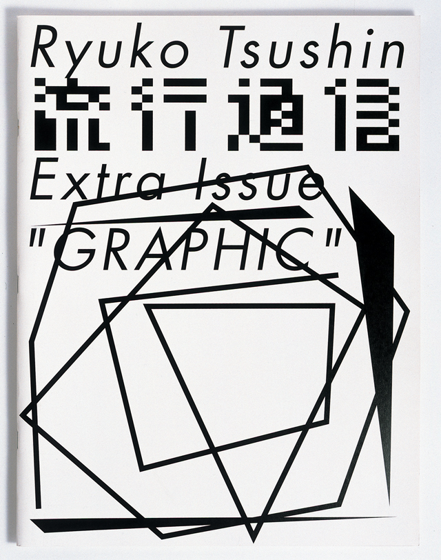
The other K is Kazunari Hattori, a Tokyo-based art director, designer, image-maker and, most certainly, a mover and shaker of type. It was his amazing art direction of the Japanese style magazine Ryuko Tsushin that had me gripped the first time I saw it. It's his ability to take a fundamental typeface like Futura and make it appear to be one he'd just created that morning that has me as captivated today just as it did the first time I encountered it some five years ago.
Kazunari Hattori seems to have a blatant disregard for any semblance of a grid, but somehow manages to make each piece of his exquisite work look as though it adheres to a very precise structure, but not one that any other designer could possibly emulate. And, believe me, I've tried.
He'll carve up the space with zigzagging lines and create his own typefaces from seemingly arbitrary shapes that all converge with expressive coherence. And that's just his typography. If I were to begin writing about his inventive image-making and photography there would be no pages left in this magazine for L to Z. All I'll say is this: check out his amazing series of 'cake' posters and he's sure to have you hooked.
—
L
Ian Anderson
Lover, Learner, Loser

L is for Lover, Learner and Loser – and I’m all three when it comes to Typography with a big T.
Lover because I love the 3 Rs—reading, writing and ranging left. I love setting and abetting the printed word.
I’m a Learner because I want to know if we really do read best what we read most, and what that really means in real life, and because the printed word, what it can say and finding new ways to convey it should never be limited by rules of kerning and L for Leading; and Loser, because, serif or no serif, deeds speak louder than Didots. I should be doing something else, and so should you.
I also collect football programmes.
In its purest form, the lowercase l is one just one decisive stroke — the simplest mark of all, a beautifully minimal, non-stop journey direct from a to b, from top to bottom, from whenever to wherever. The uppercase adds the right-turn, a decisive change in direction, a promise, a base, a bottom line.
Stripped of title and the font of office, other letterforms lose their looks, their shapes abstracted into perverse arbitrary aesthetics no more intelligible than kanji to the non-Japanese reader, but L retains an iconic simplicity — witness the L is for Learner-driver plate, a beautiful Helvetica 95 shop-local Swiss flag inversion.
In any case, L works best naked in unadorned form and function sans serif where the stroke thickness is equal, the angle is 90 degrees, as god or the fairies at the bottom of the garden intended, stripped down to Helvetica 35/45, Akzidenz Grotesk Light, Univers 35 or even a cheeky little Akkurat Regular.
Turn the lights out when you go.
—
M
Max Bill
Adam Michaels
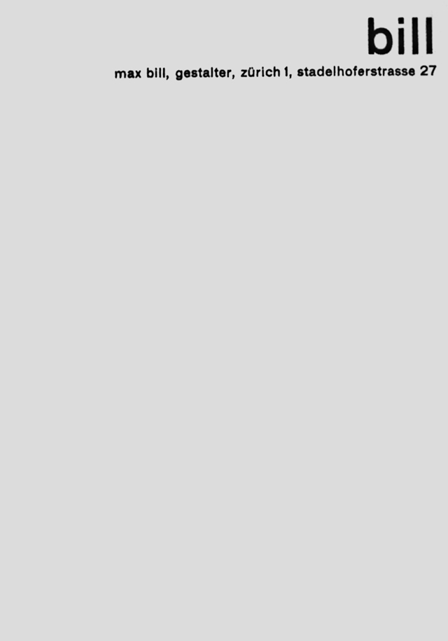
amidst his work in architecture, painting, sculpting, writing and design pedagogy, max bill (1908–1994) was responsible for crucial developments in the evolution of modern typography.
writing in 1946, he condemned others' (including jan tschichold's) ornamental affectations, considering elements such as "thick rules and lines, large points, oversize page numbers, and other such features" to be "unnecessary and now superfluous". bill instead promoted a more considered approach to functional typography, in which "all factors—technical, economic, functional and aesthetic requirements—[are] fulfilled equally, and combine together to determine the text-image".
of particular relevance today as an antithesis to our era of all-pervasive pluralism at the service of spectacle, bill remains a model of simple, staunch commitment to the social core of communication.
all citations from:
Bill, Max. On Typography. Typography Papers 4 (2000): 62–70 (first published in Schweizer Graphische Mitteilungen, Jhg 65, April 1946, pp. 193–200).
—
N
Wood McGrath
Newspapers
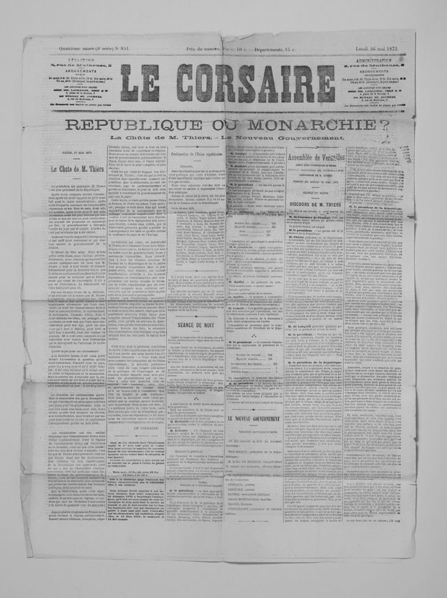
We have a particular fascination with the typography of newspapers, initiated in part by a small bundle of early twentieth-century newspapers found in a ‘vide grenier’ a number of years ago.
Our collection of (mostly French) newspapers now spans a sixty-year period from 1870 to 1930, and they are a constant source of inspiration. Some regional examples boast decorative editorial openers and as many as eighteen fonts on a single page – a notable contrast from the multi-font institutional typefaces more commonly found in today's papers.
The diverse combinations of fonts from one paper to the next give each a unique voice: from the Parisian dailies to the village weeklies, they deliver their information in their own typographic language, specific to their geographical origin and time.
These early examples contain a treasure trove of interesting pairings and unusual cuts, some of which have yet to make it into the digital catalogues of today's type foundries. This issue of Le Corsaire from 1873 is more restrained than most, but still boasts a beautiful range of typefaces on this one page.
—
O
Astrid Stavro
Mother and Child
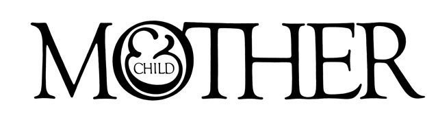
If words are a way of creating meaning, then the shapes of their letters give colour, voice, character and individuality to that meaning. Herb Lubalin, the father of conceptual typography, made type talk, merging concept and visual form into typographic poems. In typograms, word and image are meant to be viewed as one.
To Lubalin, letters were not merely vessels of form, but objects of meaning. His career as an ‘O’ filler started with a Hires Root Beer Cap in the slogan ‘It’s Tops’. One of his most memorable typograms is Mother & Child, designed with Tom Carnase in 1965, a masthead design for a Curtis Publications magazine that was never published. The letter ‘O’ is a womb that holds a child in the shape of an ampersand.
The logo is a virtuoso manipulation and combination of letters and a masterclass on the power of ideas and how meaning is communicated. It is a logo I keep coming back to and is particularly endearing to me now as the mother of a newborn child.
—
P
Hector Pottie
Parking
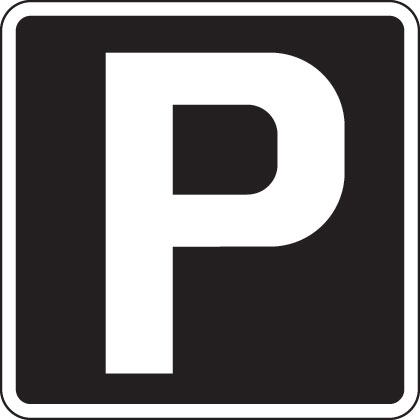
The white P on a blue background that we all see everywhere around our towns and cities tells us where to park. I wanted to write about it, as it is for me a small part of one of the most remarkable graphic design triumphs of our time: the road and motorway signage system designed by Jock Kinneir and Margaret Calvert from 1957 to 1967.
They developed a new typeface and signage system based on Akzidenz Grotesk and renamed Transport, which became the benchmark for modern signage systems all over the world. Replacing a confusing and erratic multitude of signs that were in place already, their system forms the basis of what is still in use today.
It's the fact that a piece of graphic design has made such a positive impact on society that I find worth remarking on. It communicates to the public without them even knowing. It's so good that it has become invisible as a bit of design and simply works. Pure graphic communication that everyone understands..
No Entry, Clearway, Give Way, M1, The North, Hospital and, of course, Parking: the list goes on and on. Simple, clear and legible — this really is the power of good graphic design. It makes our world work better. It makes our world easier to understand. It helps us on our way. This article first appeared in Grafik 171, March 2009