
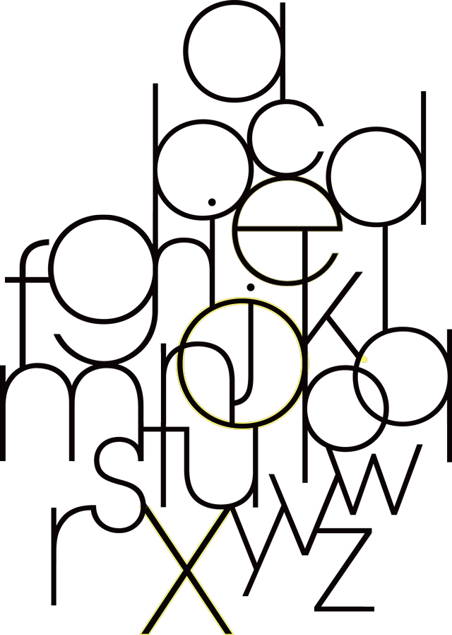
In the final instalment of our archive piece revisiting the fascinating A-Z of Typography which first appeared in Grafik 171, we look at letters Q through to Z...
Q
Angus Hyland
Q is for?
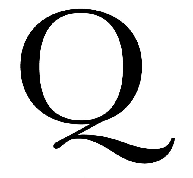
So here’s one... q: How many typographers does it take to change a light bulb? A: A lot.
A silly joke but q is a silly letter. A folly, odd, queer if you like, in
the original sense of the word. As a functioning letter, q is utterly redundant. The job can be done perfectly well by the letter K and, for the most part, generally is. When comparing the same sound in English spelling, C is the most popular, K finishes a distant second and q is miles behind. Aside from Z, q is the least used letter in the English alphabet.
q was not adopted into the English language until after 1066, with the French-language invasion of the Norman Conquest. Previously old English had got by without it. Ben Jonson wrote: “The Anglo Saxons knew not this halting q with her waiting woman u after.”
Perhaps the enduring enigma of the q has something to do with its rather fanciful shape, by developing the boring o with a flourish at the end of it. Set in Baskerville, it looks lofty, feminine and regal, like the queen with u, her lady-in-waiting.
—
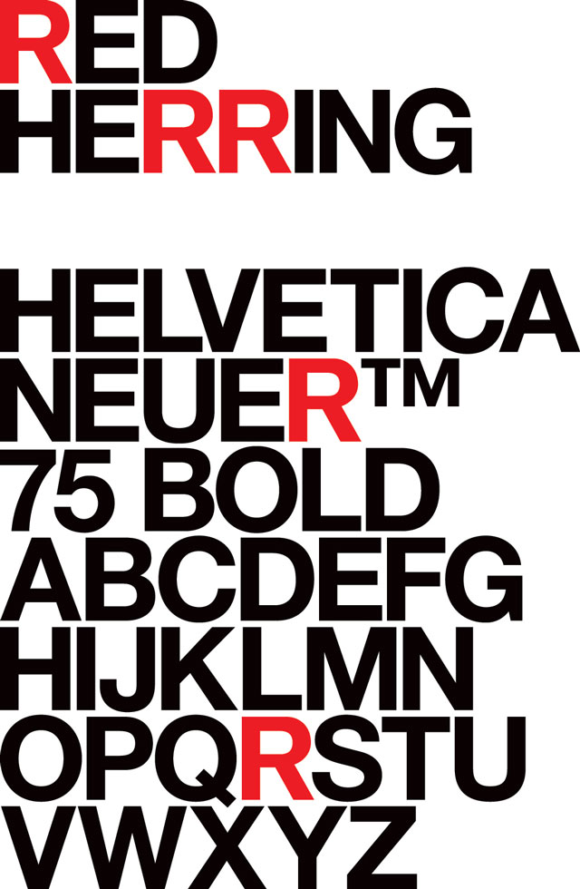
R
Mark BoyceR… is for Helvetica
—
S
Hamish Muir
System
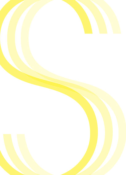
SystemSystems oftypeface(s), fonts, units of measureSystems forreading, comprehension, navigation, orientation, clarity, order, logic
—
T
StilettoT is for Alice Palice’s Flickr Letters Assignment
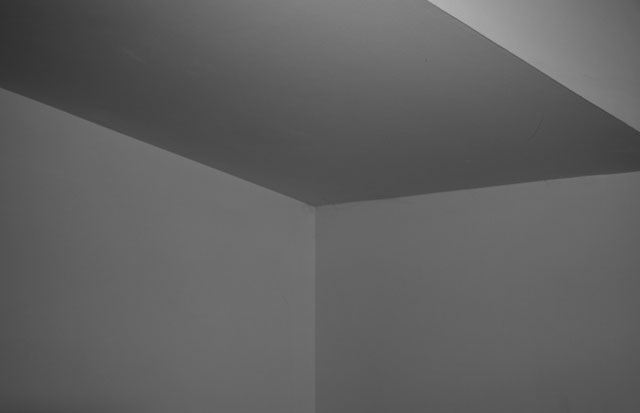
We were searching for T ideas when we happened upon this photo online. We saw it and were so impressed with it that we couldn’t help wishing that we had taken it ourselves. Though it isn’t a Stiletto original, the photo quickly became a favourite and we’d like to thank Alice for allowing us to use it.
When we started this assignment, we started to see Ts everywhere: in the corner of a table, a window division, a T-shirt, but this photo triggered our T-vision even more. What we were struck by is how this photo of an ordinary room corner became something else entirely when looked at it from a different angle and in a different context. Here it became a T in space, a dimensional letter. We love the simplicity both of this photo and of the letter T (which we learned is the most used consonant and the second most common letter in the English language). —
U
Our Polite Society
Untitled
—
V
Rick BanksGeometric Typography
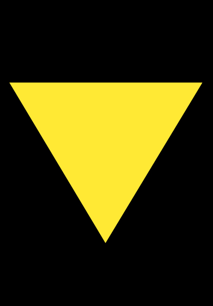
Designers are often ineluctably drawn to the letter ‘V’. This is probably down to the fact that, when stripped down to its fundamental elements, it reveals a basic shape of geometry: an equilateral triangle. The font featured, entitled Constructivist, is based on the posters and graphic designs of Revolution-era Russian artists. Many of the letters were based directly on specific letterforms from the works of Rodchenko and other letters were simply inspired by the bold forms of El Lissitzky.
Geometric shapes and in particular triangles have long been featured in art and design. They are synonymous with the Bauhaus, whose principles of simplified forms and simple functionalism stemmed from the circle, square and triangle. The artist Kandinsky, who later taught at the Bauhaus, was obsessed by the golden section and the proportions of the harmonic triangle, their influence pervading much of the genius in his paintings. His obsession with triangles was probably passed on to Max Bill, a student at the Bauhaus, who constructed a typeface (Architype Bill/Foundry Types) purely using triangles and straight lines for an exhibition poster in 1949.
It is not just artists who are fascinated by the composition and balance that triangles bring. Most modernist designers are obsessed with the three elementary shapes. This is probably because using these functional shapes produces strong lines, wise proportions and clean design. A recent example of geometric modernism is Experimental Jetset’s identity for 104 (Le Cent Quatre). The logo consists of three elements: a line, a circle and a triangle. Together, these three elements form a stylised '104'. Another great example of geometric modernism is Paul Rand’s 1965 timeless trademark for ABC showing the ‘legacy’ of the Bauhaus and Herbert Bayer. Bayer’s ‘universal’ alphabet reduced letterforms to the simplest of geometric shapes, circles and straight lines. The simplicity and reduction of the logo make it a personal favourite with its almost time-defying novelty. —
W
Fernando MelloThe Letter W
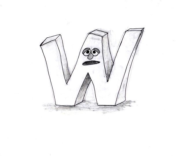
It would be just boring to write some 200 words on William Caslon, W.A. Dwiggins, etc…
… W, the 23rd letter of the alphabet, has often been depicted in Muppet form on the Muppet Show and Sesame Street. The letter’s famous appearances include acts like pummelling Kermit the Frog in an early episode, eluding capture by Sergeant Thursday in a Dragnet spoof and, more recently, being interviewed by Larry King. Its “wuh-wuh” sound has endeared itself to the public since it first appeared on the song The National Association of W Lovers, part of the 1971 LP The Muppet Alphabet Album. It was sung by Bert, one of Sesame Street’s main characters, and is in fact the anthem for the National Association of W Lovers, an organisation devoted to recognising and celebrating the values of the letter, whose activities included reciting W-words and drawing letter Ws. The W, along with other letters such as E and S, is also said to have sponsored the first episodes of Sesame Street in the late Sixties and, alongside the letter B, to have produced the first Sesame Street movie, Follow That Bird, in 1985.
—
X
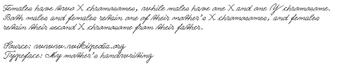
Henrik KubelThe X Chromosome
—
Y
Jon SuedaYearbook
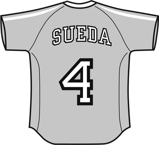
Yearbook is a typical American sports typeface sometimes referred to as“collegiate lettering.” It’s a blocky, slab-serif typeface, commonly used on team jerseys at all levels of sports from little league to professional. The complete font family contains Yearbook Filler, Outline, and Solid; the first two of these faces are designed to be superimposed on top of each other to create a decorative outline.
This typeface is commonly associated with the culture of high school and college athletics as well. Those who excel in a particular sport are dubbed a “letterman,” and wear jackets that have the first letter or initials of the school, set in Yearbook on the left breast area. Traditionally, athletes wear these jackets to represent team pride and to display personal awards.
Although I lettered in tennis and received one of these jackets, I felt quite uncomfortable with what it meant to wear it. Like many schools, the ‘atheletes’ were at the top of the social pecking order, and that embroidered letter on the jacket became a status indicator of the social elite and essentially a symbol of what was depressing about being in high school. On the other hand, I have many fond memories of little league baseball and soccer teams as a kid. The ritual of choosing your jersey number and getting that big slab-serif 4 printed on my uniform before first game was always exciting for me.
—
Z
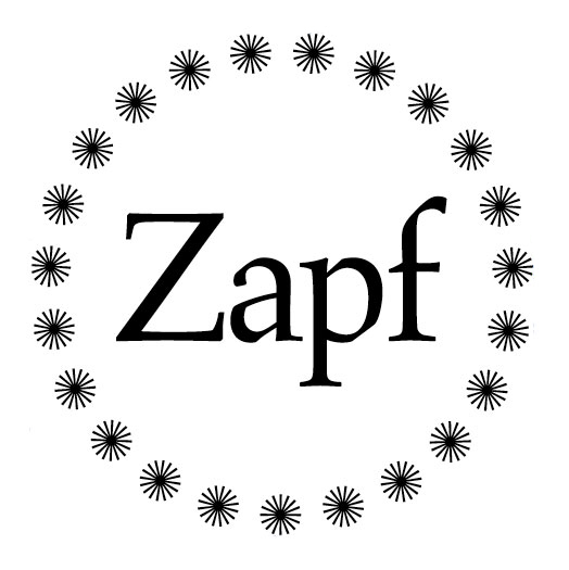
Paul FinnZapf
And here it ends. Z. The final and most rarely used letter. Z. With Zeus-like zeal this formidable form acts as the bookend to the alphabet. Z. An onomatopoeic zigzag; a line or course characterised by sharp turns in alternating directions. Z. The end but also a beginning, it points in both directions; back to A and forwards to the zillion combinations these twenty-six forms can collectively manifest.
Z is for Zapf. Hermann Zapf, the creator of many wonderful typefaces, but one shines brighter than the rest: Aldus.
A typographic homage to a character who captured the zeitgeist of the late fifteenth century. Aldus Manutius. A leading publisher and printer. The instigator of the italic typeface style. The inventor of the pocket book format. The first typographer to use a semicolon. Aldus reached the zenith of typographic achievements and Zapf gave it form. And here it ends. Z.
This article first appeared in Grafik 171, March 2009