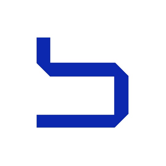
Fontsmith type designer Stuart de Rozario pays homage to the lowercase ‘s’ of Wim Crouwel’s New Alphabet, a typeface that was aesthetically visionary as well as solving a key problem of phototypesetting technology. When I was presented with the opportunity to write about one of my favourite things, letterforms, I deliberated between whether to write about where it all started in my career or something that I’ve found inspirational and influential along the way. There are so many typefaces and letterforms that I love, picking one is almost an impossible task. As a type designer, it’s easier to name letterforms that I don’t like to sketch. After much internal deliberation, I’ve decided on the most inspirational typeface to me: Wim Crouwel’s New Alphabet and the lowercase ‘s’.
I first came across this letterform back in the early Nineties in a music shop flicking through the latest vinyls. I wasn’t on my chosen career path in those days, I was just a long-haired kid looking for a decent tune. I came across the album cover for Joy Division’s Substance (the 1991 re-issue) designed by Peter Saville. It featured the striking, geometric, indecipherable and futuristic fluorescent green ‘s’ emblazoned on the cover – reminiscent of something you would see from a X-Wing spaceship in Star Wars. I was blown away.
It wasn’t until many years later when I was a graphic design student that I discovered who actually designed the maze-like green shape from the album. I found it when reading through a velvety peppermint green typographic journal from the International Society of Typographic Designers. Inside was an article on the designer Wim Crouwel and his typeface – New Alphabet. The typeface revolutionised my own approach to graphic design, typography and typefaces, enlightening me to new thought processes and methods.
New Alphabet was originally drawn in 1967 by Wim Crouwel to counteract the limitations of the CRT Cathode Ray Tube technology used on screens for phototypesetting. It meant that conventional typefaces lost their subtle definitions due to the horizontal and vertical nature of the display technology. Crouwel “saw the horrible type coming out of that first generation machine”, so he proposed a new single lowercase-only alphabet typeface (a tradition of Schwitters, Bayer and Tschichold).
The typeface was never intended to be released and like many of Crouwel’s other typefaces, New Alphabet was designed with 5 x 9 proportions and a 45 degree sheered angle to replicate curves or corners. It’s a human but mechanical approach to type design that is inspiring and provocative – a new graphic language was born. For me, Wim Crouwel’s New Alphabet lowercase ‘s’ symbolises the man: influential, iconic, visionary and legendary.
fontsmith.com
Stuart de Rozario
… is a designer at Fontsmith, a London-based foundry that was established in 1997. He draws inspiration from a broad range of sources, from ancient manuscripts to abstract modernism and primitive marks to urban calligraphy.
Wim Crouwel
… is considered by many to be the world's greatest living graphic designer. Although he has designed type throughout his career, his designs were not commercially available until 1996 when The Foundry digitised Crouwel's New Alphabet. Fast forward to 2014, and many of Crouwel's typefaces are now available as webfonts, ready for use in the next generation of screen-based applications.
December 30, 2014 2 minutes read
New Era
Fontsmith designer Stuart de Rozario pays homage to the lowercase ’s’ of Wim Crouwel’s New Alphabet, a typeface that was aesthetically visionary as well as solving a key problem of phototypesetting.

