
Following the successful redesign of art world favourite Elephant, the magazine’s Robert Heath picks five established publications who haven’t been afraid to give themselves a facelift.
The first cover of a magazine redesign is always tricky: it needs to communicate something fundamental about the changes to the title and the underlying motivation behind such an upheaval. What’s better about this version? What can we as new or dedicated readers expect?
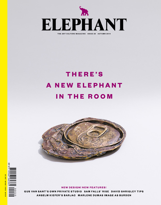
When Elephant made the decision to metamorphose, it was to create better tools to explore the lively and thriving subject matter of contemporary art and art culture. The concept of the cover of issue twenty, then – the playful tagline and the conceptually complementary ‘High-Class Can’ sculpture by Ken Kagami – offers a clever invitation for those invested in such subjects to come in, as it were, and explore what’s new. Most importantly, it announces the disruption that the new structure and design poses to the ‘room’ of the art world: Elephant presents and considers work in a unique way amongst its competitors.
Below, I’ve chosen five covers of newly redesigned magazines to see what works when a magazine sheds its skin and steps out in new garms.
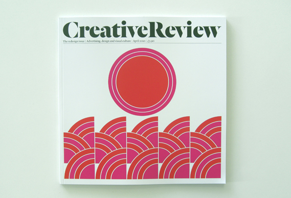
Creative Review — April 2010
Creative Review’s current design premiered in 2010 to celebrate the magazine’s thirtieth birthday (but also due to tightened purse strings: the smaller format reduces postal costs). Replacing the old ‘CR’ logo with a broad serif masthead, along with the striking graphic print, offered the first redesign a strong newsstand presence, and the square format of the magazine has since made it instantly recognisable.
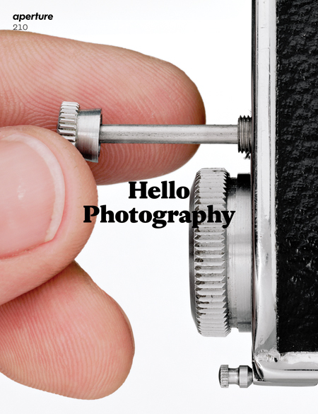
Aperture — Issue 210, Spring 2013
Like Elephant, Aperture’s re-launch in Spring 2013 saw more than just a change in presentation. The iconic cover (and the wider redesign) was the work of London studio A2/SW/HK, which used the cover line ‘Hello Photography’ to demonstrate the title’s raison d’être. The re-launched magazine positions itself as an aesthetically interesting object made to appeal to a broader audience, with the content being thematically-led rather than a collection of arcane photographic knowledge.
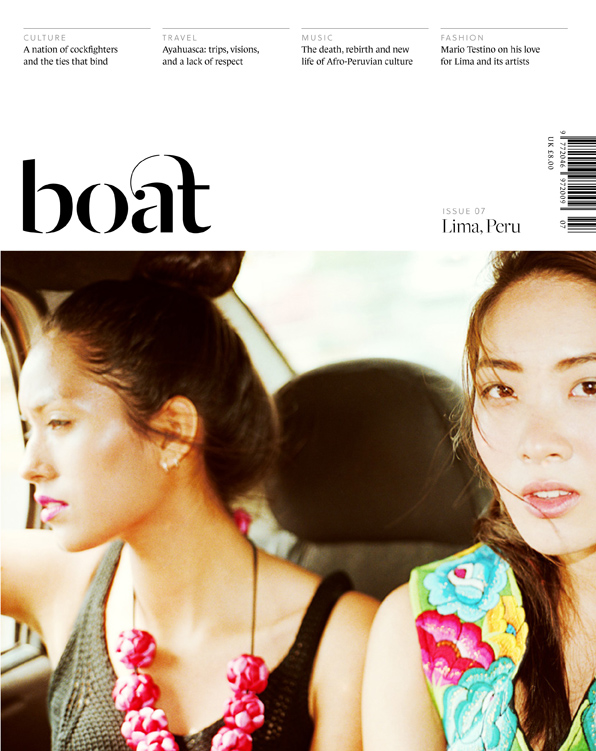
Boat — Issue 7, Spring 2014
One might not have thought that traveller’s companion Boat, only a few years young and with a fairly distinctive cover, was in need of a new look. However after two elegant covers in the revised style, editor Erin Spen’s bold decision to revamp after just six issues has been vindicated. Whilst the new look is not formally as original as before, Boat sets itself apart with its handsome new masthead and colourful cover photography.
Icon – Issue 90, December 2010
Prior to its 2010 redesign, Icon’s most interesting covers were often those with the boldest colours, and since then the magazine has played to these strengths. With a white frame, a new upper-case typeface, and the issue number clearly displayed, every issue now looks more alike, and feels pleasingly like a volume of a journal or an edition in a series.
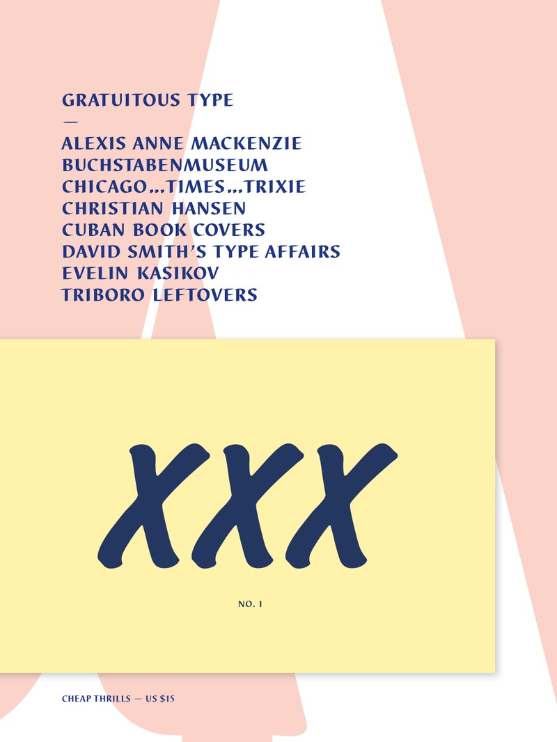
Gratuitous Type
Gratuitous Type, the project of New Yorker Elena Schlenker, is an anomaly in the magazine publishing world as its cover, contents, typeface and grids are effectively redesigned with each new issue. This “pamphlet of typographic smut” is only published annually, and Schlenker has eschewed the idea of competing to have a perfectly branded design in favour of gorgeously reinventing each issue afresh.frameweb.com/magazines/elephant