Studio Marcus Kraft has pulled out all the stops to create a bold and communicative visual identity for F-ABRIC, a new venture from recycled bag makers FREITAG. Marcus Kraft gave us the inside track.

Describe the project in basic terms.
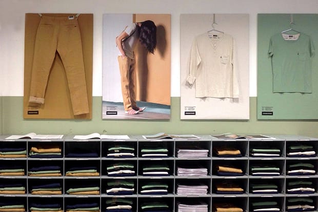
Until now, Zurich-based FREITAG has mostly been known for producing bags made from recycled truck tarpaulins. At the beginning of November a completely new and groundbreaking material innovation was launched: F-ABRIC. These are new textile fabrics that grow and are processed in Europe, and which are 100 per cent biodegradable. We created the visual appearance for this new branch of the business in close collaboration with the two founders of the company, brothers Daniel and Markus Freitag.
How did the project originally come about?
Actually, the original intention of FREITAG was to provide their employees with sustainably produced work wear so that they would no longer have to rely on the cotton and synthetic materials that are so common in the globalised textile industry. As they couldn’t find anything on the market that fitted the bill, they decided to take matters into their own hands and develop their own employee clothing from scratch. A daunting task!


What was the original brief and did it change at all?
The briefing was more like "OK, we’ve got this new material now, let’s see how we can communicate what it is.”. Daniel and Markus wanted to involve an art director/graphic designer at a very early stage of the project because they knew that it would be challenging to communicate their approach. I had worked on projects with them before and so I started to work in close collaboration with the in-house F-ABRIC team about two years prior to the public launch. During this period, we not only talked a lot about the branding, but also about the whole F-ABRIC concept in general. I remember at an early stage, we even thought about a kind of a ‘deposit’ system: the fabric itself would still belong to FREITAG and you would have to give it back when the textiles are worn out. We never actually implemented that concept, but I still like the idea.
How did you approach creating the visual communications for a new branch of an existing brand?
Compared to other companies, the design guidelines of the FREITAG brand are very open; there are a few general principles but it’s more important to put yourself in the right mindset. As an example, ‘We like to think and act in cycles’ is one of those principles. And then there’s of course the logo itself and the typeface Akkurat – that’s about it. It was pretty clear from the beginning that the graphic design for F-ABRIC should fit in seamlessly with the material’s visual appearance and retain its trademark wink. In a way, it happened all very naturally, particularly because Daniel and Markus were involved in the whole process from early on.


Did this project present any particular challenges, and if so how were these overcome?
The sustainable F-ABRIC materials went through five years of development and research, and so there are many invisible technologies that are not obvious when you look at the final products. I think the biggest challenge of this project was to work out how to communicate this quite complex and unique concept in a very simple and accessible way. We decided on an idea featuring scans of half-decayed, composted trousers, to show that they really are biodegradable, for example.
One of the key aspects of F–ABRIC is its environmental credentials. Did this concern for the environment remain part of your thinking for the visual communication, and if so in what way?
The F-ABRIC products are produced with such incredible conscience that this also had to be mirrored in the graphic design. We have, for instance, printed all relevant product information on the inside of the fabric and have thus dispensed with any unnecessary care labels. All hangtags are made of recycled paper and the newspaper does without staples.


Is there an aspect to this project you think worked particularly well?
The Freitag brothers travelled around France, Germany and Italy by bicycle and train, following the production sites of a pair of trousers. We photographed and filmed this journey, and developed a huge pool of imagers to use both in print and online. The trip reduces the complexity of the F-ABRIC concept down to two guys on their bikes on a trip through Europe. It communicates the pair’s attitude and the spirit of the whole project in a very simple and unique way.
Did this project involve sourcing any new materials (other than the textiles) or using any new processes?
On the product side, almost everything was created from scratch – even the sewing thread. As an example, the buttons on the pants screw in so you can use them on your next pair of trousers, an idea that was patented by FREITAG. To give it a more personal touch, you can individualise the buttons yourself with your initials in selected shops and we developed a unique little embossing machine for that task.
Creative Direction: Daniel & Markus Freitag
Concept, Art Direction & Design: Marcus Kraft (Studio Marcus Kraft)Overall responsibility: Daniel Rohrer (FREITAG)Photography (Roadtrip): Lukas WassmannPhotography (Look Shots): Pascal GrobFilm: Yves ScagliolaText: David Keller (FREITAG), Rainer Brenner (Wessinger und Peng)Vektorgrafiken: Ilg/TrübScans: Studio Marcus KraftStore Design: Mario Stadelmann (FREITAG), Leandro Destefani (FREITAG)Production (Roadtrip): Lukas Widmer (Sturm&Anker GmbH)Styling (Look Shots): Andrea A. Serrano
marcuskraft.net
freitag.ch/fabric

