
Glasgow exhibition It’s Not Very Nice That embraces memes, digital networks, and conceptual projects, as well as more traditional posters and pamphlets, to provide a vibrant snapshot of current politically engaged graphic design.
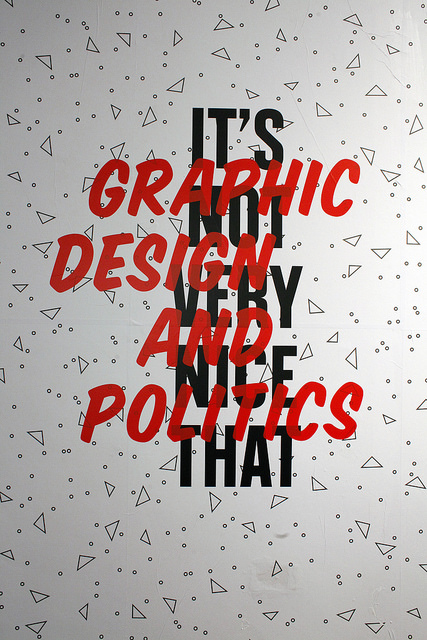
It’s quite a brave move to title an exhibition about graphic design’s intersection with politics, uprisings and civil unrest something quite so tongue-in-cheek as It’s Not Very Nice That. By subverting the name of the well-known design site, you’re immediately introducing the show with a joke, and the semantics of ‘not very nice’ (as well as the show’s cutesie branding) run the risk of giving the impression that you’re trivialising what is in many cases a profoundly serious struggle against oppression, violence or corruption.
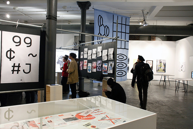
But, in many ways, this decision exemplifies Glasgow-based studio After The News’ unorthodox – and very successful – approach to curating such material. Instead of opting for a traditional narrative of the earnestness of political struggle, ATN has opted for a much more interactive and accessible approach, often courting the cheekily subversive. Much of the work on display is concerned with protest connected to recent political shifts, from Occupy Wall Street to Tahir square, but similarly the show includes more utopian projects that critique the status quo by inviting the audience to imagine alternative futures. Throughout there’s a clever hierarchy that combines immediacy for those visitors just wandering through, with a level of exploration and engagement that makes spending a whole day delving through the the show’s extensive books and digital resources a very real possibility.
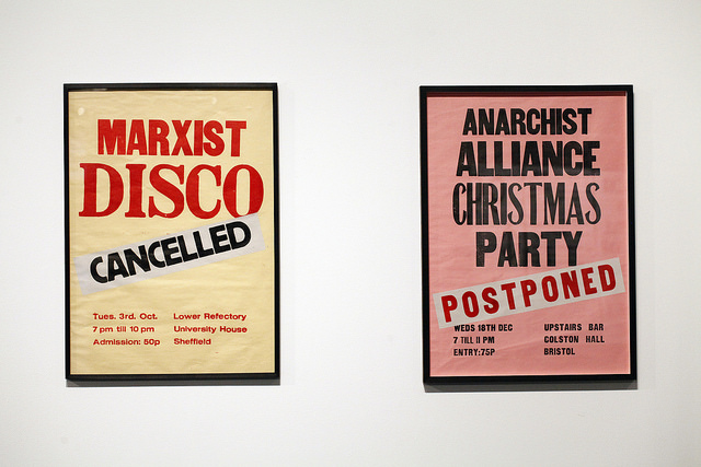
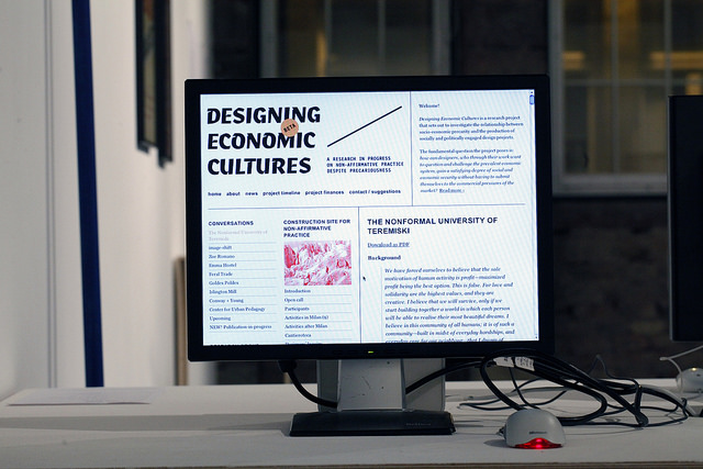
This balance between accessibility and depth is largely down to the clever selection, curation and presentation of the wide-ranging projects on display. An enormous flag from Anthony Dunne and Fiona Raby’s United Micro Kingdoms project, which imagines England devolved into four self-contained areas that are allowed to experiment with their own economy and governance, dominates the middle of the room, luring visitors in to an accompanying tablet hosting the project’s website, which can then be explored in depth. A series of posters created by British conceptual artist Scott King, including the amusing Marxist Disco (cancelled), is partnered with a weighty tome introducing his work. Lizzie Malcolm from Lustlab’s infographic Women’s Political Rights Around The World, is projected large on to one of the exhibitions industrial screens, but a nearby trackpad allows the audience to explore the piece in greater detail and manipulate the display to suit their interests.
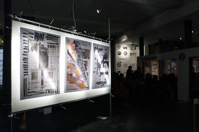
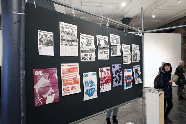
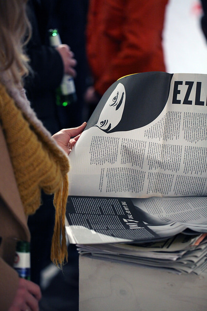
The range of work on display is also vast for such a compact exhibition. As you’d expect from a show encompassing ideas of protest, there are plenty of posters and pamphlets, including issues of the Occupied Times, a free not-for-profit newspaper with high design values and striking typography, the first issue of which was published on 24 October 2011, just nine days after the Occupy movement began. Midway through a residency in Cairo in 2011, Dutch designers Sandra Kassenaar and Bart de Baets became “accidental journalists” during the protests in Tahir Square and produced poster series Back up – Success and Uncertainty to explore daily issues they discovered through communicating with people on the street. There are also posters from the now disbanded Deterritorial Support Group, a group of self-proclaimed “humorous provocateurs” who use the internet meme as a tool to present “ultra-left propaganda” and infiltrate mainstream debate, and also from Åbäke, who similarly package political messages with 2.0 LOLs by setting their posters in Comic Sans.
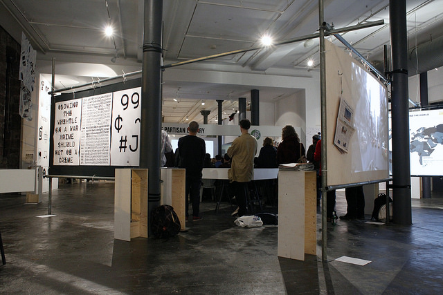
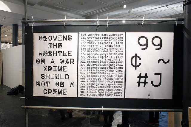
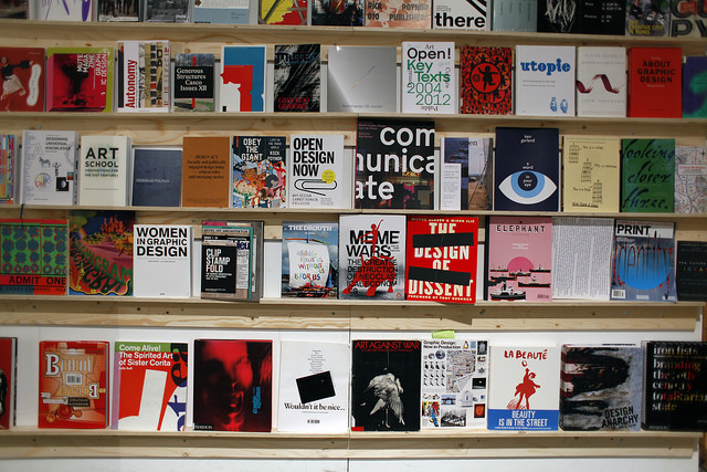
Alongside more traditional formats sit other methods of design protest. On display are a number of typefaces created by OSP, a Brussels-based practice that only produces work using free and open-source software, as is Sang Mun’s zxx typeface which was designed for a future where citizens have to be more protective over their own surveillance in light of recent whistleblowing incidents. A short documentary on New York-based The Yes Men explores the practice’s fake version of The New York Times, which complete with utopian news stories detailing international peace, better health provision for the poor and commitment to sustainability was distributed throughout the city. Metahaven’s infographic poster examines power relationships among the Wikileaks leadership but the project also includes silk scarves that have used the data to create psychedelic patterns. In the tradition of political movements, there is an extensive reading room, The Partisan Library, which also served as the location for a number of workshops, debates and events held throughout the exhibition’s lifespan. In addition a bank of computers allow visitors to explore a number of projects in detail including the interdisciplinary student-led working space Department 21, which ran at the Royal College of Art in London between 2009 and 2010.
With content that was created to provoke, mobilise and question authority, it is refreshing to experience an exhibition that encourages visitors to do the same, rather than leading the audience blindly through a preconceived narrative of what political design might involve. Although a well-honed hierarchy for different levels of visitor should be at the root of all exhibition design, it’s surprising how often it is overlooked. Many galleries could learn a lot from this neat – and dare I say nice – exhibition. It’s Not Very Nice That
The Lighthouse, Glasgow
Ends 27 April 2014
itsnotverynicethat.com