An in-depth tour of some of the most important graphic design of the last century, in a book designed by Swiss stars of today. Manuel and Dimitri of Norm talk us through the design of '100 Years'...


100 years of Swiss graphic design would be a daunting subject for any book designer to handle, let alone a Swiss one: how did you deal with the weight of legacy on your shoulders? What characterised your general approach to the design and layout?
We discussed what the right behaviour should be. We wanted to avoid making a statement by Norm. We avoided big graphical gestures and tended to rely rather on the visuals (those alone are the historical ’truth’) than on the text (nothing against the text). We used only one typeface (see below) in three sizes, and we kept to the grid (we admit, no surprises there).
Akzidenz Grotesk is the typeface used throughout the book — could you explain this choice?
Both Helvetica and Univers would have been appropriate, though probably too obvious. Initially, we fully agreed on Unica (the ambitious type project in 1977 that was meant to bring together the best of UNI-vers and helvt-ICA). When working with it however, we were not happy — the regular cut was to light for us and the medium cut is rather bold.
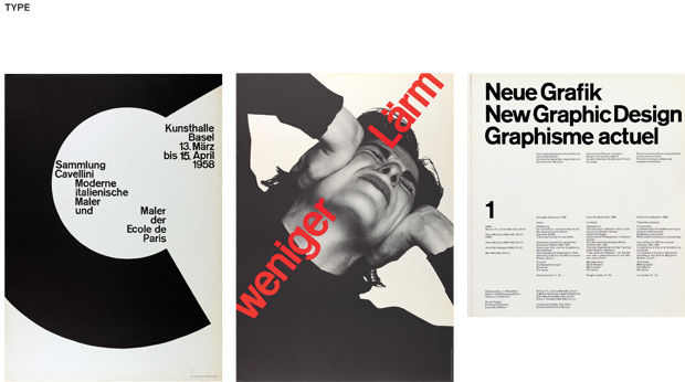
In the material contained in the book, Akzidenz Grotesk (and versions of it, for big letters always drawn and interpreted by hand) has a very strong presence, even after 1957, when Helvetica and Univers came out.
So, we turned to that typeface. We used Berthold Akzidenz Grotesk Medium for titles, cover and introduction text. For body text and legends we used Akzidenz Grotesk Next Medium.
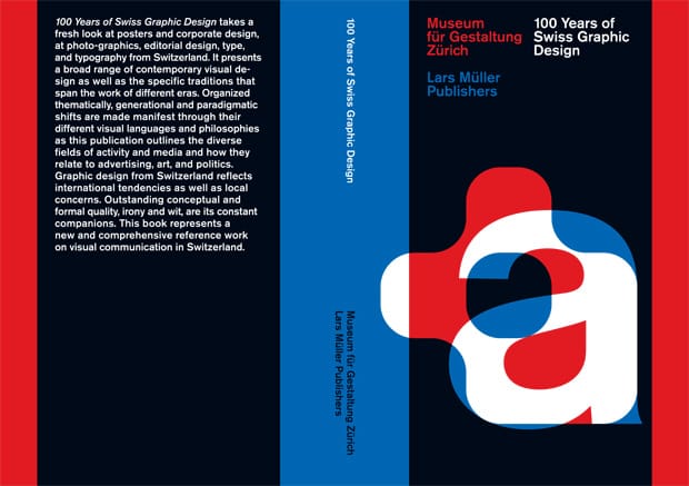
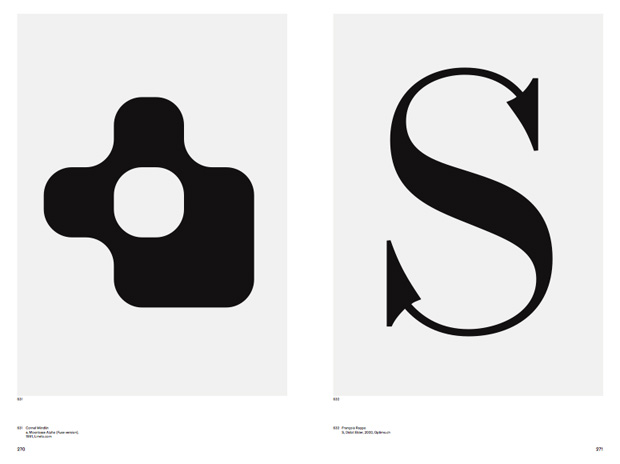
Tell us about the cover design and your graphic fusion of 'a's by Francois Rappo and Cornel Windlin…
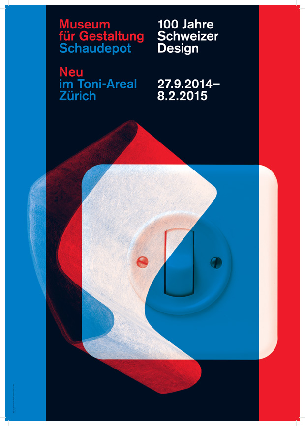
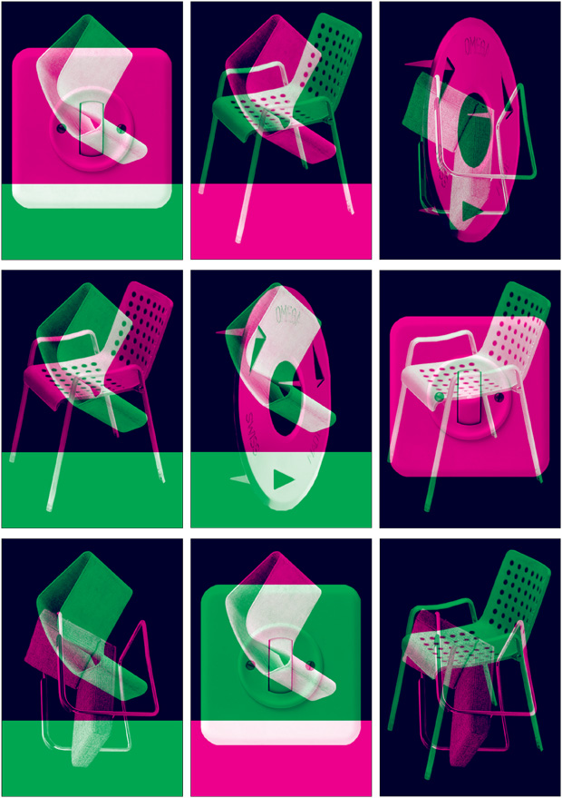
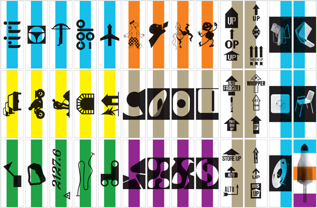
In 2012 the Museum for Design held the exhibition 100 Years of Swiss Graphic Design, for which we designed the poster. At the same time the museum was planning for the 100 year celebration of ’schweizerischer werkbund', the exhibition 100 Years of Swiss Design (the exhibition just opened last weekend). The 100 Years of Swiss Design is the opening show at the museum's new location. Both catalogues were planned for this opening. But before we designed the cover for the graphic design book we worked on the communication design for the exhibition. For that, we proposed to put Swiss design icons in relation to each other. For the final version we used the Willy Guhl chair and the kippbalkenschalter switch by Feller AG (see image below). For the opening, that poster was completed with the 'neu-neu' ('new-new') poster, which was to stress the new location.
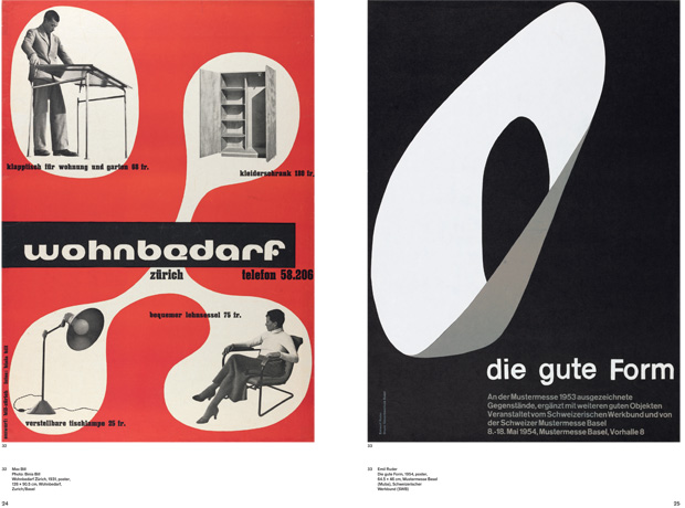
After that, we decided to have for the book cover of the design catalogue the same visual as for the communication. Lars Müller and the museum both wanted the graphic design of the two books to be closely related. We first worked with extracts of iconic posters (like ‘wohnbedarf' by Max Bill or ‘die gute form’ by Emil Ruder. We ‘recycled' them for the design of the tickets. But to use that material felt a bit like a sacrilege and we had the impression that it would be better if the book cover featured less dated elements. François Rappos' 'a' refers to Helvetica (and we had it already on the design for the exhibition poster). In the end it was just a good match with Cornel Windlin's font Moonbase Alpha (besides that, we admired the font when it came out).

The book has interesting proportions - could you explain how you designed the format?
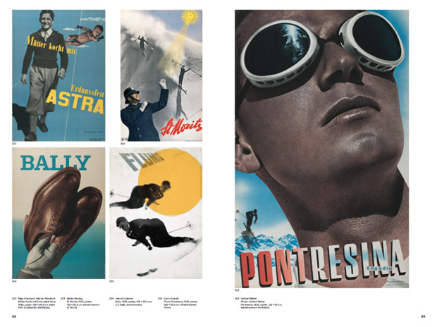
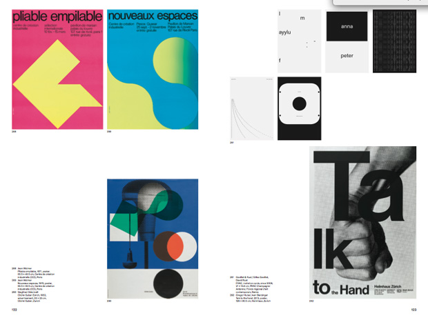
All our books use either the ration 2:3 or 3:4. For displaying posters, if you want to have space left for legends, 2:3 is better.
Were there any special technical challenge to overcome in the production of the book?
Besides pre-press questions like whether artefacts that had yellowed over time should be reproduced in that state, or if they should still look fresh; and whether books be photographed with or without a shadow, there were no particular problems.
Great endpapers. Could you introduce Swisstopo and say how these graphics were made?
It’s from the Federal Office of Topography, briefly they measure out Switzerland and its geographical reference data in all possible ways, representing and archiving of geographic spatial data (such as national maps, elevation and landscape models, satellite images, orthophotos). The visual we used is the height curve of an area in the alps.
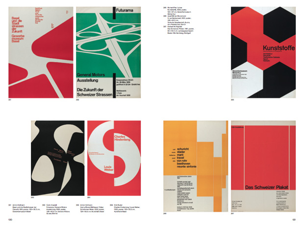
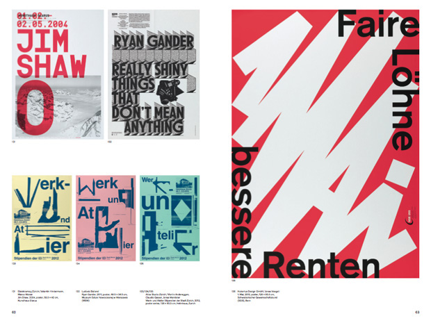
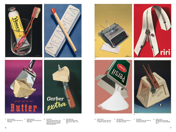
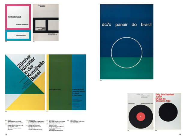
100 Years of Swiss Graphic Design
Published by Lars Müller, 2013
Edited by Christian Brändle, Karin Gimmi, Barbara Junod, Christina Reble, Bettina Richter, and Museum of Design Zürich
Designed by Norm

