Max Bill's Die gute Form was an ambitious exhibition which attempted to define 'good design'. Here Emma Tucker reviews a new book by Lars Müller which revisits and reappraises the controversial show.
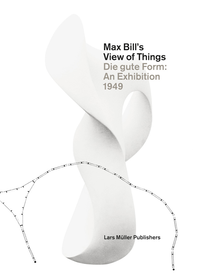
In 1949 designer and artist Max Bill staged a controversial exhibition in Basel for the Swiss Werkbund. The exhibition, entitled Die gute Form, aimed to explore and challenge the idea of 'good design' across a wide range of disciplines, everything from architecture to household appliances. In Max Bill's View of Things published by Lars Müller, the exhibition is reconstructed, albeit in 2-dimensional paper form, and accompanied by essays that explore not just the details of the exhibition, but the surrounding design climate and the ensuing controversy. The book appraises Bill's own arguments about what design should be in the light of both his predecessors and his successors, exploring the exhibitions that paved the way for Bill's own Die gute Form, and the long term outcome of his curatorial approach.
Shown at the Basel Mustermesse trade fair in 1969, the exhibition showed 240 items as examples of 'good' design, displayed as black and white photographs arranged across 80 flat panels. Bill designed the exhibition himself, sending visitors on a serpentine path through the exhibits. Wanting to encourage people to 'develop their own eye', Bill spared unnecessary verbiage, with most items accompanied only by brief comment pointing out distinctive attributes.
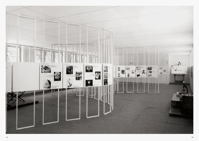
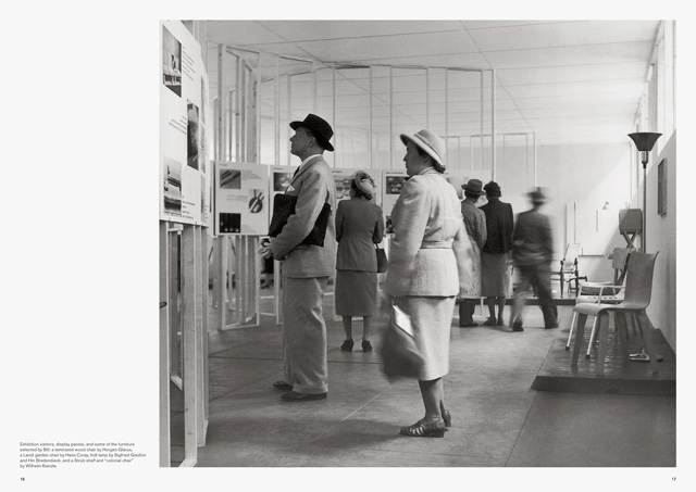
Divided up into areas – nature, science, art and technology, architecture, the home, and transportation – the book highlights the exhibition's bewildering variety of items. Natural forms like rock salt and mushroom clouds are shown as prequels to industrial items and machines, and strictly utilitarian pieces such as suitcase handles and faucets. The personal and the public are mixed together, with large pieces of architecture shown alongside more familiar domestic items like stoves and saucepans. Even clothes are included, although displayed in a striking and purposefully 'unfashion' way, with shoes bereft of feet and set unremarkably alongside one another.
The book offers a helpful lens through which to view the exhibition, which, to current eyes, seems far less controversial than expected. Claude Lichtenstein's introductory essay admits that “it is difficult for us today to see quite what was so provocative about Bill's vision”, but sets it in an understandable context for contemporary readers, taking into account the thinking and trends of the time. He also traces the longterm outcome of Bill's exhibition, claiming that his curatorial approach played a major role in changing the way we view and interpret product design, opening up a subject previously restricted to discussion within small design circles.
Deyan Sudjic's essay is more concerned with the climate that surrounded the exhibition, offering an introduction to opinions of the time and demonstrating that, despite its impact, Bill was not the first to explore the potential for showing design. A precursor to Die gute Form, shown at the MoMA in 1940, was Useful Objects of American Design Under $10, curated by Eliot Noyes. This celebrated the good, yet anonymous, design of America, as sourced from hardware stores and office supply companies – reminiscent of Bill's own inclusion of domestic and everyday items. Sudjic's essay traces a society beginning to value not just the breadth of design, but also the way the debate about good versus bad design was becoming deeply ingrained in our thinking.
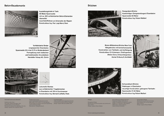
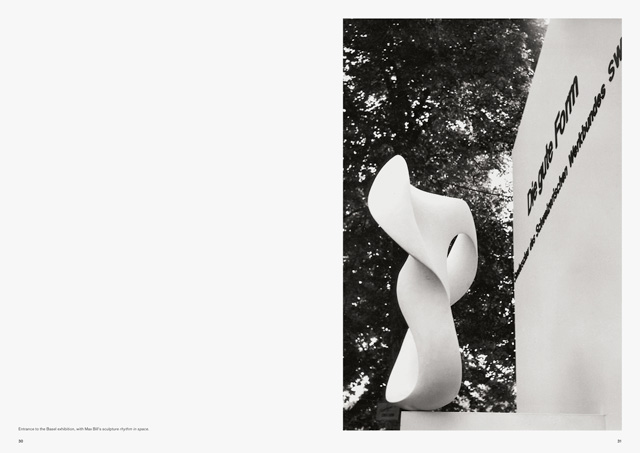
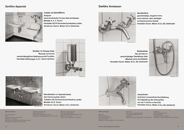
It's clear that responses to the exhibition were mixed, and Bill himself admitted he'd stirred up controversy with the show. Financing was a challenge to obtain, and some of the items Bill requested photographs of, such as Raymond Loewy's Parker fountain pen, were refused. While immediate reviews of the exhibition were generally favourable, the Swiss Werkbund were not happy with the outcome. Complaints ranged from comments that the show had failed to gain support from trade fair visitors, to criticism that too many foreign products had been included. There was also a suggestion that Bill had placed his own name and products too much in the foreground.
In the 60s, Bill had some of his own criticisms to make, mocking the “drivel, bluffing, hair-splitting and intellectual swindling” of the judging panels of many of the European design prizes, feeling that objects were being assessed purely on 'superficial criteria', rather than the way design related to their practical use. Ironically, the book notes that it was Die gute Form that had helped launch many of these prizes.
The book offers a rich view, not just of the exhibition, but of the thinking and environment of the time, taking into account both the successes and failings of the show, and its longterm impact on discussion around design. Images of the exhibition are housed in a satisfyingly minimal design, allowing the typography to do the heavy lifting. The only criticism is that the book occasionally feels a little too restrained, and some colour alongside the succession of black and white images would be welcome.
As the title suggests, Max Bill's View of Things offers direct insight into Bill's own approach, and his celebration of design. It's clear that his thinking still rings true, even more than 60 years after the exhibition took place. To conclude with Bill's own words: “Good design depends on the harmony established between the form of an object and its use.” Max Bill's View of Things
Edited by Lars Müller in collaboration with the Museum für Gestaltung Zürich
Published by Lars Müller


