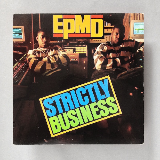
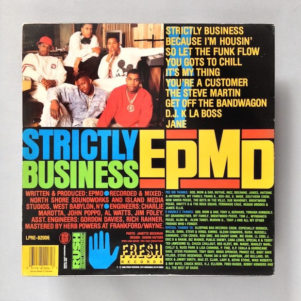
A perfect snapshot into hip hop’s golden era, EPMD’s Strictly Business eschews the genre’s tendency for macho clichés – but it’s the back cover that’s really impressive, says Give Up Art’s Stuart Hammersley. Hip hop records were my first ‘proper’ musical purchases really. I was starting to develop my own tastes, and I got drawn into this exciting new musical world. I’ve recently been sorting through a load of old records, and this one caught my eye again – EPMD’s first album Strictly Business, released on Fresh Records/Sleeping Bag in 1988.
I would have bought it when it came out, on US import, most probably from the wonderful (but now sadly long gone) Groove Records in Soho. I purchased it for the music first and foremost: it’s golden age hip hop that samples Steve Miller, Kool & the Gang, Eric Clapton and even a bit of ZZ Top.
The front cover (below) is OK. It sports a classic two-dudes-in-a-recording studio shot. The dudes are Eric Sermon and Parrish Smith, the ‘E’ and ‘P’ of EPMD (or Eric & Parrish Makin’ Dollars). It’s got that great EPMD logo designed by the legendary NY artist and designer Eric Haze, who also created logos and album covers for people like Tommy Boy Records, LL Cool J, Beastie Boys, Stussy, Public Enemy, and DJ Premier.

But it’s the back cover that I really love. In fact, on lots of album sleeves that I adore, and even when I design them myself, a lot the best bits are to be found away from the front cover. I’d assumed that Haze had designed this as well, but it was actually done by Susan Huyser. It exhibits wonderful use of type, colour and layout. It’s not overtly macho or clichéd, as a lot of hip hop design can be, it’s fun and really well executed. And I love the low-key, almost ‘snapshot’ style imagery. There’s no ostentatious posing or attempt to construct some tired rock-style iconography. It’s just a few mates sitting in a small Long Island recording studio, wearing questionable denim. I pored over these shots of suburban hip hoppers, as they gave me a window into the new and exciting world that I loved so much. The photographs were shot by Janette Beckman, a British-born photographer who, I’ve since learned, documented a lot of NY and UK youth culture in the 70s and 80s. Her work is fantastic.
In fact, most hip hop albums that I bought around this time feature excellent design and photography. They’re low-budget but realistic, and act as snapshots into another world. Records like this definitely made an impact on my design and art direction for the early releases on Tempa and Rinse records, which I created in collaboration with photographer Shaun Bloodworth when dubstep was just emerging. I think we tapped into that idea of shooting people in regular, everyday locations (whether on a hill in Reigate, an estate in Glasgow or a sweaty club in Leeds) and knowing that this was of interest in its own right. A document of what is happening at the time has far more relevance to me than something that’s been staged or made-up.
giveupart.com
Top hip hop
Stuart Hammersley selects five hip hop tracks with great back cover artwork - click to listen.
1. Strictly Business from You’re A Customer by EPMD
2. Get Stupid Fresh from Mantronix: The Album by Mantronix
3. The Vapours from Goin’ Off by Biz Markie
4. Just Rhymin’ with Biz from Long Live The Kane by Big Daddy Kane
5. Rip The Cut from Weightless by Skinny Boys
Give Up Art
A collaborative project between husband and wife team Stuart and Emma Hammersley, Give Up has defined the visual identity of a many era-defining record labels, including Tempa and Apple Pips, as well as iconic former-pirate-now-FM radio station Rinse. The studio’s output often features bright colours and pop art typography, using a minimalist language with clashing shades to grab your attention rather than cluttered images. This playful style is complemented by the gritty photography of Shaun Bloodworth, a long-time collaborator and an integral part of Give Up Art’s winning formula.

