
A masterclass in semiotics, British Rail’s double-arrow symbol is one of the country’s best-loved logos. Karoshi creative partner Ben Vincent sings the praises of its creator, and his design hero, Design Research Unit’s Gerry Barney.
Gerry Barney may not be known to many younger designers by name, let alone be their design hero, but his work is familiar across the globe. As a twenty-five-year-old, he created the classic British Rail double-arrow logo and later the typeface VAG Rounded – originally used for Volkswagen AG’s advertising and still featured on every Apple keyboard.
Corporate identity design was a nascent field in the early 1960s and Design Research Unit (DRU) were Britain’s foremost exponents. As one of the first multi disciplinary design studios, they combined expertise in architecture, graphics and industrial design.
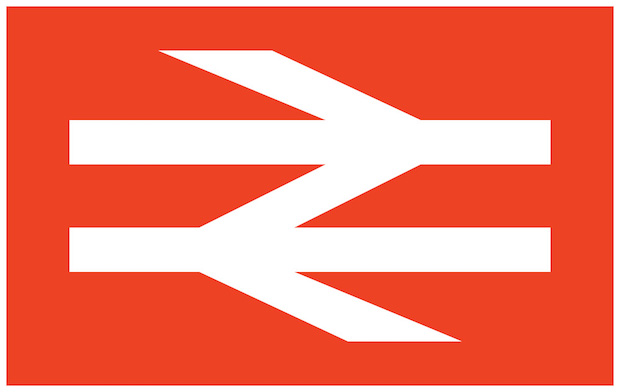
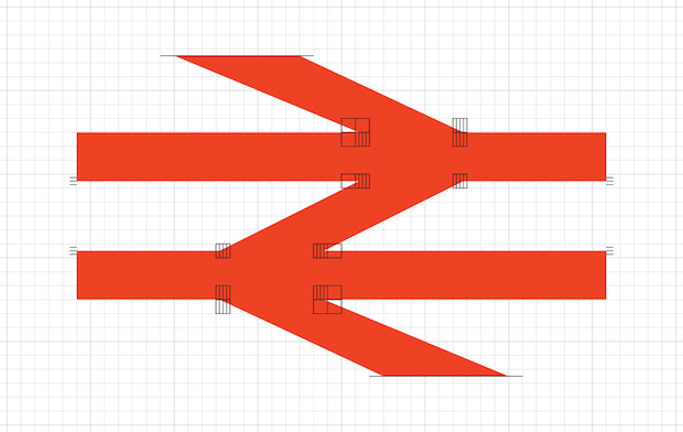
Gerry Barney trained as a type designer and was working under DRU Founding Partner Milner Grey when British Railways (as it was at the time) briefed them to create a modern, unified, identity system for the network. Much as rail travel drove the necessity for unified timekeeping in the Nineteenth Century, it did the same for corporate identity in the Twentieth. Passengers could board a train in London and arrive in Edinburgh, therefore it should be expected that the communication was similarly joined-up, from signage to uniforms, advertising to liveries. Tasked with creating something ‘timeless’, Barney’s solution was simply two rails and a set of points. As he explained himself: “It worked because it was obvious. When you think of railways, you think of parallel lines: up this way, down that way.” Sketched onto the back of an envelope (as all the best ideas inimitably are) on his commute to the studio, Barney’s solution was one of fifty symbols developed and presented to British Railways’ board representatives before being narrowed down to six.
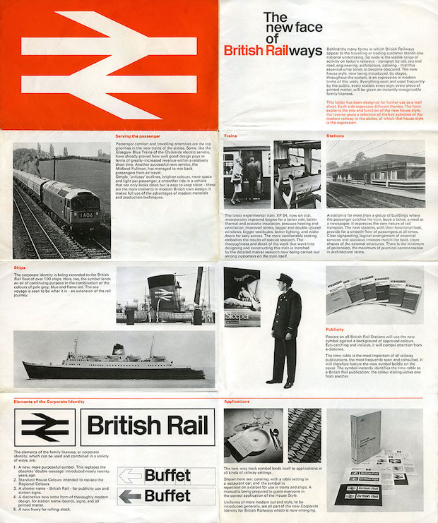
It’s unimaginable today but the double-arrow – or “the two-way track symbol” as it was initially heralded – was not the approved route until the winner was leaked to the press and a replacement sought. The mark and supporting identity system, now synonymous with the railways, was rolled-out in January 1965 and remains in use across Britain fifty years on.
The double-arrow was one of my earliest introductions to identity design and the power of communication through motifs. It holds a rare place in British society as a logo that transcends far beyond the brand and service it represents. Although abstract in form, it’s regarded as a visual shorthand for rail travel before a trademark. It’s abstract and timeless – the suggestion of movement over rails, speed and Modernity – a masterclass in semiotics.
In 1978 Gerry Barney formed the design agency Sedley Place (named after their first studio address in London) along with David Bristow, Kit Cooper and Terence Griffin, all of whom had worked together at Wolff Olins.
The following year in collaboration with GGK Düsseldorf – the agency founded in Switzerland by Karl Gerstner, Paul Gredinger and Markus Kutter – they were responsible for unifying Volkswagen AG’s portfolio of brands under a single visual umbrella.
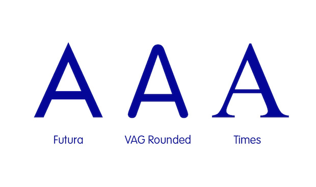
Conceived as the typographic bridge between Volkswagen’s Futura and Audi’s Times, Barney’s solution was VAG Rounded/Rundschrift, a typeface characterised by the letterform’s rounded terminals. A revolution of the time, it straddled the stylistic divide of serif and sans serif type and was employed from advertising headlines to showroom signage.
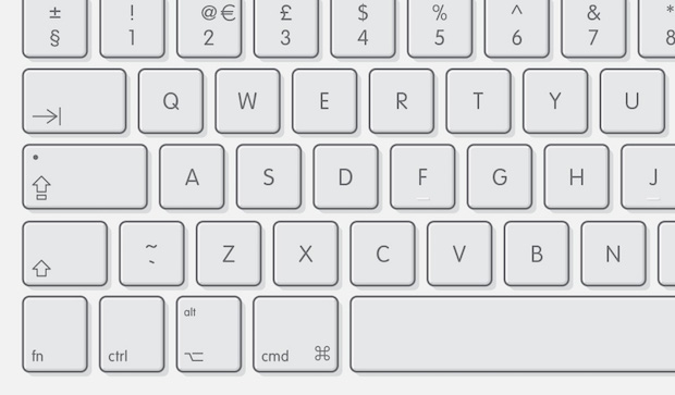
In an effort to make the font accessible to dealerships and their printers globally, it was released into the public domain. Although Volkswagen officially ceased using the typeface in 1992, VAG Rounded remains available in most free font packages and became widely used for that reason. It’s testament to the typeface that it still features on all Apple notebook and desktop keyboards and was also revisited for Marina Willer/Wolff Olins’ 1999 Tate identity. More recently, VAG Rounded and its imitators have been the font of choice for countless ‘soft and friendly’ Web 2.0 brands.
Although Gerry Barney remains a consultant at Sedley Place he retired from day-to-day work in 1996. His design legacy endures.
teamkaroshi.com