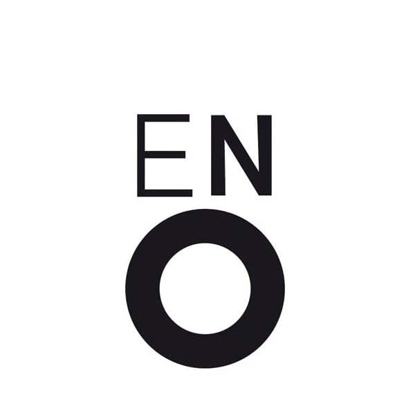
For Bryan Clark, the English National Opera’s logo hits all the right notes by embodying the physicality of performance to engage both your eyes and your ears. I was brought up in the traditional world of the London classical music scene. My mother had been an opera singer, but for her, English National Opera were always “a bit too avant-garde… a bit too modern”. Their often provocative staging of classical texts, like Jonathan Miller’s mafia theming of Verdi’s Rigoletto, was divisive and alien to some but had helped ENO rise through the eighties and nineties to help reposition the genre; I believe that the deployment of a new identity played a huge part in this too.
The new ENO mark, which, teamed with an emotive and bold use of imagery, launched the overall identity in 1987 across a variety of print and branded applications. It still exists today. Whilst many years have passes since Carroll, Dempsey & Thirkell completed the task, the job’s fitness for purpose has guaranteed its longevity and rightful place as a logo great.
The mark itself is characterised by the attributes of a true classic. It engages the audience with its simplicity, strength and — importantly for this category — emotion. The latter, so central to operatic performance, has helped create the trigger for its form; with its open mouth ‘O’, and the almost wincing eyes of the ‘E’ and ‘N’ it captures the height of operatic drama, the final crescendo in the last note of a tragic aria. It therefore has inherent meaning but also leaves room for an audience’s imagination; an ethos shared with the opera itself.
In implementation, the mark sits quietly in the wings, at the head of a poster or rear of a lorry, while the drama of a given production is performed and amplified through the use of imagery by photographers like Michael Hoppen or illustration by designer Ian Crockart. Interestingly, Crockart later went on to become a photographer himself and it is clear that this period of development both in industry and technology gave greater opportunity and control over imagery. ENO is a prime exemplar of this.
Looking into the history of its inception,like many great pieces of work, it took the trust of a healthy designer and client relationship to provide the foundation for development. Mike Dempsey, of the CDT studio had already repositioned the LSO (London Chamber Orchestra) with dramatic effect and this work had caught the eye of the ENO team. Dempsey wished for an equally dramatic response across the whole visual identity and was given the challenge by ENO to make a mark as famous as the VW logo. This, I believe, he did.
Today, it still remains fresh, with a timeless modernity that sings out with delightful charm; a witty logo that you both see and listen to at the same time.
Bryan Clark
…is an established designer and Senior Academic. He currently leads the teaching, research and development strategy at Falmouth University as Head of Graphic Design, following a twenty-year consultancy career. During this time he was Creative Partner and Director at Lewis Moberly working for clients across the World and prior to this he worked in a freelance capacity and for design consultancy Wiliams and Phoa.
November 4, 2014 2 minutes read
Open Mouthed
For Bryan Clark, the English National Opera’s logo hits all the right notes by embodying the physicality of performance to engage both your eyes and your ears.

