It’s a tricky brief to design something that appeals both to very young children and to teens, not to mention alleviate them of drill fear. We caught up with Stephen Smith, AKA Neasden Control Centre, to discuss his murals for The Royal London Hospital’s dental ward and how to make kids smile.
What was the original brief?
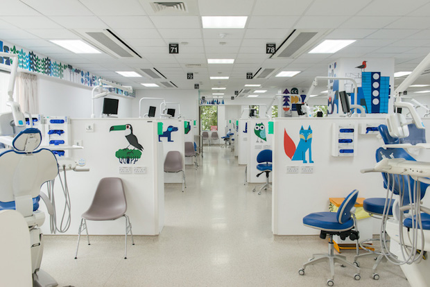
I was commissioned by Vital Arts at Barts Health NHS Trust for the dental ward at The Royal London Hospital in Whitechapel. After initial site meetings, I worked on several concepts and presentations for the site-specific installation. The initial briefings concentrated on the following points: The Royal London Hospital is a urban and busy central London hospital, the age range of patients varies from very young children to teenagers, the artwork's colour scheme needed to compliment the hospital equipment and, as a hospital, this had to follow guidelines around health and safety. Vital Arts then gave me the freedom to come up with ideas in dialogue with the head doctors of the dental ward. Vital Arts commissions a huge range of artwork across several sites so has a really good relationship and understanding with the artists it works with and what is possible in the space.

Did the brief change at all during the project?
The brief remained the same throughout it was just a case of getting it right and re-working drawings and compositions to get the right mix in the space. The artwork was made over the course of six months, and this was great as it enabled plenty of time for different options and re-working the illustrations.
Tell us about your concept for the murals.
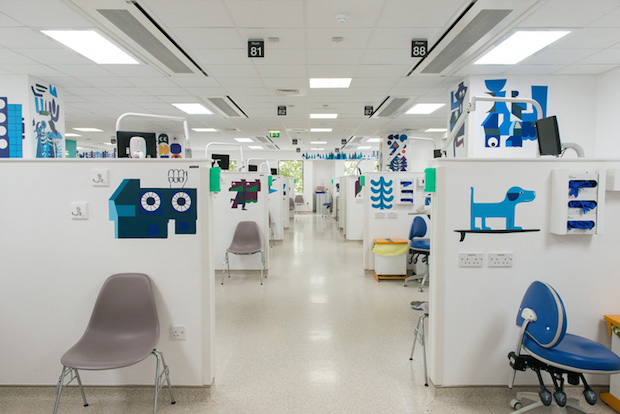
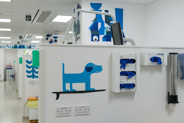
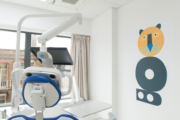
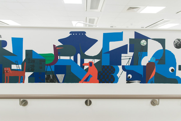
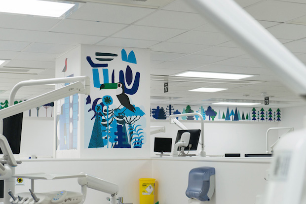
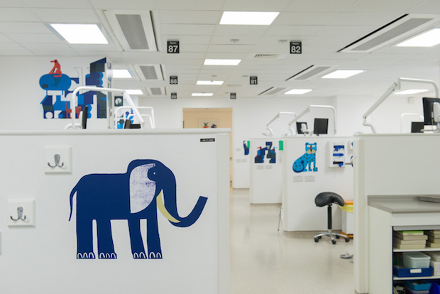
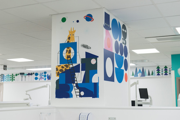
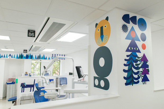
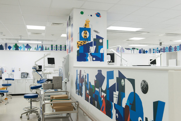
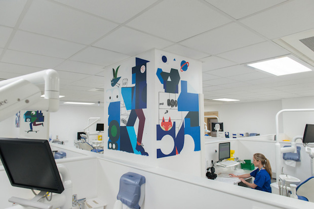
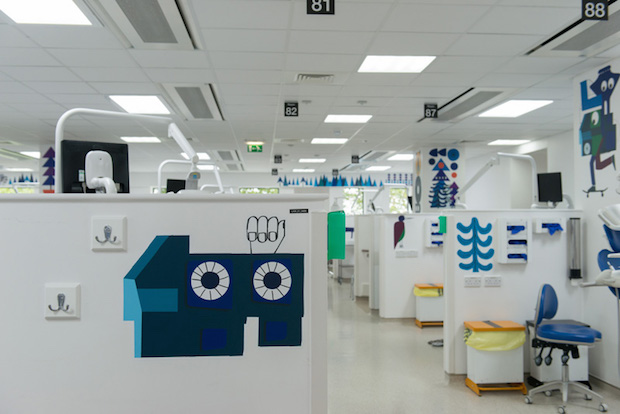
My original concept for the space used the four central pillars and areas around the ward which could be viewed from different angles. It was especially important to consider how the work would be viewed while sitting in the dental chairs. As it is a busy ward and there is a lot of movement around different spaces, it was important to me that the artwork acted in a subconscious way where different colours, textures, characters, animals and environments start to tell stories as you pass through the central corridors. It was important also that the illustrations would relax the children and teenagers that entered the space and create a happy vibe. Going to the dentist can be traumatic enough, so I didn't want the artwork to add any extra anxiety. I used a combination of colours, abstracted patterns, shapes and characters to do this in combination with futuristic architectural forms which referenced the urban position of the hospital in Whitechapel.
The characterisation of the animals is really charming. Where did you draw inspiration?
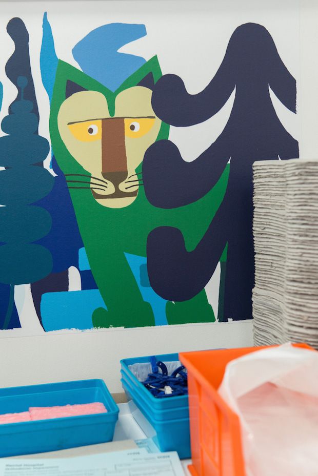
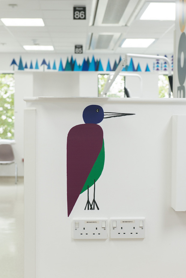
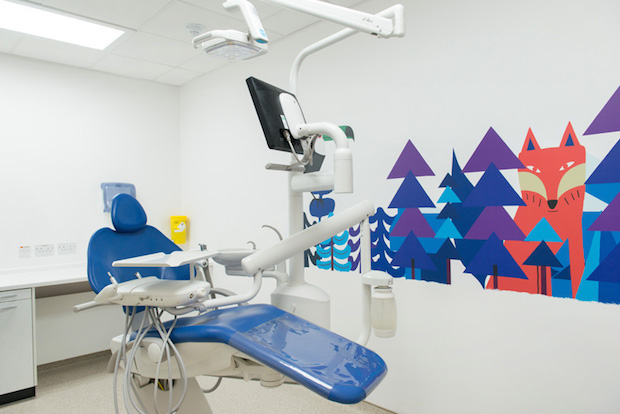
I have been working on series of animals for a while now. I purposefully treated the animals so they have friendly faces and smile in a non-aggressive manner. This was backed up by the use of non-representative colour.
The colour palette was important for the project, can you tell me a little bit about that?
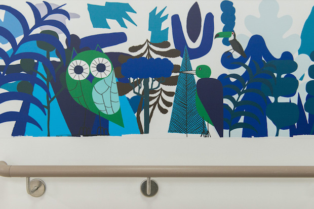
It was part of the original briefing in dialogue with Vital Arts and the head doctors to compliment the mainly blue colour of hospital equipment as much as possible. This was so that the artwork became part of the ward and integrated into the whole environment. As well as this other colours were purposefully selected to pop out of the colour scheme and are used as visual anchors as your eye moves around the ward. This was heightened by carefully choosing where to locate the artwork around the space. Balance was key in this respect and in a way was like creating a painting. It needed just enough elements, as to not overcrowd the eye and the space.
What was the most challenging part of the project?
Working with an area that has so many different surfaces. Each illustration had to be measured and designed to fit a particular space. In total there are were roughly 200 different executions. Also installing in a busy hospital environment was challenging, but we hired a team was hired and kept disturbance to a minimum.
neasdencontrolcentre.com

