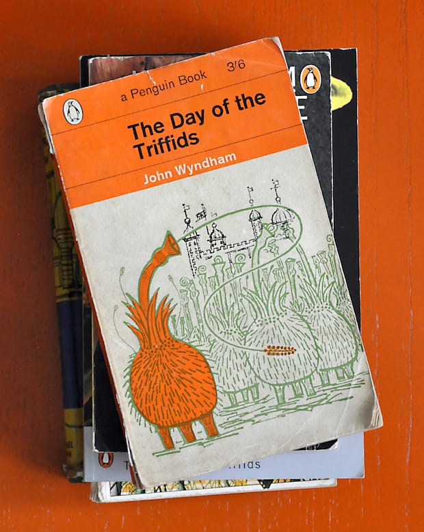
Striking a perfect balance between consistency and uniqueness, Delayed Gratification’s Christian Tate explains why this John Griffiths-illustrated cover for The Day of the Triffids outshines the four other versions in his collection. This is one of my favourite books. By ‘book’ I mean the object rather than the narrative, the physical printed collection of John Wyndham’s words bound together and presented within a cover illustrated by John Griffiths. I own five copies of The Day of the Triffids, from a 1951 first edition to a 2000 Penguin Classic copy. My collection is missing a first Penguin paperback edition, similarly illustrated by Griffiths and one of the first Penguins to use illustration on the cover. While many favour Jan Tschichold’s 1940s typographic system as the classic Penguin design, for me it is the illustrative covers that are really inspiring. These post-1950s Penguins achieve that perfect balance between consistency and uniqueness, which is so difficult to get right.
With Delayed Gratification, we produce a magazine which is a collection of unrelated stories – long, short, funny, serious, illustrations, portraits, photography, infographics – the only unifying element is that they are all from the same three month period. The struggle is to bring together these disparate elements without stifling their individual stories, to have a consistency in presentation without being too formulaic.
Here’s where those illustrated Penguins excel: a simple, strong, consistent framework of typography and colour creates a cohesive collection from a huge range of wildly differing styles and methods of illustration. John Griffiths’ work on British science-fiction covers alone is a catalogue of printmaking techniques. There’s whimsical linocut on this edition of The Day of the Triffids, two-colour screen-printing on Fred Hoyle’s The Black Cloud and Wyndham’s The Outward Urge and Seeds of Time, collage on the 1960 edition of Wyndham’s The Trouble with Lichen and the amazingly stark simple handprint on a 1965 copy of The Chrysalids, also by John Wyndham.
And that’s why I love print. My five editions of The Day of The Triffids contain the same story, the same identical words, but through typography, illustration, interpretation, colour, design, through the ragged edges, the cracked spine and turned down pages and faded ink, each physical copy, from the moment it is printed, is an object embellished with its own additional tales.
Christian Tate
…is the art director of the Slow Journalism Company, the publisher behind quarterly politics and culture magazine Delayed Gratification. The title revisits top current affairs stories to investigate what happened next, aiming to analyse in depth and, with the ability of hindsight, expose what impact items of news had on wider society. One of Delayed Gratification’s real strengths is its infographics, which Tate designs. He has also created infographics for the BBC, Empire magazine and Tatler.
John Griffiths
This illustrator and printmaker is perhaps best known for his linocut-style covers for Penguin’s sci-fi novels and as accompaniment to the work of Eric Linklater. Formerly a draftsman at an advertising agency, Griffiths went back to school to retrain as a printmaker, first at Camberwell and then at the RCA, a move that dramatically shaped the style of his trademark look. As well and science-fiction, Griffiths also had an interest in period shopfronts, which informed one of his most iconic works – the 1964 London Transport poster Rhubarb and Roses, which celebrated Covent Garden market.
October 9, 2014 2 minutes read
Other Worlds
Striking a perfect balance between consistency and uniqueness, Delayed Gratification’s Christian Tate explains why this John Griffiths-illustrated cover for The Day of the Triffids outshines the four

