
As the Design Museum opens its Designs of the Year 2014 showcase, we ask six image-makers what they’d pick – nominated or not – to win the coveted prize.
What would you most like to see win the Designs of the Year 2014 award?
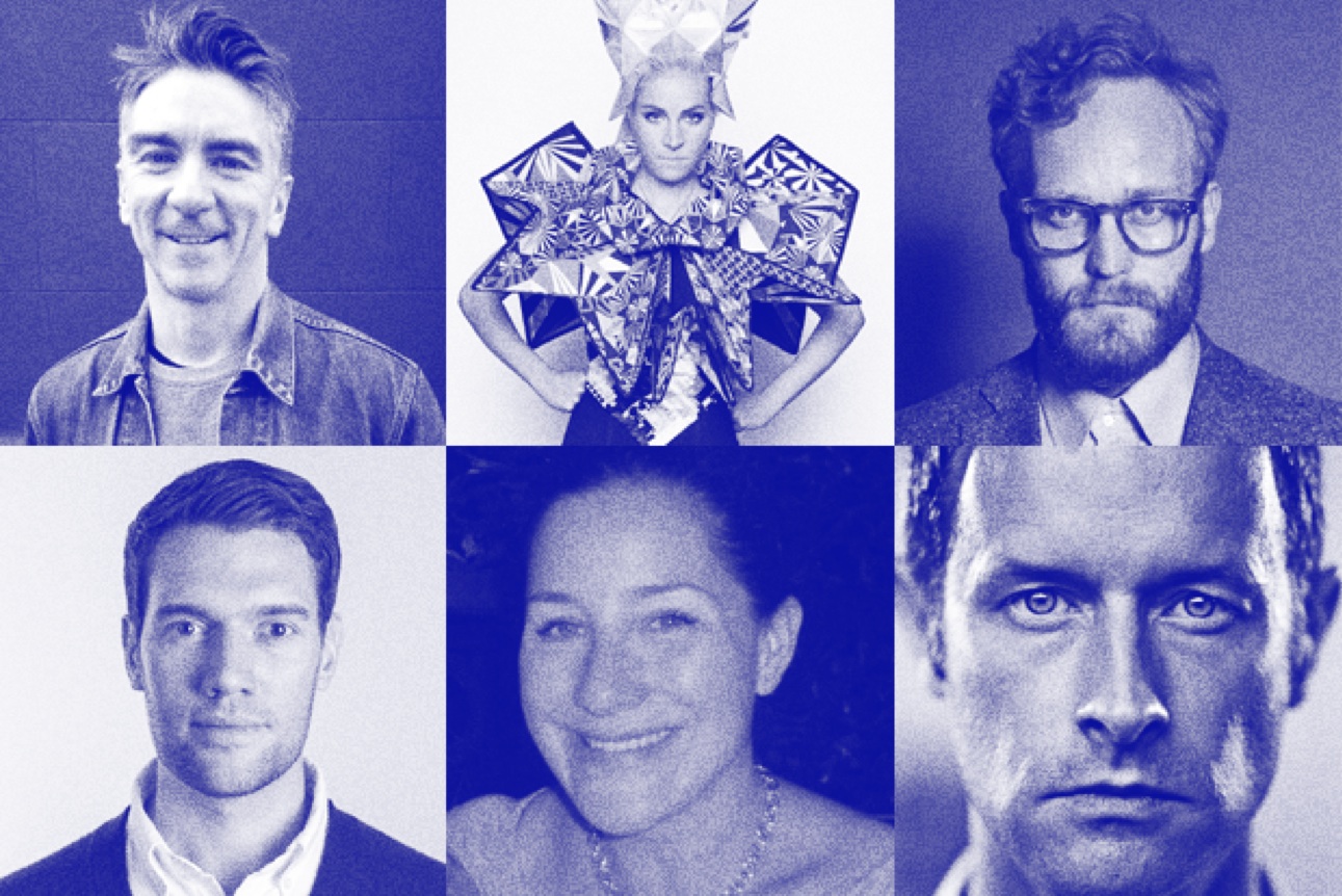
Chris Harrison, Harrison & Co
Hello Lamp Post would be my choice for 2014’s design of the year. I love the simplicity. As a piece of design, it has everything. It reuses existing infrastructure in an interesting way, it creates narrative, it engages everyone and excludes no one, it's witty, it's art, it's useful (and at the same time, whimsical) and the idea is scalable. The designers have made a really creative connection between everyday objects, everyday technology and (everyday) people. For me, the best kind of design is where connections have been made that didn't previously exist. Hello Lamppost is a beautiful example of that.
harrison-agency.com
Fred Butler
I’d pick the Rick Owens SS14 show. Owens presented his collection with teams of female step-dance crews. They modelled his clothes in an entirely new way and their sensational performance brought a freshness and diversity to the Paris runway.
fredbutlerstyle.com
Nicolas Roope, Poke
My design of the year would go to Tinder. The thing I love about digital is how it cripples our prejudices and requires us to accept reality, the true underlying forces that define whether something works or not. Tinder, with its inimitable, gloriously simplistic interaction, demonstrates the true power of interactivity. A lazy, leafing, flicking motion is all you need to hook up with someone new. And yet behind so many casual flips, real, rich friendships and connections form. Great designs (like this) are at their best when they negotiate carefully with reality and chuck all the extraneous stuff out.
pokelondon.com
Nigel Bates, Socio Design
I'd like to see the Whitney Museum identity win. I'm a huge fan of Experimental Jetset and the Whitney project is a fantastic example of a modern, adaptive identity. Brands are typically designed these days to be restrictive – with the aim of maintaining consistency across touchpoints. While this methodology worked well in print, the increase in digital devices calls for something more fluid. The Whitney identity addresses this brilliantly through its variable ‘W’, allowing the identity to flex across a multiple of printed and digital touchpoints.
sociodesign.co.uk
Robin Kadrnka, Together Design
As someone who is constantly trying to marry my old-world paper diary with my multitude of electronic devices, the Lego Calendar by Vitamins really spoke to me. Visually stimulating and requiring physical contact that truly engages the user (and therefore has a better chance of embedding the schedule), Lego calendar is a clever design that has a natural home in a design studio but would be equally welcome within my own four walls. The effortless link to a digital format makes it easy to share and access from anywhere. Beautiful, convenient, effective – fantastic.
togetherdesign.co.uk
Simon Elliot, Rose
The project I'd really like to see win the Design of the Year (or at the very least, nominated next year) is Mark Wallinger's Labyrinth for Art on the Underground. As a permanent installation across the whole of the London Underground (a unique artwork in each of the 270 stations), it's a brilliant response to a courageous commission by a national institution, which I believe should be encouraged, applauded and given the credit it deserves. No doubt I'm a little biased in light of our close collaboration on the project.
rosedesign.co.uk