
Currently part-way through an MA at HAW Hamburg, this young designer has created a number of innovative editorial projects during his studies, scooping up several impressive commissions and a Red Dot award along the way.
How would you describe your approach to graphic design?
I would describe myself as a pictorial designer who puts a lot of emphasis on concepts. Not pictorial in the way that my works are pictures, but that I imagine the outcome as a picture. Whenever I am introduced to a new project, I first try to visualise the finished project – independent of whether this project is a book, a magazine, an object or an illustration. These visions are deeply connected to my understanding of the content. Sometimes I have them right from the beginning, and sometimes they develop and change significantly before I feel that they are complete. Another important thing for me is to work in a team. I need conversation. For me concepts are born and refined through communication and they have to prove themselves in critical discussions.


Tell us a little bit about your Fachgruppe K project?
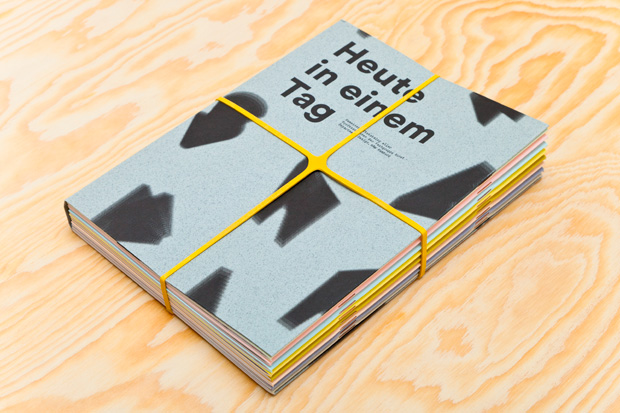
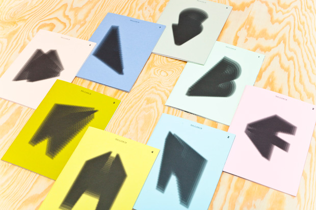
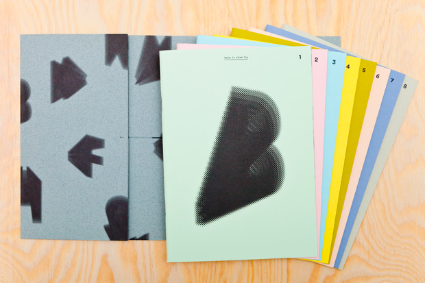
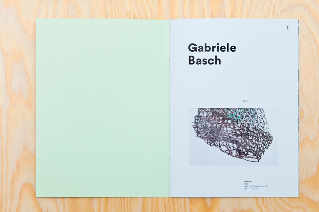
The art catalogue Fachgruppe K contains the works of all eight art professors at the University of Applied Sciences, HAW Hamburg. In June 2013 they had their first joint exhibition with the theme Heute in Einem Tag (or Today in One Day). Together with Lynn Dohrmann I created the catalogue that accompanied this exhibition. We developed a visual concept, which allowed us to present all artists, their work, and their style, in one catalogue, without forcing them together in a single book. For us using one, representative piece for all was not the right solution, so we finally got to the current concept, which is based on the initial letter of the last name of each artist. In reference to the name of the exhibition, we imagined light shining on them like on a sundial. If you place the booklets in a circle, you can imagine the wandering of the light projected on the covers. Another thing we wanted to use was different paper colours to separate the booklets from each other visually. The project is highlighted with copper-coloured staples, a foldable poster including an accompanying text, and varying colours of rubber bands.
You are both a keen adept illustrator and graphic designer. How do these two disciplines influence each other in your work?
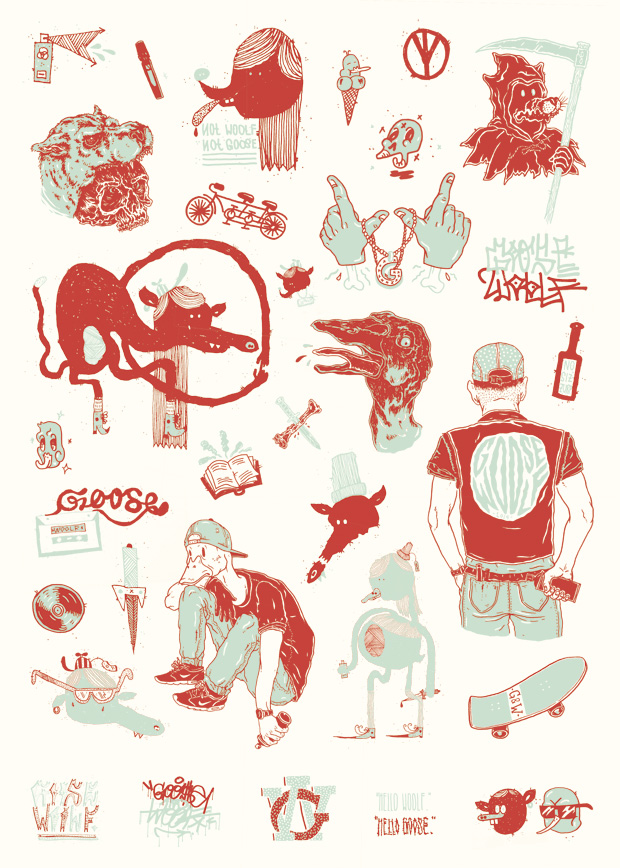
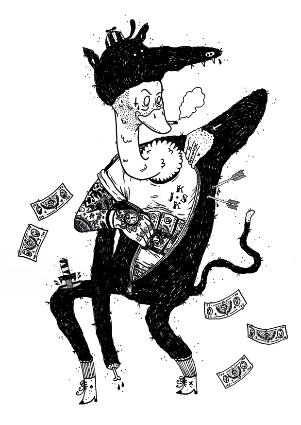
I come from an illustration background, and I always imagine a project through a sketch or an illustration for my inner eye. I started university as an illustrator but then I got into all the new things about typography and graphic rules, and I somehow lost the emphasis on illustration along the way. I focused on editorial design, printed work and the beauty of finishing. Illustration became a tool – I scribble a lot, and use it to preserve new ideas and thoughts. Recently I rediscovered it as something that I need, and something that I do for pleasure – not just out of necessity. One result of this process is the on-going collaboration with a good friend of mine which we call Goose & Woolf. I try to keep my illustrations free from strong concepts, and I try to use them for jobs with a wide range of visual possibilities and solutions. One reason I love editorial design is that, within a magazine or book, you can use everything – illustrations, photography and typography – and you are able to put them into a dialogue.

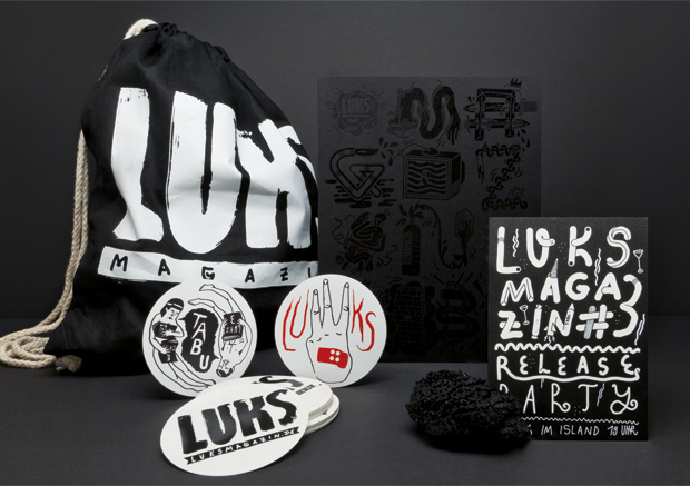
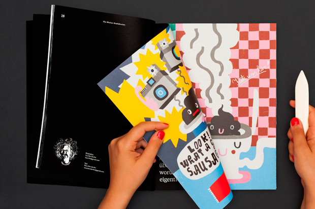
What was the thinking behind launching LUKS magazine?
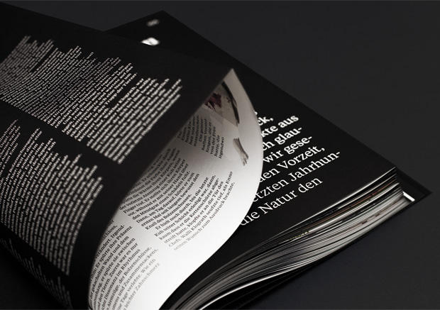
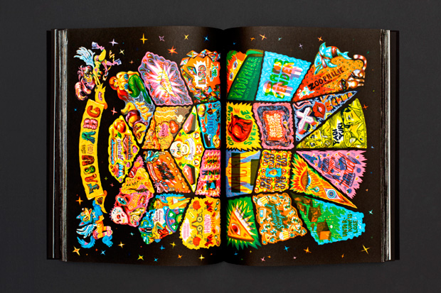
LUKS Magazine was founded in 2011 by a small group of illustration students of the HAW Hamburg to showcase their work and the work of other students at this university. It is a thematic magazine, which is released yearly by a changing group of editors but always under the full responsibility of students. I entered the team with the third issue. The topic was ‘Taboo’, so we decided to push the magazine to a new level, and to use the topic not only as a guide for the included illustrations and texts, but also to translate it into the magazine as an object. The cover resulted in a combination of screenprinted clear varnish on black and laser etchings, which made the title only visible in certain angles. The insides are unopened pages of a Japanese binding and contain the work of about 84 illustrators, writers and designers, on 245 pages. Only the first and the last pages of each chapter are displayed.The thinking behind this was to also place the illustrations under a taboo through the Japanese binding, and to make the reader break the taboo of destroying a magazine which he has just bought.
What area would you like to work in once you graduate?
Actually, at the moment I am about to found a small collective called Kjosk with my two talented friends and colleagues Lukas Zabek and Florian Schommer. We are focused on editorial design and printed matters but also have a strong passion for illustration. The idea is to concentrate on projects from the cultural sector, artworks for musicians and catalogues for fashion and art. But we are also interested in working with shops, restaurants or galleries – anything that we can develop from the concept to the implementation. We just want to avoid monotony.
behance.net/mariathasan
kjosk.de