
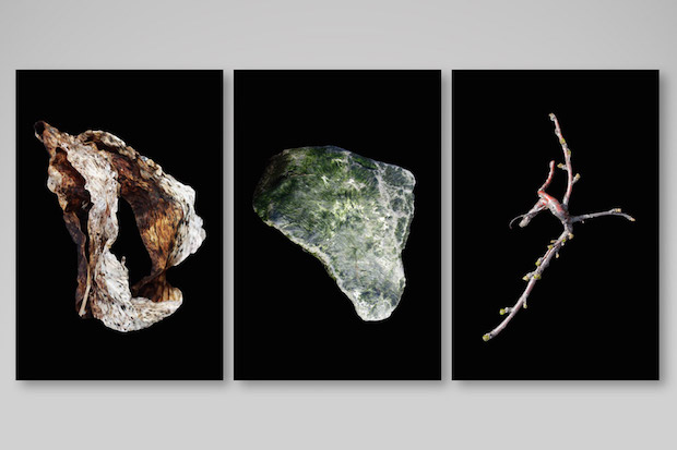
From collages of organic environments to promotional material for a self-initiated fan club dedicated to Germany’s lowest division footballers, the portfolio of this young designer is broad, thoughtful and engaging.
How would you describe your approach to design?
Before I studied communication design at the FH Düsseldorf, I enrolled in a one year program at a copywriting school in Hamburg. Being trained in classical advertising had quite an impact on my design studies. On the one hand, I was really annoyed about how superficial and stupid 95 percent of all advertising was and still is. So discovering the design universe was a pretty exuberant experience for me. On the other hand, I now benefit from the copywriting skills I learnt there.
When I’m starting a new project I have quite an holistic approach. I don’t care so much about aesthetics in the first place, instead I try to think in concepts and ideas. Writing is as important to me as the visuals. So I’m always searching for a simple, basic idea that somehow ties everything together. In the end it is very important to me that my work somehow feels easy and not too serious. There is enough serious design out there.
Tell us a little bit about the concept behind the experimental identity for Nothing New.
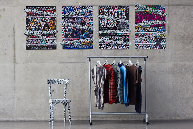
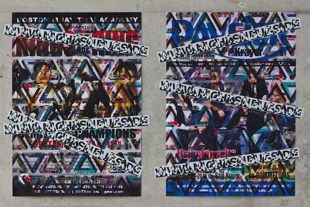
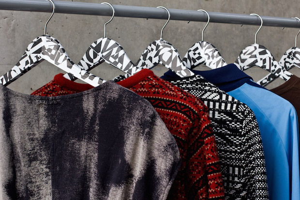
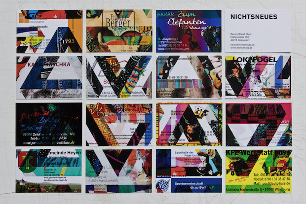
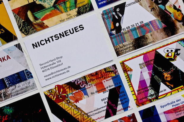
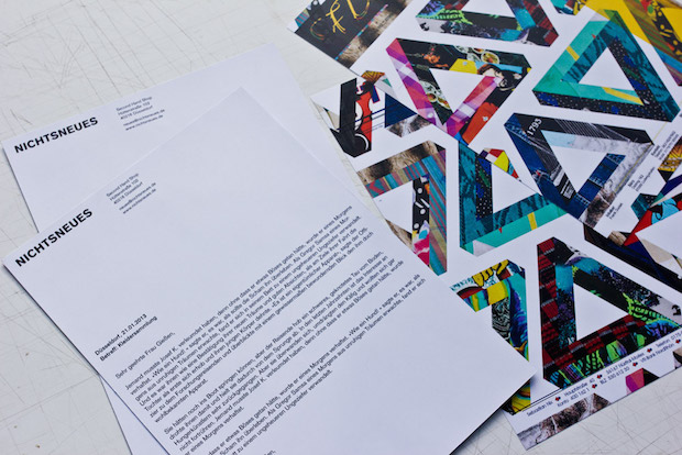
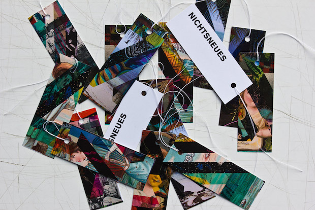
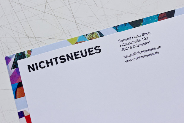
This is a good example of how I try to connect words and visuals. It was a group project that dates back to my studies at the FH Düsseldorf. The task was to design a visual identity that works without a logo. Two of my colleagues (Moritz Kotzerke and Axel Mohr) and I decided to design an identity for a second hand pop-up store. We called the store Nichtsneues, which means Nothing New. And that basically suggests the overall concept. We used old business cards, letterheads, posters, postcards, bags, etc, and overprinted them with a pattern, which is made of Penrose triangles filled with the fabric pattern of second hand clothes. Every detail somehow references the concept of recycling.
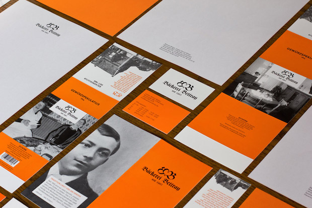
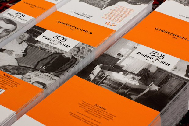
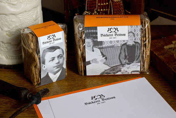
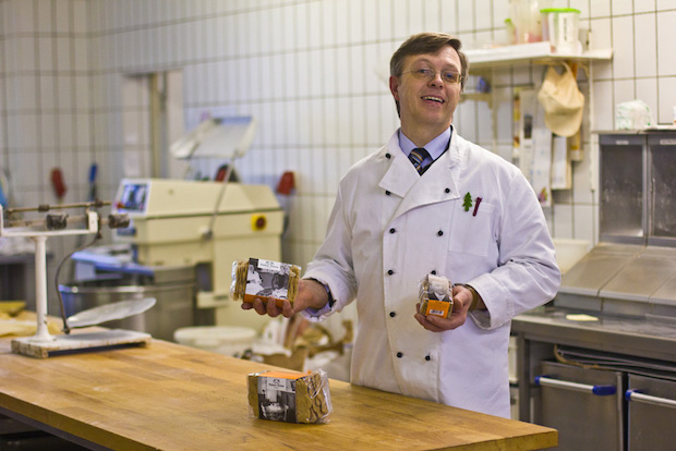
Your portfolio is really broad, from packaging design to editorial design to more of an art practice. Are there any common threads that tie all your projects together?
I’m not really interested in finding my own style, as Sagmeister said: “Style = fart”. Instead I hope that my way of thinking somehow ties together all my projects. I’m super serious and often quite stressed when I’m working on a project. But I only do so in order to reach a certain easiness in my work. It’s quite ironic but somehow it mostly works out in the end.

Tell us about a recent project that you’ve really enjoyed?
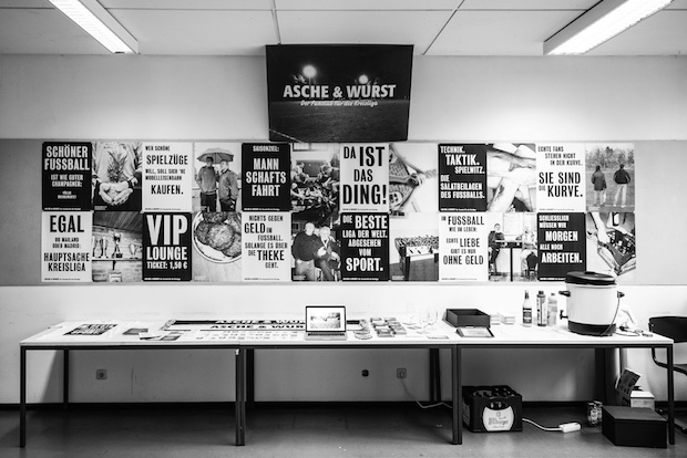
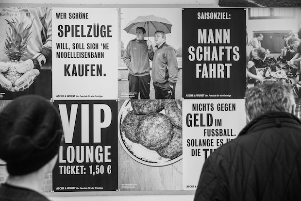
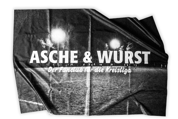
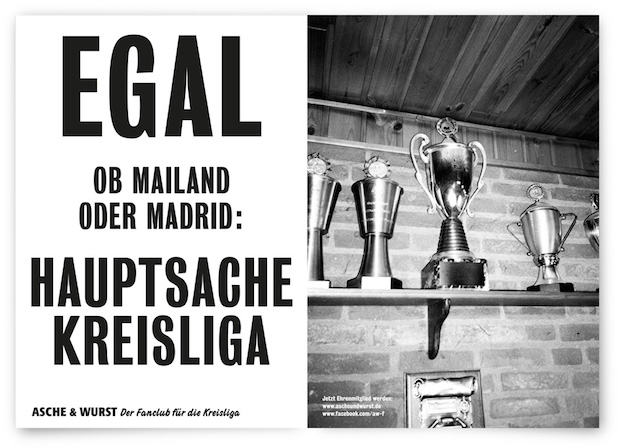
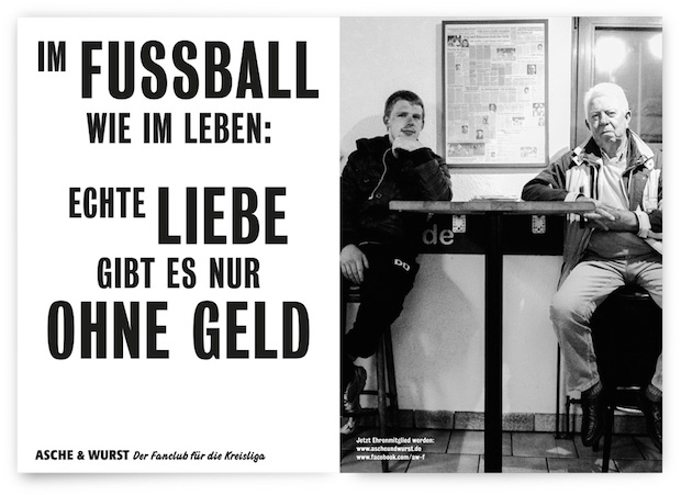
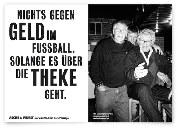
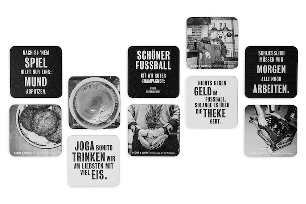
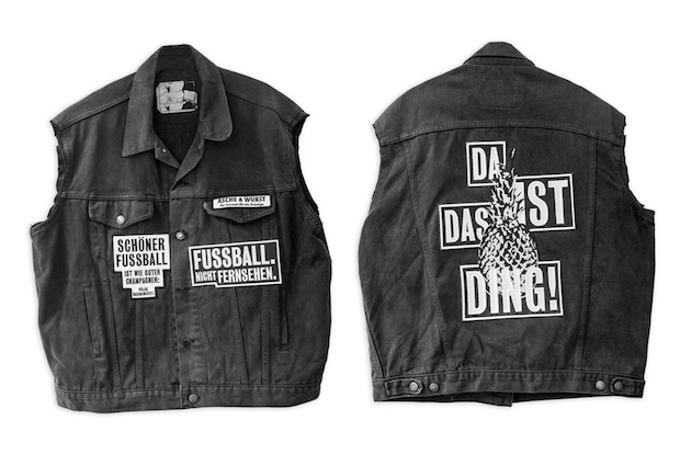
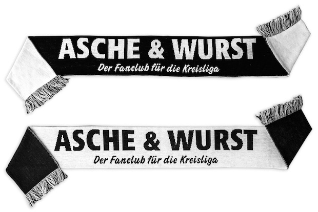
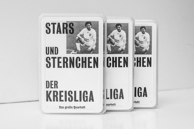
For my bachelor’s thesis I created a campaign for the lowest ranking football league in Germany. It was great fun to come up with advertising ideas that celebrate the worst football. I founded my own fanclub called Asche und Wurst and made posters, video-clips and a whole merchandise collection for it. It is all based on the idea that amateurism is so much cooler than everything professional.
It was not really a design task in the classical sense, since the aesthetics had to be quite trashy in order to fit the topic. But that was actually the hardest part. It is quite easy to do a shiny but dull design. But it was hard for me to do something trashy that was still striking in it’s visual language. I am afraid the campaign is very text-based, so it is hard to understand for english-speaking folks.
What’s the most challenging brief you’ve received so far and why?
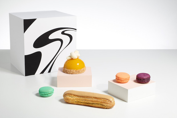
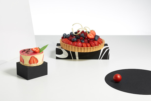
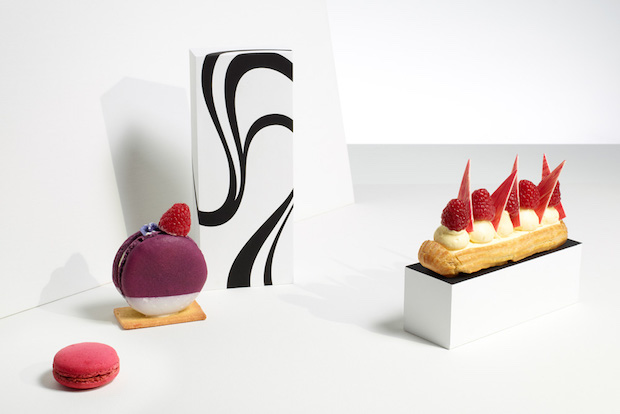
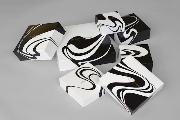
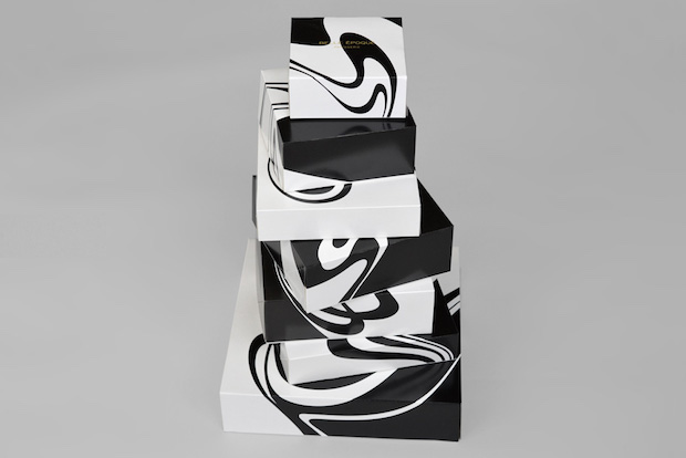
During my internship at Mind Design in London, I worked in a team on the identity for the French patisserie Belle Epoque. Our concept was roughly to interpret the visual language of the Art Nouveau movement, especially the illustrations by Aubrey Beardsley, in a modern way. The creative director Holger Jacobs was excited about the project and obsessed about finding the perfect design for it. So we literally spendt weeks just twisting and tweaking black and white curves. It was crazy and tiring but worth it in the end.
paulschoemaker.de


