
In terms of recognition (if not for what it actually stands for), the CND logo is one of the most ubiquitous symbols around. In this Archive piece, Yolanda Zappaterra looks at the fascinating history of the logo, from its humble roots at the 1948 Aldermaston anti-nuclear march to its current incarnation as the global poster boy for all things peace.
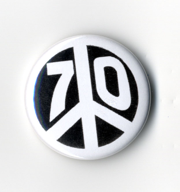
What makes a great logo? Last year marked the fiftieth anniversary of the CND logo, an event that saw a spate of articles about the enduring potency of this globally recognised symbol of peace and counterculture. Some centred on the history of the logo, some on its development and origins, others still on the way it spread a growing message of peace and anti-war feeling so quickly and effectively, and others on the way it’s been appropriated or used on everything from stamps and cigarette packaging to Banksy graffiti works and living sculptures. What these articles nearly all shared was a fascinating range of discrepancies and unknowns about all these aspects.
Take its origins. Versions and aspects of the symbol, most seen as a man with outstretched arms both the right way up and upside down, have been found in pre-Christian alphabets and imagery through to pagan rituals and runic symbols in the Middle Ages. As a Teutonic rune of death, it was picked up by the Nazis, who used it as a symbol marking the deaths of SS officers. For some, it represents Christ on the cross, for others a Hopi Indian sign derived from the footprint of a crane; over centuries it has been linked with Satanism, a myth that’s persisted through the life of the CND logo.
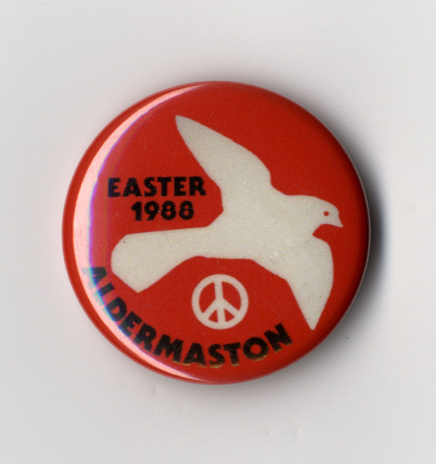
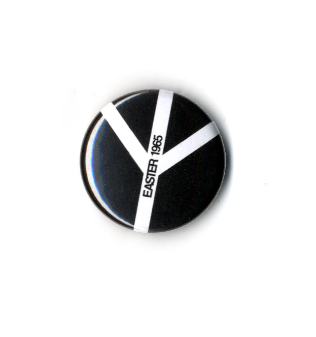
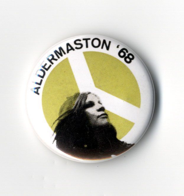
The date of the logo’s birth seems unclear too; a trawl of the net will reveal sites claiming it as anywhere between February and April 1958 – it in fact was designed for and first seen at the CND Aldermaston march at Easter 1958, beginning on Good Friday, 4 April, when anti-nuclear campaigners carried the purple and white logo on lollipops as they marched the fifty miles from London's Trafalgar Square to a nuclear weapons factory at Aldermaston in a demo organised by the Direct Action Committee Against Nuclear War (DAC) and the Campaign for Nuclear Disarmament (CND). And its migration to the US has a number of stories attached to it too: some say civil rights activist Bayard Rustin took the logo from the Aldermaston march and began to use it in civil rights marches there, others that its popularity in the US came from its use by pacifist protester Albert Bigelow, who sailed a boat adorned with a CND banner into a nuclear testing area. And others say it’s down to a University of Chicago student who persuaded the Student Peace Union to adopt it as the official SPU symbol. Its presence in 1961 on protest signs in a sci-fi film, The Day the Earth Caught Fire, may have played a part too. All have obviously contributed to the symbol’s extraordinary and immediate global impact which, as Ken Kolsbun, author of Peace: The Biography of a Symbol, says, “continues to exert almost hypnotic appeal” and “has become a rallying cry for almost any group working for social change”.
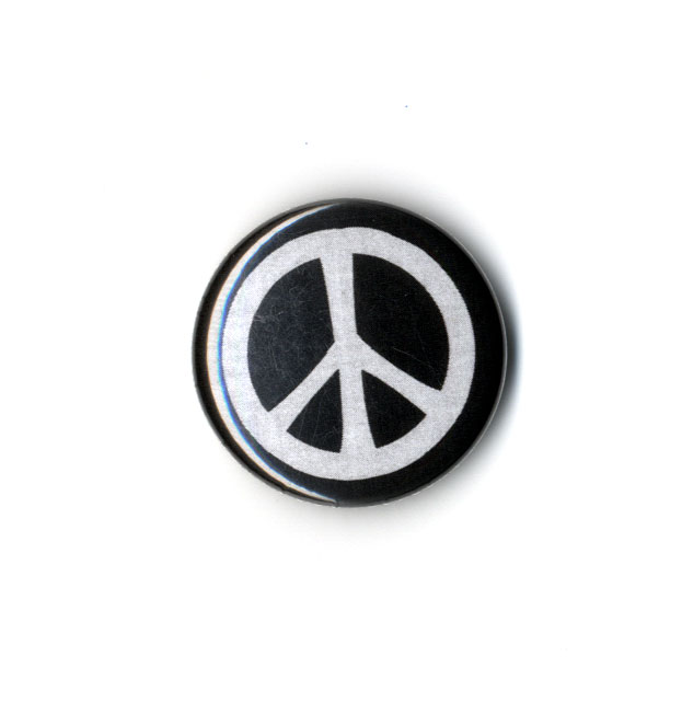
Bruce Kent, CND vice-president, believes the symbol’s immediate appeal is rooted in the march it was devised for: “It’s the circumstance in which it’s produced that makes a symbol. The power people of the day ensured the march got taken seriously around the world, so it became an international episode whose unexpected success meant the symbol was seen widely around the world, which in turn meant immediate success for it – and for the peace cause. The march and its concerns hit a national trigger, the logo an international one.” Whether its continuing popularity is due to films, individuals or mythologising, one aspect that is not in dispute is the power of the symbol’s design, although even here rumours persist that a version similar to that designed by Gerald Holtorn (widely regarded as the definitive version) was designed twenty years earlier than by philosopher and CND chairman Bertrand Russell. The simple graphic uses the semaphore letters ‘N’ and ‘D’ (for ‘nuclear disarmament’) and came from a dark place for Holtom, a designer, RCA graduate and WWII conscientious objector who in a letter to Hugh Brock, the editor of Peace News, described the logo thus: “I drew myself: the representative of an individual in despair, with hands palms outstretched outwards and downwards in the manner of Goya’s peasant before the firing squad. I formalised the drawing into a line and put a circle round it.”
The simplicity has been crucial to its potency, says Kent: “It was a simple, clear symbol, not at all complicated. It was an ideal logo that registered at once – though, interestingly, Harry Mister, who was very active in the peace movement at the time, though it would never catch on.” Richard Slocombe, senior curator at the Imperial War Museum’s department of art, adds: “Its simplicity meant it was able to stand for and represent a nebulous and undocumented group of ideas, rather than specifically defined ideologies, and it has retained that potency much more successfully than other symbols of counterculture; it’s remained relevant.”
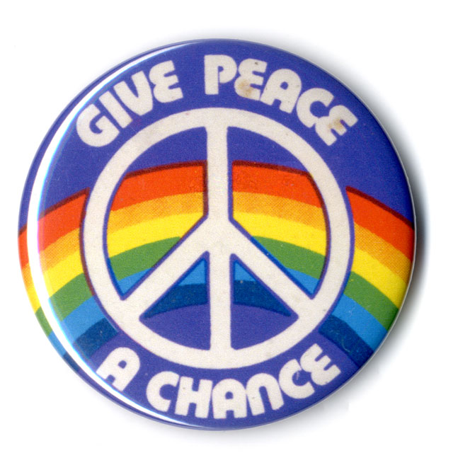
Given all this, it’s hardly surprising that the logo quickly took hold, particularly in the US, where it would become a shorthand symbol for anti-Vietnam War protest both on US soil and in Vietnam itself; by the mid-1960s the CND logo was a universal symbol for peace around the world. The simple design makes it child’s play to reproduce too – always handy in protest situations. But how and why it’s endured for more than fifty years is harder to analyse. The shift in its symbolism and meaning to act as a global shorthand for the universal themes of tolerance, peace, equality and freedom has certainly played its part, but so too has the CND’s early decision not to copyright its logo. As Kent sees it: “Making the logo available free for use by anyone helped the CND cause, and copyrighting it would have gone against the ethos of CND.” And two other things have helped. After a dip in the logo’s – and CND’s – fortunes towards the end of the 1960s, when, as Slocombe recalls, “its use by bands like the Monkees in cod-hippie music videos led it down the road of meaningless fashion symbol”, it rediscovered its potency a decade later thanks to two people: Peter Kennard and Ronald Reagan.

“Thanks to the Cold War warming up and the proliferation of nuclear missiles on UK soil, there was a very strong resurgence in support for CND,” recalls Slocombe. “This brought Peter Kennard to CND, and instead of giving them the rainbows and peace symbolism they wanted, he gave them the much tougher, more obvious imagery he felt it needed, powerful montages like the logo slicing through missiles.” These bold, aggressive and powerful agitprop pieces worked like a dream, reflecting the anger of a nation and galvanising opposition to what was seen as US and UK warmongering being spearheaded by President Ronald Reagan and UK Prime Minister Margaret Thatcher. They had to; Kent recalls “fanatical opposition to CND” in the 1980s. “Political and religious right-wing groups were horrified by CND, and there was a lot of incredibly perverse opposition that represented us as being overrun by the Soviet Union,” he says.
Thirty years on and with a very different US President keen to lead nuclear disarmament initiatives with Russia, can CND’s journey be seen as a success story? Time will tell, but if it is, a simple logo will likely have played a large part in it. As Slocombe says: “In this great era of commercial branding, there’s a slight irony that the CND logo, in recognisably representing a way of thinking for more than fifty years, remains one of the most successful brands in the world.” cnduk.org
This article first appeared in Grafik 176, August 2009