Johanna Siebein of Studio Laucke Siebein tells us about the emotive and consistent identity of German stationery company Pelikan – while arguing for more daring and absurdity in graphic design practice.
The Lufthansa bird flies across the skies, the Nestlé bird feeds its brood, the Pelikan bird… I was clueless. Even though I’ve held many Pelikan products (the paint box, the fountain pen, the bottle of ink, and last but not least the correction fluid) in my hand day-in, day-out during primary school, this bird still posed quite a riddle for me. A pelican doesn’t use school supplies, right? I simply couldn’t make the connection between product and brand due to my childish logic. Additionally I always had doubts as to whether it was called “Telikan” or “Pelikan” which didn’t help either. The swash of the ‘P’ with its extreme weight on the left simply did not correspond to the handwriting that I had just learned so eagerly. Luckily the big bird gave me a little hint; ‘Pelikan’ it was.
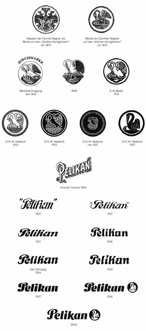
Pelikan was founded as a manufacturing firm for ink and artist’s paint in 1838 in Hannover by the chemist, Carl Hornemann. Günther Wagner, who took over the firm in 1878, decided to use his family coat of arms as the company’s trademark – a coat of arms that featured the infamous pelican.
I am not well versed in heraldry but I know that the pelican is used as a symbol for Jesus; the pelican supposedly wounding its breast with its own beak to revive its dead chicks with its blood. On a lighter note, what makes me smile is the changing number of chicks in its nest. At the company’s beginning there were three birds – as was traditional – but with the birth of Wagner’s fourth child a fourth bird was added.
O.H.W. Hadank, Pelikan’s in-house designer, finally designed a proper trademark in 1937. Reducing the number of chicks in the nest to two, in order for it to read more clearly. He also changed the odd art nouveau characters to a more readable lettering that was written with a broad nib.
The Hadank version of the trademark was the one that was familiar to me as a child. It was replaced in 2003 with a redesign using only one chick under the care of an extremely motherly looking pelican. Appropriate to the trend of a declining birth rate in industrialised countries, perhaps, and in stark contrast to Wagner, who knew about the advantages of a symbol that stands for a sense of family and education. Unfortunately the current trademark is weaker rather than stronger that it’s Thirties predecessor, but at least the ‘P’ is no longer ambiguous.
Early in the company’s history and certainly under Wagner’s son-in-law Fritz Beindorff, the company commissioned talented artists to design posters and advertising. In an early pitch competition, amazingly about 500 artists participated. There is something bizarrely wonderful about the poster containing the pitch-black pelican oozing ink. Alongside the various and quirky art nouveau posters, the Pelikan graphics done by El Lissitzky – which he made to cover the costs of his tuberculosis treatment – are the most well known.
Pelikan has demonstrated how a product, through its graphic identity, can be etched into collective memory. Within the current context of dynamic and loose corporate design such a concrete and pictographic trademark becomes even more appealing – though confusing to my younger self. I offer this short essay as a plea for more absurdity and daring in our profession.
studio-laucke-siebein.com

Studio Laucke Siebein
… is a design studio based in Amsterdam and Berlin. Focusing on a range of areas from identities to book and web design, it has won such awards as the Art Directors Club Award NY, The European Design Award and The Best Dutch Books award. It has recently designed the identity for the exhibition Like Pastoe, 100 Years of Design Innovation at Kunsthal Rotterdam.
El Lissitzky
… was a Russian typographer, artist, photography and architect – among other things – who started out his professional life illustrating Yiddish children’s books before going into teaching at the tender age of fifteen. Avant-garde art movements and designing Soviet propaganda posters followed these innocent beginnings, with Lissitzky going on to be one of the founders of modern graphic design.


