
Grafik editorial assistant and graphic designer Thom Swann tells us about his love of the eccentric, hand-wrought early Penguin, Pelican and Puffin logos – and of his admiration for the imaginative copying of Allen Lane.
In his essay Antiquarian Prejudice, the critic and poet John Betjeman points out that “good architects copy with imagination”. It’s a sentiment that can apply to many industries and professions, including publishing. Allen Lane, in 1934 managing director of the struggling publisher The Bodley Head, came up with the idea of good quality editions by contemporary writers for a sixpence each – the price of just ten cigarettes. Failing to convince his co-directors that there was a profitable market for these cheap paperback books at The Bodley Head (his family business), Lane was forced to make the venture, and gamble, a private one.
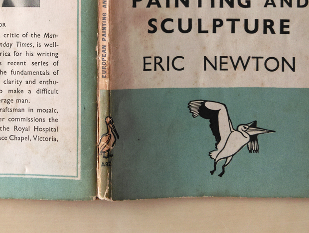
When the first ten Penguin books were finally released, to the British public they looked starkly original; to a German bibliophile of the nineteen-thirties on the other hand, the Penguin books might have looked like nothing more than a rip-off of a pre-existing German book series. Albatross had been producing English-language paperback books in Hamburg since 1932: they were the first to mass-produce paperbacks and the first to colour-code by genre. Albatross books also featured sans-serif typographic covers with a prominent logo in the form of a bird – the comparisons with Penguin are obvious. The similarities show that Allen Lane knew a good thing – and an opportunity – when he saw it however, and as Albatross books weren’t allowed to be distributed in the U.S.A. or the British Empire, in the pre-globalised world of the thirties there was no reason not to copy this remarkably modern German format.
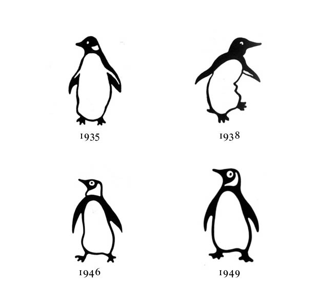
Lane copied, as Benjamin would have it, with imagination, though. He didn’t want his new series to be named after something simply akin to an albatross, but something which was “dignified but flipant” – it was his secretary, Joan Coles, who suggested a penguin. Promptly, early Penguin designer Edward Young went off to London Zoo to sketch the penguins in their modern enclosure and the infamous logo was born. Traditional accounts of the story of Penguin’s logo usually from this point simply skip ahead to Jan Tschichold's 1946 tidying-up of the logo before leaping head-first into talking about Angus Hyland’s slightly boggle-eyed 2003 update. But this misses the magic, eccentricity and contemporary relevance of the mark.
It’s a phrase that must seemingly be used in almost any article on logos but the idea of the ‘responsive’ logo is, surprisingly, relevant to the story of the Penguin mark. While many contemporary logos are very literally responsive (perhaps most famously the Experimental Jetset-designed Whitney Museum ‘W’), the logos which adorned the books and publicity published by Allen Lane were responsive in a far more lateral, intelligent and entertaining way. Right from the off, the use of the Penguin logo extended beyond the static mark found on the cover of Albatross books: the 1935 advert headlined “The Penguins are coming” features a series of penguins drawn in the style of the logo slipping and sliding down an invisible surface, the furthest right of the set is perhaps about to dive into an equally invisible sea. In the nineteen-forties, to advertise the Penguin crime series, the Penguin mark is seen dressed-up as Sherlock Holmes and, in another case, lying dead on the floor with a knife sticking out of its chest. The level of adaptability which the logo allowed for makes the Whitney’s W look a little obvious.
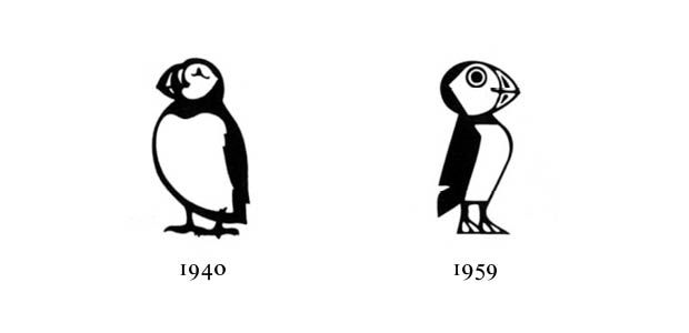
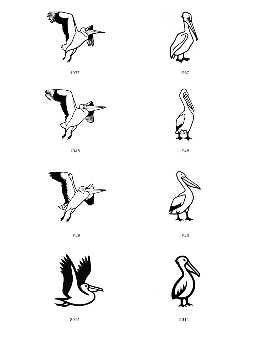
In 1936, Allen Lane overheard a woman asking “Have you got any Pelican books?” while at St Pancras Station in London. Lane knew she meant Penguin but was worried a rival publisher might start an imprint called Pelican; after consulting with the lawyers, Lane realised the only way to make sure this didn’t happen was to do it himself. The radical Pelican imprint of original non-fiction writing called for a new logo: the answer was obvious, a pelican drawn in the same style as the Penguin logo. Later in the nineteen-forties, when the children’s imprint Puffin was started by Lane, the answer was again the same: a puffin drawn similarly to the original penguin. Thinking in terms of the first three forms of Penguin books (Penguin, Pelican and Puffin), the Penguin logo can be seen as simply one iteration of a shaping-shifting logo, where the consistency is found in style of drawing, occasional use of an oval frame – and the image of a bird beginning with the letter ‘p’. Second layers of information are then contained by the ways the Penguin iteration is combined with certain colours: orange to signify a fiction book, green for a crime thriller. The characteristics of each bird are also carefully chosen and drawn in order to convey the tone of each imprint. While the penguin is approachable, the pelican is serious and confident and the puffin friendly and eager. This is a truly advanced logo (or series of logos): it is able to convey complex layers of information on both a semiotic and a highly functional level. It’s a logo where the form can be entirely changed and yet still be recognised as part of the overarching Penguin group.
This ‘responsiveness’ was never conceived of in such a way at the time of these logo’s development, of course, making them all the more appealing. Without attending any marketing seminars or listening to any branding gurus, Allen Lane and his designers were able to create logos which responded to the needs of the company as and when they had those needs. They created a nuanced and visually appealing brand identity which grew organically rather than being thrust wholesale onto the company; the Penguin logo(s) are like tailored suits in comparison to the prêt-à-porter, loose-fitting ‘rebranding exercises’ which are so common today.
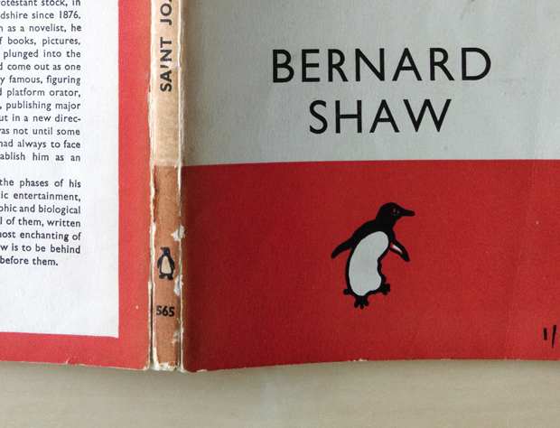
The flexibility provided by a combination of the initially small team at Penguin and the use of talented in-house designers allowed for a level of adaptability within the overall standardised approach to book design of Penguin. One of my personal favourite aspects of the early Penguin logos is their ability to change stance from cover to spine – or from cover to cover for that matter. With the original Pelican version of the logo, it’s particularly satisfying seeing the elegant bird in mid-flight on the cover and yet standing stationary and relaxed on the spine. It’s an easy thing to overlook, but it’s the sort of negligible detail (to borrow of a phrase from Jonathan Miller via Derek Birdsall) that gives the design, both of book and logo, that little bit of something – a knowing smile, a wink, an in-joke – which sets it apart from the rest. In all which they turned their mind to, Lane and his series of talented designers did what had been done before, but with more imagination.
thomswann.co.uk
Thom Swann
… is a graphic artist and designer and editorial assistant at Grafik magazine. He is currently working on projects for London Design Festival (with ceramics artist Matthew Raw) and for Deptford X contemporary art festival, alongside his own book design and publishing practice, Nowhere Editions.
Edward Young
… was 18 when he joined The Bodley Head and at the tender age of 22 became the Production Manager at the fledgling Penguin Books, working with Lane to design the first Penguin logo and the famous horizontal orange-white-orange grid. Young then became a submariner during the Second World War and at one point found himself in a flooding, sunk submarine. Along with three others still trapped onboard, Young decided to open the hatch and swim to the surface where he was eventually rescued. Young later became a submarine commander and wrote an autobiography titled One of Our Submarines. Penguin honoured their former member of staff by making the paperback edition of One Of Our Submarines the 1000th Penguin publication.