
Maraid Design and Present and Correct have hooked up to bring us a hand-picked selection of small but perfectly formed matchbox designs from eastern Europe. In today's Take 5, P&C's Neal Whittington picks out a few of his most favourite.
Like stamps, matchbox labels are small, perfectly formed graphic gems. A canvas into which advertisers and governments promoted their products, causes and public service announcements. Eastern Europe has the strongest heritage of this genre of ephemera. Thousands of labels were created across the former Eastern Bloc in the 60s and 70s, utilising styles of illustration which are not out of place in todays world of thick outlines, naive paper-cut shapes and graphic vector artwork.
MATCHBLOC is a celebration of these graphics, predominantly using the collection of Jane McDevitt from Maraid with a few extras thrown in from Present & Correct. Sausage Rabbit
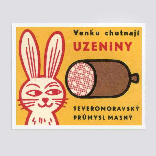
An all time favourite, for its aesthetics and ambiguity. Is the sausage made of rabbit? Better still, does the rabbit love to eat sausage? The arched eyebrow suggests the latter, and we are happier for it. Leningrad
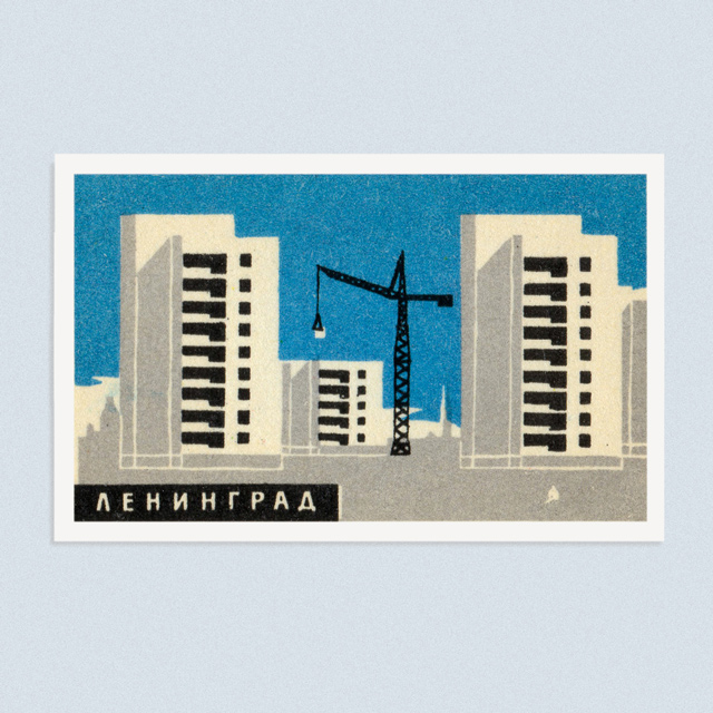
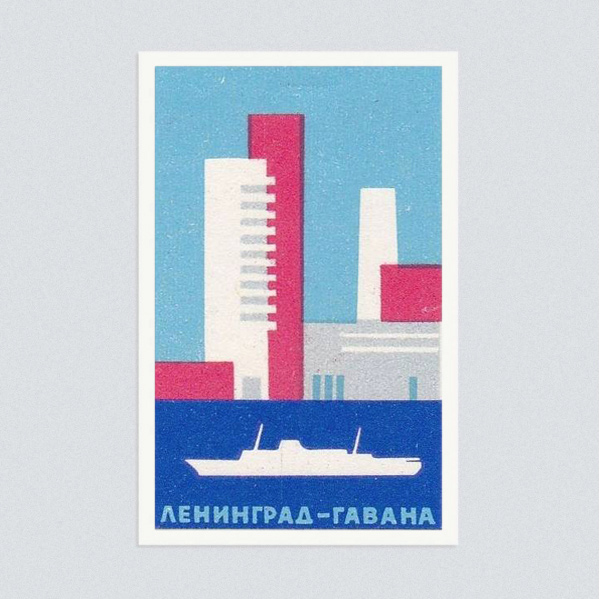
From a series promoting the city, we love the hard architectural graphics in this one, but also in many of the labels we have. The Eastern Bloc buildings work so perfectly in this pared-down style, and we have a lot more to come. Moscow Music Hall
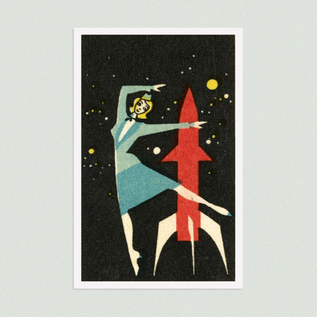
The series celebrating the Moscow State Music hall features an array of can-can girls, jesters and the like. The woman dancing around a rocket perfectly sums up the era of technological posturing, optimism and utter disregard for scale in illustration. Smoking Cat
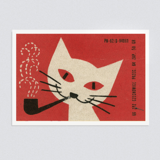
One would assume this was promoting a tobacco company but, to be honest, we don't know. And who cares? It's a cat smoking a pipe. Matchog
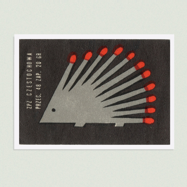
For the Hedgehog Match Company, obviously, this geniusly-simple creature. Matches replace spines, with a striking result.
Follow MATCHBLOC on Instagram here, where a new label will be posted every day.
presentandcorrect.com
maraid.co.uk


