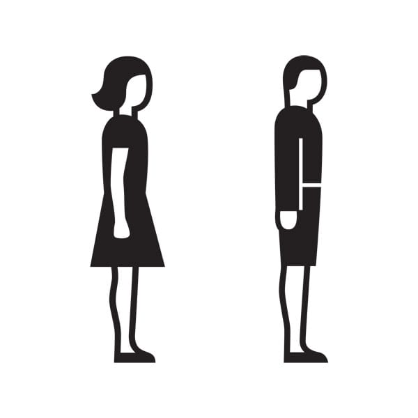
Andreas Uebele tells us about one of the most important pairs in graphic design history and how they’ve managed to become global travellers. Someone who is looking for the toilet comes to a door. He sees what we might call a humanoid figure. He sees a person. The body descends vertically from broad shoulders, the legs stand parallel with a small gap between them. “Aha”, the viewer says to himself, “this is the place for men”. Yet if the figure has a waist and wears a skirt-like garment it is equally clear – at least in the Western World – that we have reached the ladies’ toilet. A woman and a man, standing calm and still, wearing a knee-length dress and shorts. No specific fashion is discernible. These two figures have fallen out of time. They aren’t hermaphrodites, who’ve always missed out when the sexual categories are defined: we can see from the two figures that the man is probably a boy, the woman probably a girl. It’s not just that they’re almost exactly the same height: the female figure’s undeveloped chest, the male’s shorts (which tend to be the preserve of the young) are sympathetic references to the un-sexual. A shared naïveté – or perhaps rather a shared innocence – overlays the stark division of the sexes. The form fulfils its function and reminds us of childhood; the figures aid way-finding and tell us a tale of rediscovering a lost age.
The fact that this information is understood globally is a tremendous cultural achievement – its importance cannot be overestimated. It is the translation of instructions, place descriptions or complex emotional states into an internationally comprehensible language – basically the invention of an autonomous picture-based language that functions across all national boundaries. For this, we have to thank scientist Otto Neurath and graphic designer Gerd Arntz. Neurath pioneered what he termed the International System of Typographic Pictorial Education (or Isotype) to establish a universal convention of sign usage. His project was intended to create the means by which complex information relating to key social factors (housing, health) could be quickly and easily communicated to the public. Arntz was the man chosen to render the hard statistics as digestible information. He had been a member of Gruppe progressiver Künstler Köln, depicting class struggle through the use of abstracted woodcuts, and, through his publication in various leftist magazine, came to Neurath’s attention. In all, the artist created over four thousand images for Isotype, greatly contributing to Neurath’s and the wider Viennese society’s goal of worker emancipation (Vienna being a Socialist stronghold in the 1930s).
Together, Neurath and Arntz laid the foundations for the international visualisation systems we use today, which help us communicate various important matters quickly and straightforwardly, without using writing and words. This one small example alone has had a profound effect on the global graphic environment, and while it might not lead you to any sort of emancipatory revelation, it will definitely help you out when you get caught short.
uebele.com
Andreas Uebele
… was born in 1960 and studied architecture and urban planning at the University of Stuttgart, and art at the Stuttgart State Academy of Art and Design. He founded his own visual communications agency, Büro Uebele, in Stuttgart in 1996, which specialises in (but is not restricted to) identity and signage projects. Since 1998 he has been a professor for communications design at Düsseldorf University of Applied Sciences. He has been a member of the Type Directors Club of New York and of the Art directors Club of New York since 2002, and a member of the Alliance Graphique Internationale since 2007.
Gerd Arntz
…was from a wealthy, bourgeois background and had benefitted from a good education. His renunciation of his past and uptake of the socialist cause occurred when he moved to Düsseldorf as a young man, the city in which he received his artistic training and where he joined groups intent on turning Germany into a ‘council republic’ of direct popular democracy. He was inspired both politically and aesthetically by developments in Russia, adopting Expressionism and Constructivism and using the woodcut and, latterly, the linocut as his tool of attack. After his important period of working with Neurath on the Isotype project, which allowed him to pursue his agenda free from market or political affiliation and with a steady income, Arntz was forced to flee to the Netherlands due to the rise of Nazism.
September 18, 2014 3 minutes read
Picture Language
Andreas Uebele tells us about one of the most important pairs in graphic design history and how they’ve managed to become global travellers.

