
Between the ending of two very different types of war, Poland developed one of the most visually arresting schools of poster design the Continent had ever seen. Edgar Bąk picks the best in class.
The 'Polish School of Posters' is a name used to refer to a certain stye of poster-making that arose in the country in the early 1950s and ended in the late 1980s, around the time that the Cold War was starting to diffuse.
Although varied in aspect, the posters have one common characteristic: the show, movie or whatever the poster stood to represent, served only as a starting point for the direction that the author might choose to take. It was simply an opportunity to make a perfect – but stand-alone – piece of art.
Any metaphor used did often stem from the subject that was being promoted, but the designers hardly ever used an image of the actor or photos from the movie set. Instead they used their unbridled imagination to create something that often appeared to come more from a fine art tradition than from the world of graphic design.
For me, the biggest lesson that this school of poster making teaches us is that a poster must first intrigue. Only then can it communicate.
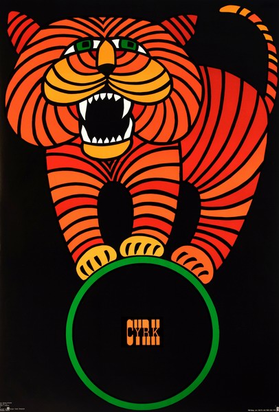
Hubert Hilscher, Cyrk Ryczacy kot, 1978
The circus poster is a distinct and strong subcategory of the Polish School of Posters tradition. Their quantity and variety has never ceased to amaze me. I assume that they were printed and distributed between circus troupes, who glued their bills over the top of the posters.
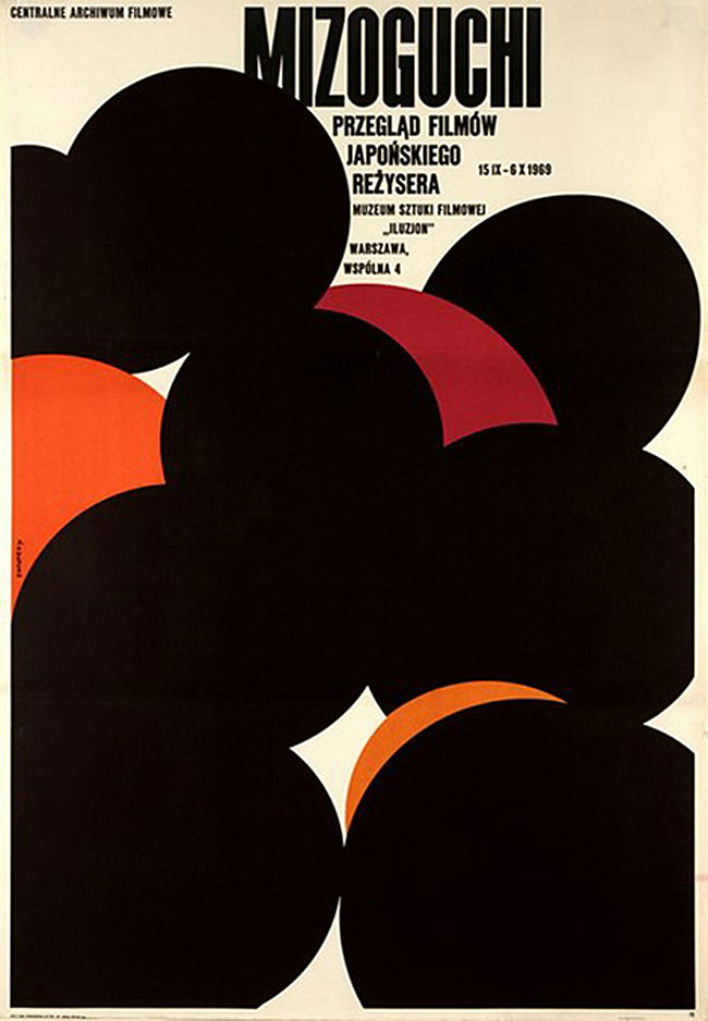
Waldemar Swierzy, Mizoguchi, 1969
A characteristic feature of the Polish School of Posters is the subtle use of metaphor: posters are mostly figurative, each image must be hooked more or less in the physical world. This poster, conversely, stands our for being very poetic and abstract. In part, it's probably an attempt to imitate Japanese art.
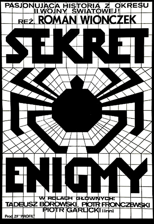
Andrzej Krajewski, Enigma Secret, 1979
This poster also breaks with stereotypical thinking – no fancy message here, instead, we have a wild, almost primitive pictographic approach as well as a beautiful example of typography that becomes an image (or vice versa)
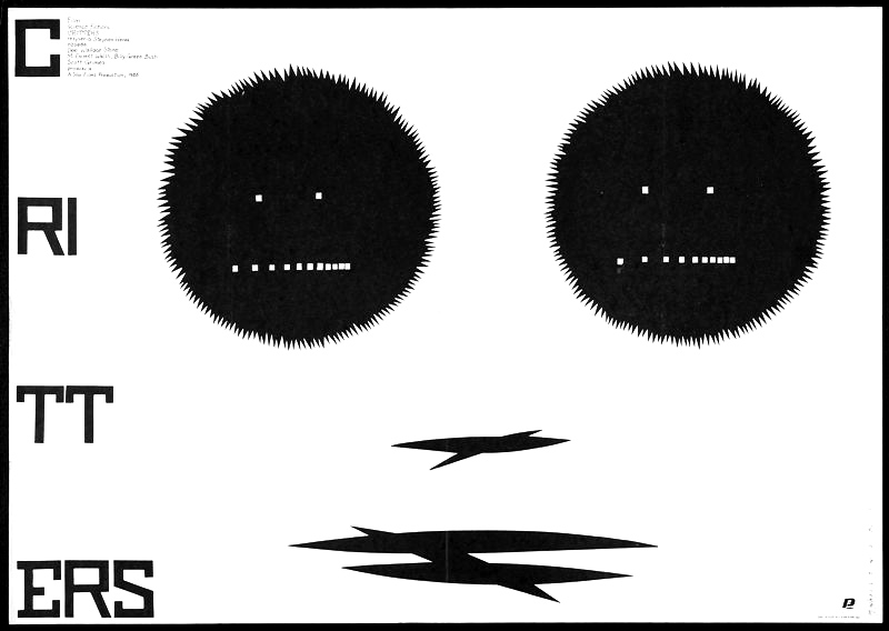
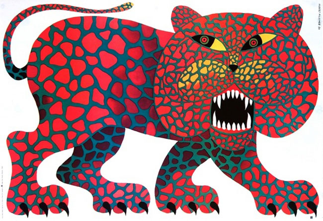
Mieczysław Wasilewski, Critters, 1986
This is probably one of the funniest examples of how a poster can end up some distance from the film that is supposedly intended to promote. This is a sophisticated but at the same time strong and sharp piece of work, a truly class A poster for a class B Movie.
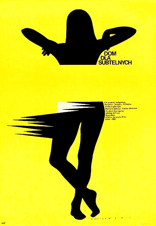
Mieczysław Wasilewski, Dom dla subtelnych, 1981
This, in turn, is typical of the sort of visual language usually found in polish posters of that period, one that seeks to play with our perceptions.
edgarbak.info


