For Adult Art Club’s Jonny Costello, the urban bleakness and subversion of the familiar in Wiley’s Playtime is Over is both unsettling and archetypically British – making it one of the most exciting covers the Grime scene has ever produced. Playtime Is Over is the third studio album by UK Grime artist Wiley, it also happens to be one of the most iconic Grime covers that has ever been produced. As a designer, it is never easy to pick a favourite sleeve, but I always come back to this Wiley one and it never fails to strike a new chord. In a genre that was famed for its lo-fi and raw production values, a lot of the covers unfortunately followed suit, rendering much of the early artwork quite aesthetically unaccomplished. Playtime Is Over was different.
Wiley is a character never far from the limelight when it comes to UK music. Whether it’s a chart smash for the masses or a new underground cut, he seems to have had something boiling for the best part of the last decade – with stand-out visuals to accompany most releases.
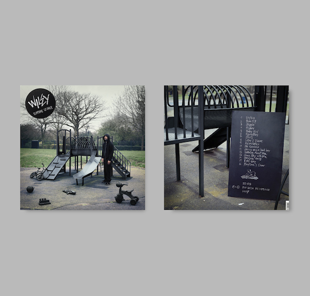
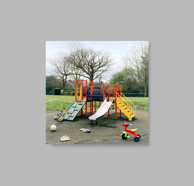
Playtime Is Over’s cover is lo-fi, simple and effective, with each carefully chosen and cleverly manipulated visual element adding another layer of depth to the design, whether intentional or not. Set in a public playground, the simple act of painting all the items black (and eroding their bright primary colours), is a dramatic action that evokes an unsettling, sinister feeling in a familiar setting. The overall tone of the photography has an inherent Britishness that captures the grey hue of a long overcast day. The bare trees only work to cement the idea of urban bleakness. These days are archetypal of the British landscape, yet they are often overlooked, and seeing them celebrated immediately sets the cover apart from the faux gloss a lot of other artists strived for at the time.
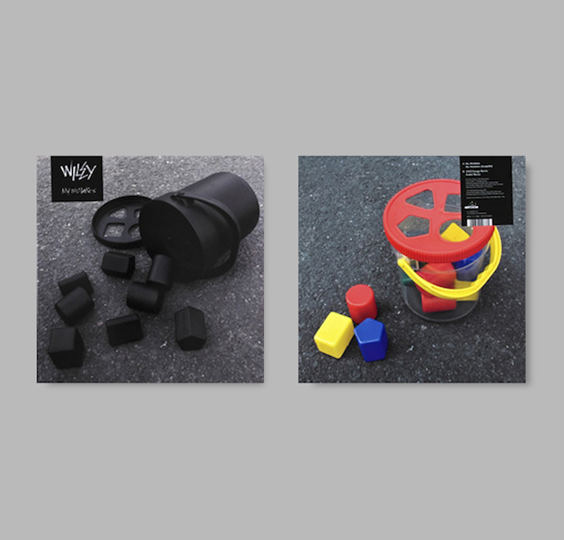
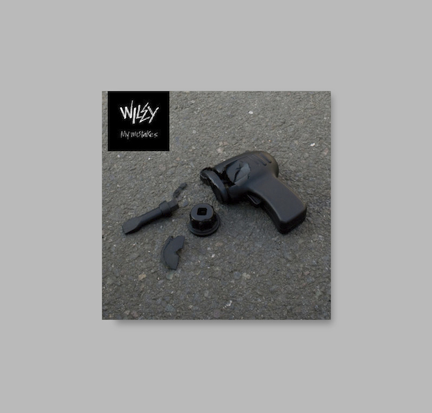
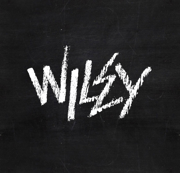
Overall the sleeve cover has an understated aesthetic, with the type presented separately on a sticker as not to detract from the image. Wiley is stood in a statue-like position wearing the uniform of the streets: all black everything and hood pulled up. A nice final touch when you flip the sleeve over is that the track listing and legals are written in chalk on a blackboard propped up within the physical space. The chalk text also forms the distinctive Wiley logo used throughout the album campaign. I always look at sleeves as a conceptual package, including the type, imagery and physical product, and this is certainly an album where all of the elements were carefully considered. The CD is black on both sides, and the artwork for the singles extended the concept further by using close-ups of black-painted toys, giving the overall campaign a cohesive feel.
The artwork was designed by Ewan Robertson, who worked closely with the team at BigDada on numerous releases including Roots Manuva’s Slime & Reason and Bonobo’s Black Sands. Sadly Ewan passed away at the young age of twenty-seven, right at the start of his career. He had a unique vision for design and art direction that favoured getting his hands dirty and bringing concepts to life in the real world rather than glossy iterations on screen. Ewan was half of the design team Oscar and Ewan with Oscar Bauer. He also produced some standout music under the moniker Offshore, and had just completed his first album just before his untimely passing in 2012. His album Bakehaus was testament to his talent in all creative mediums.
Wiley’s Playtime Is Over sleeve is without doubt a modern classic. Wiley, ‘The King of Grime’ and in this case, album covers as well.
Wiley – Play Time Is Over
Design and art direction – Ewan Robertson
Photography – Pelle Crépin
Retouching – Christopher Peabody
Label – Big Dada Records
Wiley
….also known as ‘Wiley Kat’ and ‘Eskiboy’, is an MC and producer widely thought of as the pioneer of the UK Grime scene. Aside from his cheeky lyrics and innovative beats, the Bow-born artist is remarkable for his ability to court (and catastrophically piss off) major labels while still retaining a great deal of credibility and respect on the underground scene. Thanks to his success and that of former-protégé now-nemesis Dizzy Rascal, the Grime sound has spread internationally, with 2013-14 signalling a particularly fertile period for the genre. You only need to look at last September’s ‘war dubs’ (a series of battle-style tracks created by hundreds of ‘warring’ producers stretching from Bow to the USA, even Estonia) to see a scene in excellent health.
Jonny Costello
This art director, designer and illustrator works predominately in the music and youth entertainment sectors, creating and overseeing album campaigns for the likes of Sony Music, Universal, SYCO and Columbia, as well as developing branding and collateral for live events from MTV and Redbull. Inspired and informed by popular culture, documentary film-making and realism, his work and art direction aims to help artists find their visual voice, no mean feat considering the clients he’s worked for range from underground industrial techno producer Perc to teen sensations One Direction.