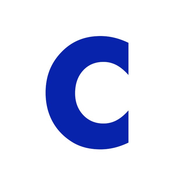
Toshi Omagari looks at the letter ‘c’ from Futura - designed in 1927 by Paul Renner to perfectly accommodate the various idiosyncrasies of his mother tongue.
You can type any Latin-based language in the typeface of your choice, provided that it has enough characters. Because of this, a Latin typeface may be perceived as agnostic about language, and it speaks to anyone equally fluently. In fact, that is not quite the case, and typefaces can have preferences and weaknesses. For a type designer from a non-European culture, a typeface’s sensitivity to certain languages is a fascinating subject. My case in point is Futura, which was made in Germany by Paul Renner in 1927, and its forte is perhaps unsurprisingly German.
If you are looking for a typeface that is suitable for typesetting German language, the ones made in Germany would be a logical start. “But how can such a geometrically pure typeface have a mother tongue?”, I hear you ask. Well, let’s look at its one of the defining characteristics, that is ‘C’ or ‘c’. Unlike ‘G’ ‘J’ ‘S’ ‘e’ ‘5’ and so on, whose strokes end with a square shape, ‘C’, on the other hand is cut vertically for seemingly no reason. Jumping to a language lesson, German uses ‘c’ exclusively with ‘h’ or ‘k’, such as in achtung, Licht, or drücke, with the exception of loanwords. Therefore, graphically speaking, the German ‘c’ is always followed by a letter with a stem, so is an uppercase ‘C’. Because of this, ‘ch’ and ‘ck’ have been often written or typeset very tightly, sometimes ligatured. Futura is no exception, and its vertically cut upper and lowercase 'c's allow you to space ‘ch’ and ‘ck’ efficiently.
The short head of the ‘f’ is another feature that makes it suitable for German; in addition to the problem of collision (as in fä fö fü), German joins multiple words together. The word schlaflos means ‘sleepless’ in English and the internal boundary is schlaf-los. In such cases, ‘f’’and ‘l’ belong to different root words and therefore should not be ligated, and it’s better to not design a dangerously long ‘f’ to begin with. This is why many German typefaces such as Palatino and Sabon have a short ‘f’.
Futura may be a primary example that tells you the importance of optical correction in type design. Not only that, its ‘c’ can show you inseparable ties between typeface and language. Most importantly, it makes you realise that a good typeface is not just a bag of pretty shapes.
Toshi Omagari…
…is a London-based Japanese type designer working at Monotype. He has released numerous typefaces, such as Metro Nova, Marco, and Cowhand, from which he won Type Directors’ Club’s certificate of excellence, Modern Cyrillic 2014 judge's choice, and European Design Awards bronze prize respectively. One of his notable custom typefaces was designed for Sir Quentin Blake; it replicates his handwriting and randomly alternates letter variations to make it feel less like a font. He also translates typography material of various media to Japanese.
Architype Renner…
…is a typeface which contains the alternative (and more experimental) characters which were included in the original cut of Futura. These were deleted prior to Futura's release, some say creating a more conventional and therefore commercial typeface. In 1997 Architype Renner was digitised and released by Freda Sack and David Quay of The Foundry, as part of its Architype Collections, featuring typefaces by designers including Wim Crouwel, Josef Albers, Theo van Doesburg and Kurt Schwitters.

