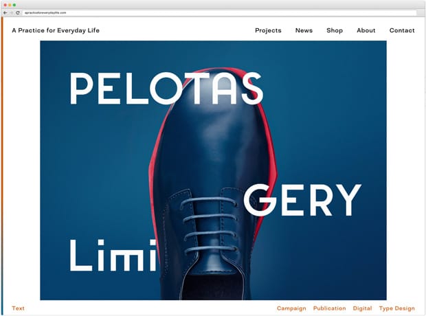
Enigmatically sparse for a long time, APFEL's website exploded yesterday, with a new design and forty unseen projects. Kirsty Carter explains their typically intelligent and precise approach to the studio's new online presence.

It’s been five years since we launched our last website, so we took this redesign as an opportunity to do a complete review both of how the site works and of how we present and record our work. We spent a lot of time together in the studio discussing what it was that we wanted our website to do for us, and how best to present our projects in order to give visitors to the site a really nuanced understanding of what we do. These conversations formed the starting point for us to piece together a new site structure and functionality—it was a big but enjoyable challenge to work out how it all fit together. We were thinking about the idea of a website as an ongoing archive of our work, and wanted to create a site that would cater equally well to different types of visitor: from those who want to gain a quick understanding of who we are and what we do, to people with more time and interest in looking closer and really exploring the details and context of our work.
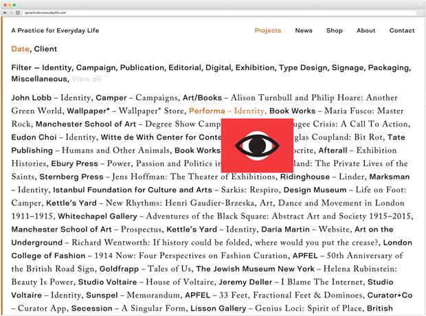
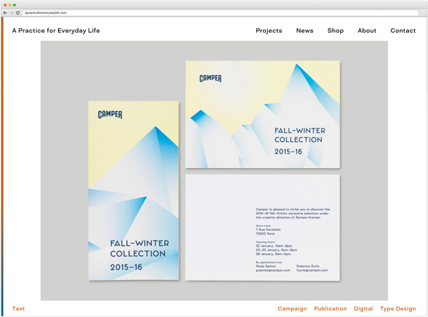
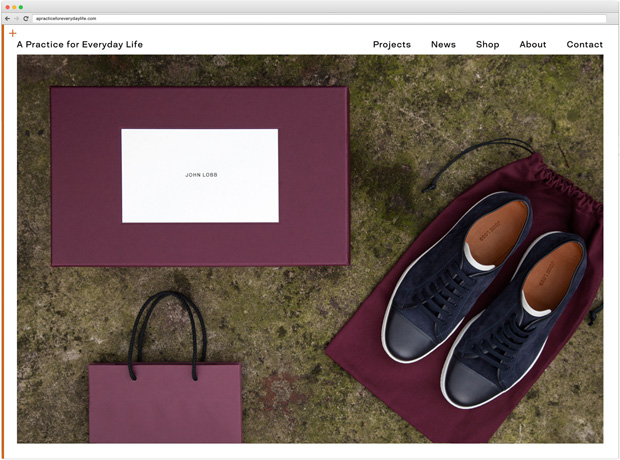
Along with the photography we were commissioning for newer projects, we decided that it was important to re-shoot a range of our older portfolio images, to create a sense of continuity throughout. We’ve worked with many photographers over the years to document projects, and the way that we art direct this has also evolved, so it made sense to bring this into line where appropriate. The new images are a mixture of studio shots and art-directed photography taken on location, where we worked with photographers selected to suit the project, and captured images of our designs in situ. We wanted to add some variety in to the grey-background packshot style photography we’d used before.
The way that the images are presented on the new site allows us a lot of control over the narrative and emphasis of each project. The art direction of each entry was as great a concern for us as the overall design of the site, and we spent a long time sequencing our images to draw the viewer in. Contextual images, installation photography and detailed close-ups have been interspersed throughout the project photographs, so we can add emphasis to certain details where it’s relevant.
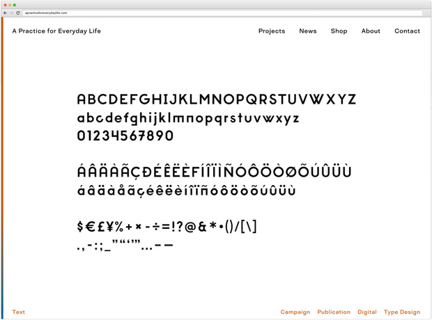
We introduced a whole new section of work on the site, Type Design, which was never really represented on our previous site. Type design is a huge part of the output of our studio and has always been part of our work, but we’d never celebrated this on our site before, regarding it as part of the process rather than an end result in its own right. We realised that this is something very important for us to illustrate on our site, both to show what we have already done in this regard but also to show visitors that we do design our own typefaces as well as work with existing ones.
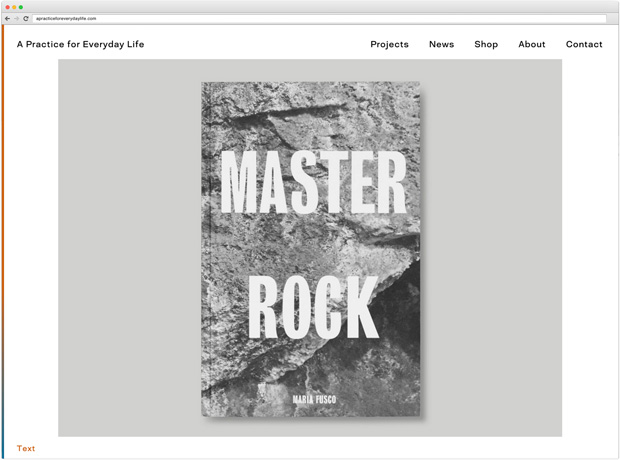
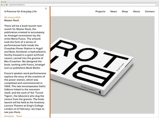
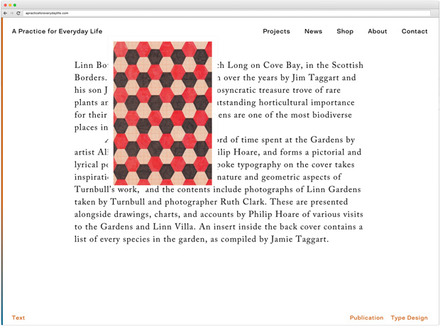
Another important change on the new site is the way that we present text content. We’ve always spent a lot of time on the written element of how we present our work, and we wanted to celebrate this in the new site. We were also keen to be able draw out more details and expand upon the context of specific projects, without the texts becoming unwieldy. To achieve this, project descriptions are now included as individual slides on a project page, and we’ve added footnotes, so that additional information can be shared to add another layer to the experience of the site. In some cases this could be information about the typeface or materials used, in others it’s a snippet of historical information that’s relevant to the project’s context or concept. We’ve also used it to add reference images we’ve collected, to express and illustrate even further the studio’s emphasis on research, context and thought and how this feeds into our designs.
APFEL news is now integrated into the front page of our site—we always felt that the blog was one of our real strengths on the old site, and also the part most frequently updated, so it seemed a shame to have it tucked away on a parallel Tumblr site. It now runs on an overlay, like a ticker banner, on the homepage itself so that visitors to the site can immediately see our news alongside the main slideshow of key projects.
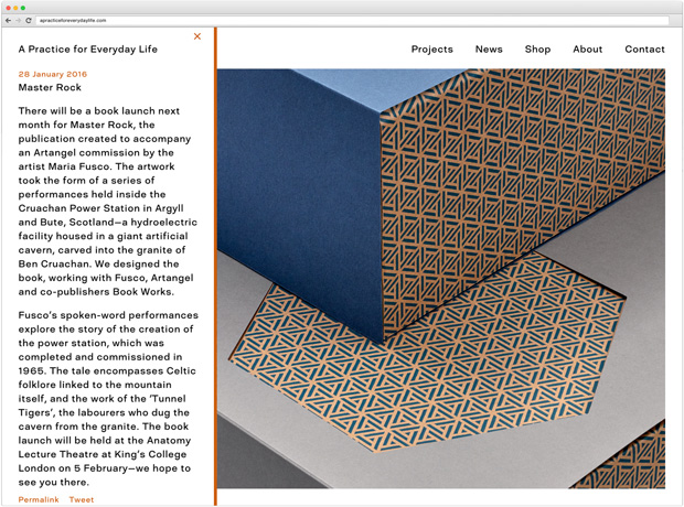
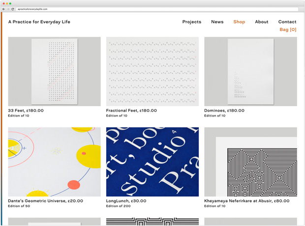
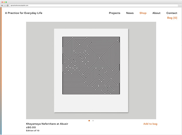
Perhaps the biggest new addition to the website is our APFEL Shop, which is something the whole studio has been wanting to make happen for a long time. We’re now selling a selection of our prints, posters and products on our website, some picked from the APFEL archives and some created especially for the launch. We’ll be adding to the range as time goes on, and are looking forward to the opportunity to come up with new products and designs in the future. We even designed a special range of APFEL packaging for the shop, which really brings it to life.
The site was built by The Workers, and it’s been a pleasure working with them, both to see them bring our ideas for the site to life but also to have their input and expertise, which has been really valuable as we were developing our plan for the website’s functionality and features.
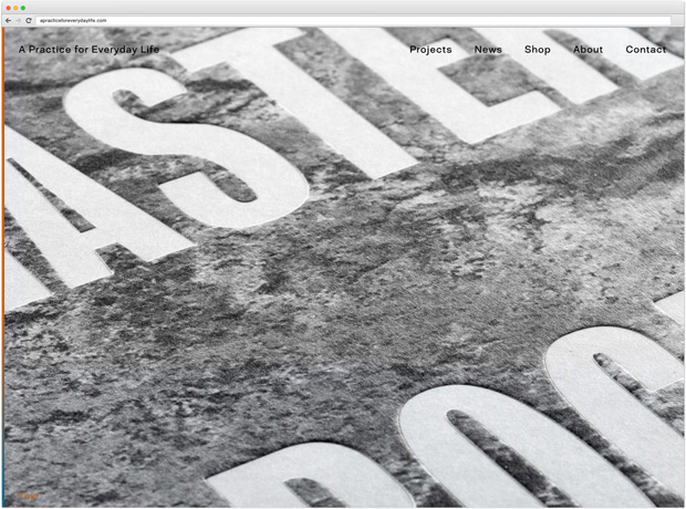
Peruse the new APFEL website.
And visit the shop.
See more by The Workers.

