
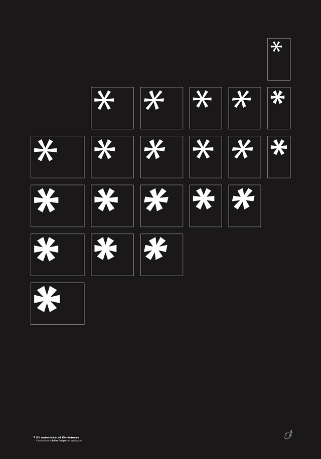
Over the years, the humble asterisk (or ‘little star’), has had a myriad of different applications. Stephen O'Neill (aka Typechap) pays homage to the asterisk from the typeface Univers, a glyph which Frutiger decided not to include in the typeface's first incarnation. It almost goes without saying that the creative world has lost some of its leading lights recently – notably for typographers, the legendary Adrian Frutiger passed away last year. Of course his masterpiece was the Univers typeface – I always loved the beautiful type specimens from type foundry Deberny et Peignot – a perfect way of showcasing this incredible system of letterforms.
I used these specimens recently as a reference for a Christmas poster that I was designing – the plan being to use the asterisks as snowflakes. However, after looking at the original type specimens for Univers, I realised that no asterisk had been created when the typeface was initially released, only in later editions. It appears it was added in collaboration with Linotype (quite odd I thought, as the asterisk has been in use for hundreds of years – perhaps Frutiger felt it wasn’t necessary at the time?).
A bit of background on the humble asterisk, then. The word asterisk derives from the Ancient Greek ‘asteriskos’ meaning little star. It was intially used much the same way ellipses are nowadays – in a set of three to show an intentional omission within a passage of text. It also started to appear in old family trees in the 15th century – the asterisk would be put next to a date of birth (while the dagger or cross symbol would be put next to the date of death). Of course, it‘s been used and misused in a myriad of correct, incorrect and profane ways ever since.
While creating the poster, I took a much closer look at the asterisks for Univers. They all have a certain liveliness to them, which initially seemed in contrast to the overall steadiness of the effect of the Univers letters combined. This made me look even closer at individual letterforms from the Univers typeface and everywhere I looked they had quirky features. The extended ‘5’, and condensed ‘5’ for example – all with their own characteristics but enough similarities to make them work together. To be able to create a typeface with so much personality and still have twenty-one weights working in perfect harmony was a phenomenal achievement.
So as a festive tribute to Mr Frutiger, I took the asterisk, an unsung hero of the Univers character set, and elevated it to star billing. No surprise, on the poster they all worked harmoniously together across all weights. “Helvetica is the jeans, and Univers the dinner jacket,” said Adrian Frutiger – whether this means the asterisk is the dickie bow or not, it‘s certainly the prettiest star.
typechap.com
Typechap...
…AKA Stephen O'Neill, is an art director, designer and visual artist living in London. His website contains his burgeoning collection of fascinating old letters and signage (much of which is from Andalucia), which he describes as “vernacular and occasionally spectacular.”
The Asterisk…
…is often used as a substitute for the letters of a word deemed too offensive to write in full. Unlike the tabloids, The Guardian's policy is always to write the word in question in full, but swearwords only appear in direct quotes. In 2012, this resulted in 808 “fucks” and 69 “cunts” being published. The latter was considerably more than the previous year's tally, the majority of ‘C word’ uses being down to the Chelsea footballer John Terry, and the paper's extensive reporting of his trail.