
In this Archive piece from Grafik 181, Max Leonard takes a tour through the surprisingly rich world of bicycle logo design, from marques invented by artisan frame-builders to branding and corporate race sponsorship. Illustrations by Andrew Edwards.
Design and cycling have a relationship characterised by extremes: the functional beauty of a classic steel road bicycle; the garish ugliness of 1980s professional Lycra kit.
In a sense, for all frame-builders, the frame is the distinguishing mark, a logo in itself. This was most true in the 1930s when British frame-builders were forbidden from placing their name on their racers’ bicycles, the rationale being that this ‘sponsorship’ would compromise the amateur sport. Some, therefore, deformed tubes in patented patterns so that the bike rushing onwards to glory would be instantly recognisable in the following week’s cycling press.
Yet bicycle logo heritage runs rich and deep, its early course, for the large part, outside the design establishment. Traditionally, top road bikes were built by hand in one-man workshops, by artisans producing a few hundred bicycles a year for local riders. A few engaged with logo design as a branding discipline, but one feels that many would much rather have been building frames. The physical constraints imposed by the bicycle doubtless also concentrate a logo designer’s mind. A traditional frame is made of steel tubes one inch in diameter – there is only so much usable surface area. Long waterslide decals on the down tube and a badge on the head tube are the norm.
Despite, or because of, these factors, there is a common aesthetic and an iconography, inspired by the spirit of competitive cycling, technological innovation and notions of craft and heritage. What follows only scratches the surface, but showcases five themes through some outstanding designs.
01 Signatures and Logotypes The simplest maker’s mark – and one that suits bicycle tubing – is a signature. Traditionally, Italian builders signed their frames on the top tube, calling attention to the act of creation, the frame as art.
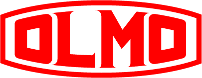
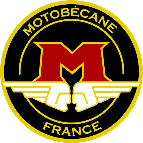
Many companies have used cursive script, or a fancy bold serif or gothic font, conforming to certain ideas of elegance or craft. Campagnolo, the components manufacturer, turned to Pittarlin, a painter, to design its logotype in the 1930s; Giuseppe Olmo, a retiring racer who turned to frame-building in the same period, paired traditional script with a contemporary, blocky logotype, recalling a brand in the word’s original sense. Motobecane, a French company, made motorcycles before bicycles; its monolithic ‘M’ reflects these industrial – rather than artisanal or ‘authored’ – roots.
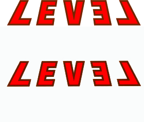
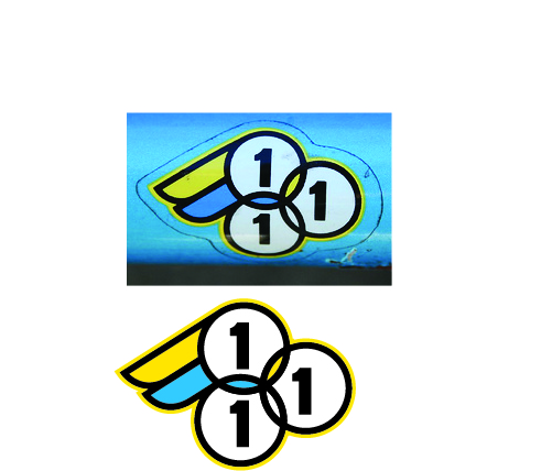
Japanese frame-builders have often used Roman alphabet, perhaps inherited from the Italian master builders with whom several of the Japanese learnt their trade. Keirin, state-sanctioned bicycle racing, was established in 1947 by the departing US troops — another possible source. 3Rensho (pronounced ‘san rensho’), despite its exotic name, has a logotype resonant of traditional Western designs. Level, by contrast, has taken the incomprehensible lettering and made it modern and graphically pure, in perfect symmetry along a vertical axis.
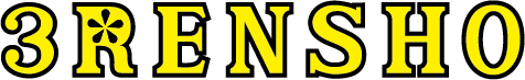
02 Racing and Bicycles The bicycle head tube affords space enough for a crest, often made out of zinc or brass, and predates the car bonnet as a branding opportunity. Images of global renown or competitive success became widespread; the world champion’s rainbow stripes and the Olympic colours, rings and torch often featured on the logos of marques whose bicycles achieved success in these arenas. 3Rensho’s decal refers directly to sporting achievement: three wins are necessary to triumph at a keirin meeting.
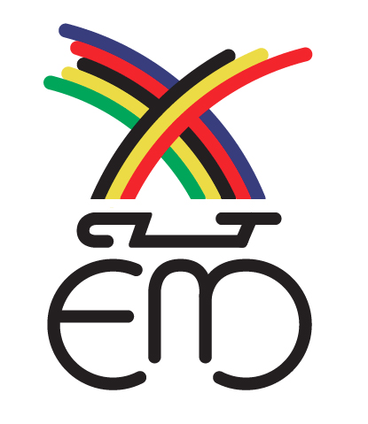
Eddy Merckx, nicknamed ‘the Cannibal’ and winner of all of cycling’s top accolades, is widely considered the greatest cyclist ever. He founded Eddy Merckx Cycles in 1980, after he retired, although he also competed on bikes bearing his name. This logo dates from the later period. Through it (together with his portrait, which adorns many Eddy Merckx bikes and has aged as he has), the champion figuratively embodies the bicycle, promising a transmigration of his legendary power into those who ride his frames.
Other firms deconstructed the bicycle for their logo. Campagnolo’s success was founded on the quick-release axle, invented in the 1930s by Tullio, its founder, halfway up a mountain as he struggled to remove his wheel. Consequently, the quick release is central. Once quite ornate, a simplified version can be seen engraved on Campagnolo alloy parts.
03 Head Badges and Heraldry Less explicable than the racing-related logos are the heraldic escutcheons favoured by many brands. The bicycle is a great leveller, formerly a symbol of working-class mobility and emancipation, so there is no aristocratic aspiration, simply a patriotic or regional, even tribal, pride — much like football club crests. Plus a certain combativeness: the bicycle, the usurper of the horse, was the steed these latter-day knights rode into battle. Many of these crests would have been designed or suggested by the badge-makers themselves, using a common stock of emblems.
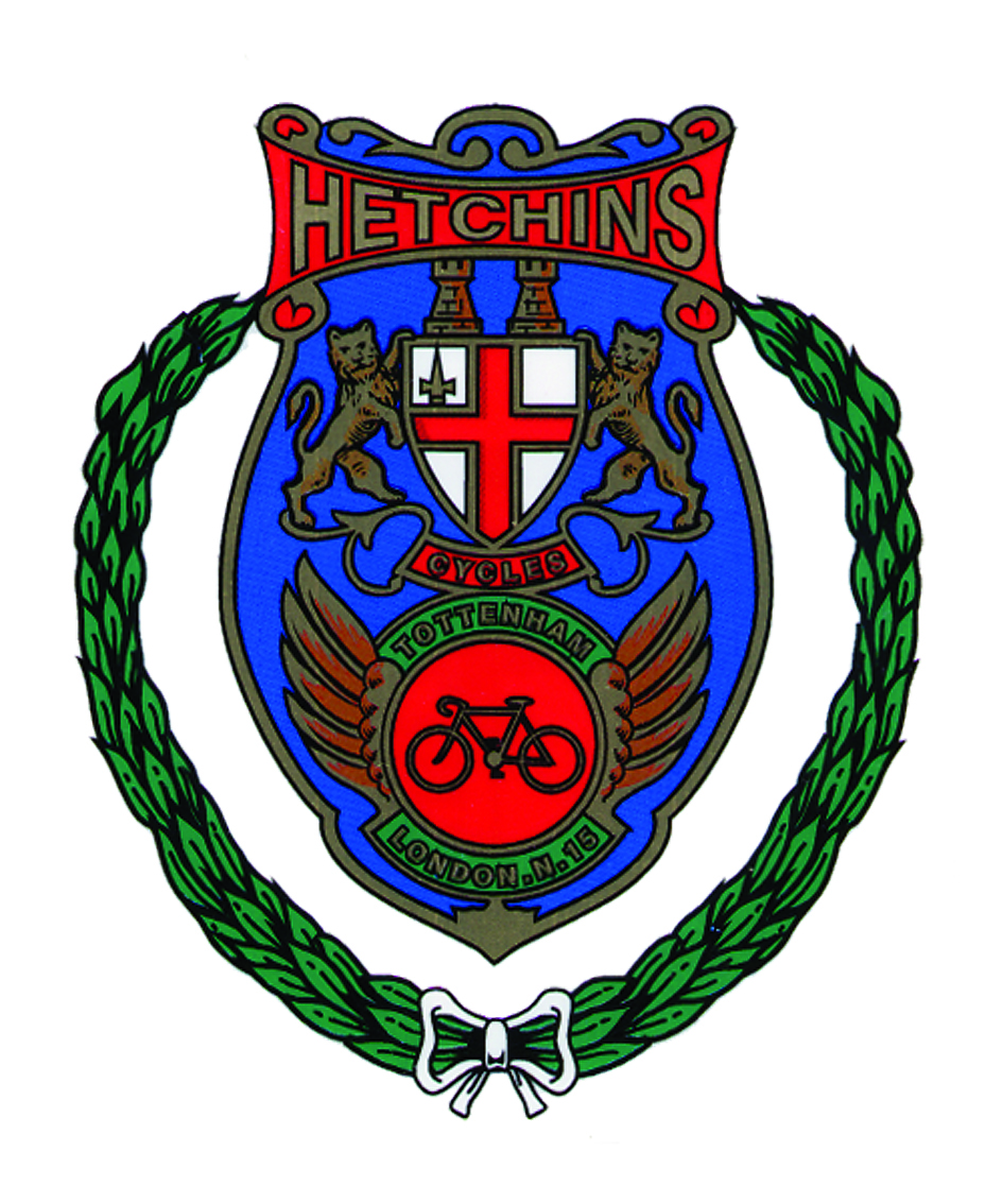
When Hyman Hetchins, a Russian immigrant, began building bikes in Tottenham in 1934, he took on the shield of the City of London, his adopted home, and the totemic lions of England. After a Hetchins ridden by the German Toni Merkins won the 100m sprint in the 1936 Olympics, the Olympic colours were displayed in the background.
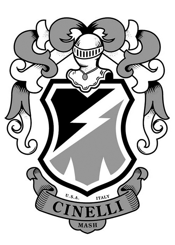
Cino Cinelli, a racer from Tuscany, started building bicycles in Milan in 1948. His badge displays the biscione (a snake eating or giving birth to an infant) and the fleur-de-lys, the traditional heraldic symbols of Milan and Florence respectively.
Thanks to the explosion of interest in track bikes, this classic coat of arms has been appropriated for a new generation. Designed by Benny Gold, the revised head badge adorns the Mash SF Cinelli bike, made by the San Francisco collective for aggressive street riding.
04 Birds and Wings Birds and wings are ubiquitous features of bicycle logos worldwide and span all eras. Bicycles and birds of course signify a romantic leap, a flight of fancy. A bicycle gives freedom, speed and command of the landscape; riding one downhill may be the closest we ever come to the sensation of flying unaided.
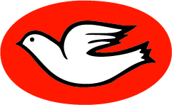
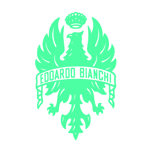
Bianchi’s eagle head badge is reminiscent of fascist imagery, yet the company was founded in 1885. Ironically, Columbus’s dove has more links to the Italian fascists: the company, which makes steel tubing, also made piped-steel furniture – elegantly cantilevered desks and chairs – in Mussolini-era Italy. In 1978, Columbus bought Cinelli; if the combined company features heavily here, it is because Antonio Colombo, son of Columbus’s founder, has long engaged with the graphic arts. He immediately set about reworking the Cinelli coat of arms, and the winged C, designed by Italo Lupi, endures to this day.
While the Columbus dove plays on the family name, Flying Pigeon, from the other side of the world, seems predicated on a misunderstanding. Who would want a bike named after sky rats? Yet pigeons and doves are close cousins, and there are an estimated half a billion Flying Pigeons, the original workers’ bikes that crowd Chinese cities, in existence.

05 Sponsors/Peripherals Since its inception, road cycling has been surrounded by clubs, sporting associations, sponsors and promoters who have appropriated its visual spectacle, or used professional cycling’s aura, to spruce up their own public image. Advertising has always been visually savvy and, in Europe especially, early cycle racing and commerce are closely intertwined.
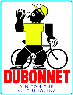
In the early Tour de France, riders would descend like locusts on the villages they passed through, raiding bars for as much food and drink as possible. Some bar owners sent the Tour de France a bill; others shut up shop for the day. In reality, only ‘doméstiques’, the teams’ minor riders, would stop, then ferry beer back to the race leaders, but this Dubonnet advert shows the Tour leader stopping to drink the brand’s fortified wine. Good enough for the yellow jersey: an astute piece of promotion. The artist, A.M. Cassandre, later designed the Yves Saint Laurent logo.
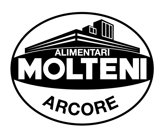
No sponsor has been as closely associated with the romance of cycling than Molteni. The company – which made sausages – sponsored a pro team from 1971 to 1976, a team that included the rampant Eddy Merckx. Thanks to Merckx wearing its kit, Molteni has virtually trademarked a certain shade of burnt orange. This graphic appeared on caps and ‘musettes’ (feed bags).
This piece first appeared in Grafik 181, January 2010