Craig Burston looks back at Design Research Unit – the pioneering multidisciplinary group of designers responsible for creating some of his earliest graphic design memories.
When I think back to growing up as a kid of the 1970s, there are a few things that I would describe as formative visual influences, things that I saw in everyday life, that drew me in and encouraged me to think about the way we see the world. Watching pop groups on Top of the Pops was a never to be missed weekly diet of new visual stuff, well before I'd started collecting music. My earliest Top of the Pops memory is of the leather clad Suzi Quattro performing Devil Gate Drive. I remember it as if it was yesterday and I don't need YouTube to remind me of the eye popping spectacle of the early special effects melding Suzi into the backdrop and then the backdrop dissolving into a series of never ending tunnel of squares and then back to Suzi and on and on for three perfect minutes of pop television. Note to self: presumably they used green screen as I believe the BBC pioneered this technology for Dr Who. Anyway, I digress…
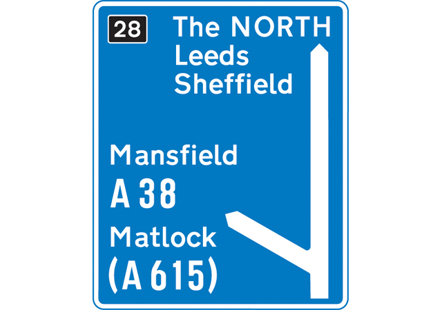
Away from pop culture (as I learned it was referred to in the refined circles of design and academia) there was an equally brilliant form of visual stuff that I loved (and learnt from) that lacked the dazzle of Day-Glo tele and that was road signs. I loved them. This isn't some pre-emptive strike to win nerdy points with the design community, I was fascinated by them and their simplicity, but that simplicity would only reveal itself if a grown up explained the codes and rules. On car journeys I'd ask my dad to explain the them as we drove by. "That one means no turning left" or "no overtaking" or on longer journeys on a motorway (motorways really were the destination to the future (or Blackpool)) you'd get to see the blue ones. "That one means the end of the motorway" which was always a little disappointing as it meant we had to slow down but then we'd get back onto the roads with the green signs.
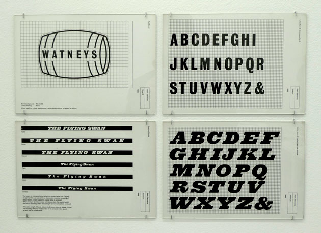
Away from road signs were pub signs, I quite liked pub signs when I was a kid too. And from pub signs (which I grew tired of more quickly as they were all about lions, dragons, horses and monks, not very modern d'y'know what I mean) were pub companies like Bass, Whitbread and Watney's. The red triangle that Bass used (and still do) was pretty pretty interesting, but Watney's had this ace little red barrel thing which I always likened to the one around a Saint Bernard rescue dog collar. So if you got lost up a mountain they'd send a dog up to find you and when it did you'd be given beer for its life giving purposes? "Cool.” Watney's pubs also had this great writing on the windows and on signs above the doors and windows. You could tell it was a Watney's pub without looking at the old fashioned pub sign that swung above the door.
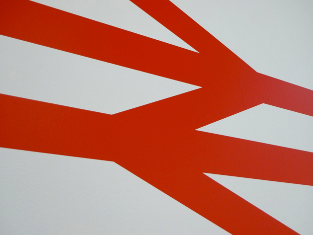
And then the final example of favourite formative visual influences from my childhood was British Rail, or more acutely, its symbol. Yep, got to thank my dad for this one too. When asking what it stood for he simply replied “it means taking you there and bringing you back.” Two arrows, top to tail, interlinked, that looked a bit like a train track. All I could think was that the people that think of these of these things and then draw them are geniuses. I was in awe of all of it. Road signs, pub signs, train signs.
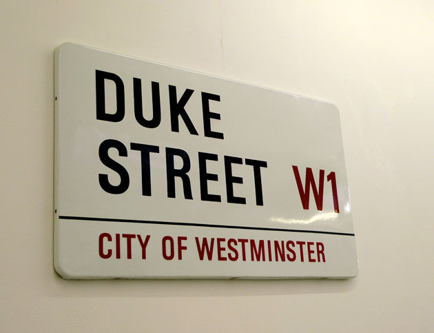
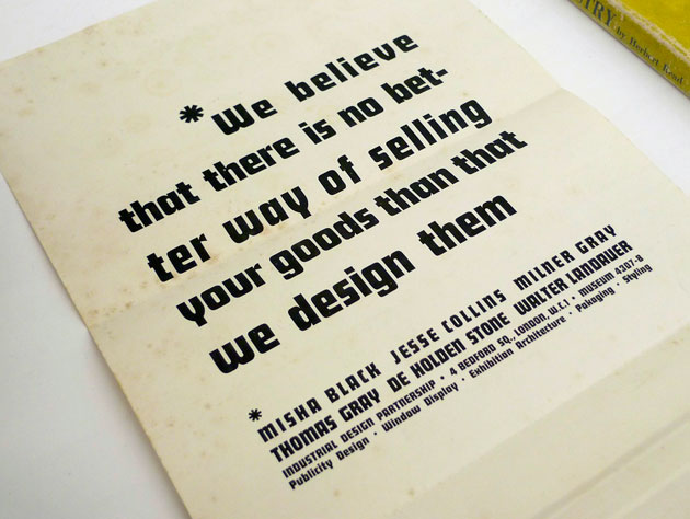
Now, I would imagine if you've got this far dear reader, given that you're reading Grafik, the big reveal that these were done by the Design Research Unit (and in the case of the motorway signs, by the ex-DRU designer Jock Kinneir, along with Margaret Calvert), will come as no surprise. But put yourself in my shoes. I grew up before the internet, before cool collectable coffee table design books. Before it was remotely conversation-worthy to say that this kind of thing gave you a mental tingle. And as for picking graphics at school, not a hope. I don't even think the term graphic design was uttered by any teacher in my school. There was technical drawing and art and nothing in between. So who did this stuff for a living? It was only later, a decade or more later in fact, that I started my own digging into design history that I discovered that was this particular group of individuals, who joined forces and worked as Design Research Unit, which is as cool a name for a collective as it is possible to imagine. They weren't interested in designing for other designers. They were public facing problem solvers. Their work is what I think of as the high watermark of popular modernism and communication design for all; forward thinking, unpatronising, democratic, always sober occasionally witty, always brilliant.