Christoph Niemann is the unopposed master of the visual one-liner. Molly Collett catches up with the brilliant German designer about his retrospective at the MAK in Vienna, drunk drawing and New York vs. Berlin.
Christoph Niemann doesn’t get recognised on the street. He’s been asked for his autograph at the checkout of an art supply shop, when the cashier recognised the name embossed on his credit card. But otherwise, one of the world’s most popular designer-illustrator-columnists goes about his life fairly uninterrupted. He’s not in the least bit bothered by this: “I don’t have to be famous,” he grins. “My drawings are.”
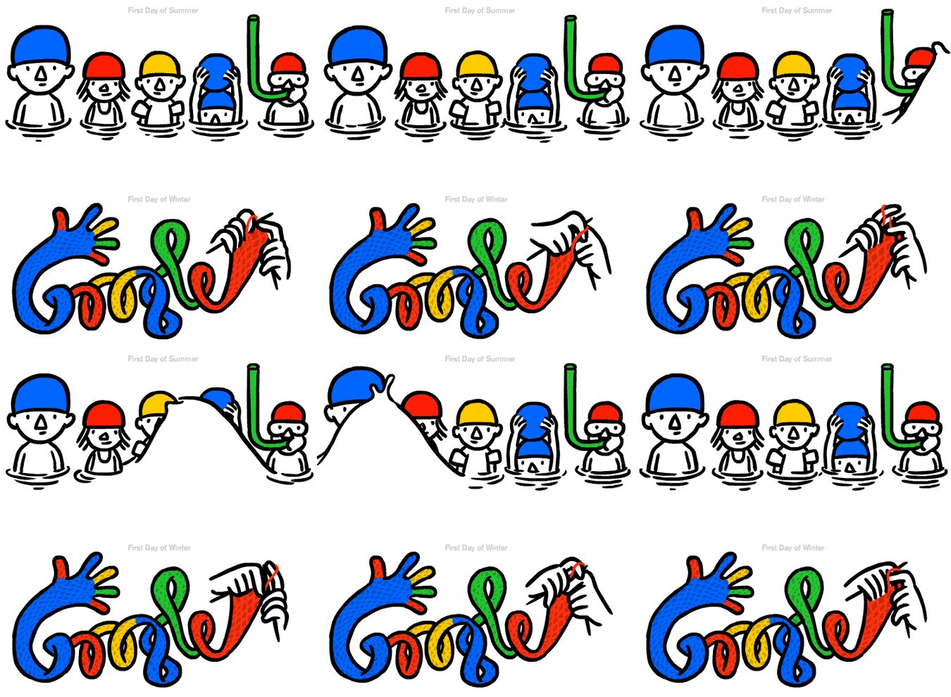
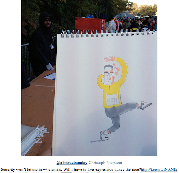
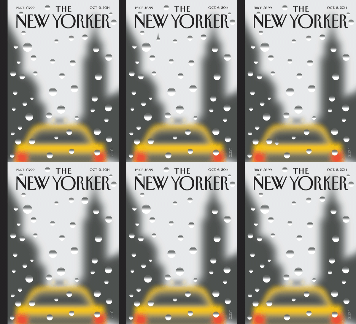
If you use Google, have seen a copy of the New Yorker at a newsstand, or are culturally involved in the Twenty-first century, you’ve likely encountered Niemann’s work. His clients include Google, MoMA and WIRED magazine and he’s illustrated the covers of Time, The New Yorker and ZEITmagazin. He is also a visual columnist for The New York Times; has written books like I LEGO New York, which is essentially a love letter to New York fashioned out of Lego; and in 2011 illustrated the New York City marathon – while running it. These are just the sort of madcap design adventures Niemann regularly embarks on that have defined and directed his career.
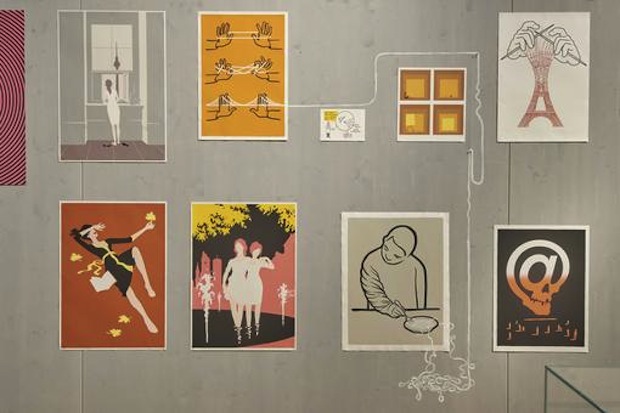
His latest project has been a show of his work at the MAK in Vienna this summer. Christoph Niemann: Drawing the Linewas curated by Kathrin Pokorny-Nagel and then embellished by Niemann (“embellishing” being the professional term for “painting on the walls,” which was actually his main contribution). Throughout his career, Niemann has seen his images displayed across many different media and platforms, but feels that the gallery setting is unique. He observes: “There’s something quite different about seeing images when you’re holding them in a book or magazine, and seeing images when they’re up on a gallery wall, and you’re totally surrounded by them.”
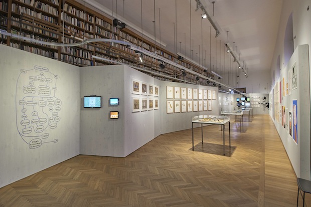
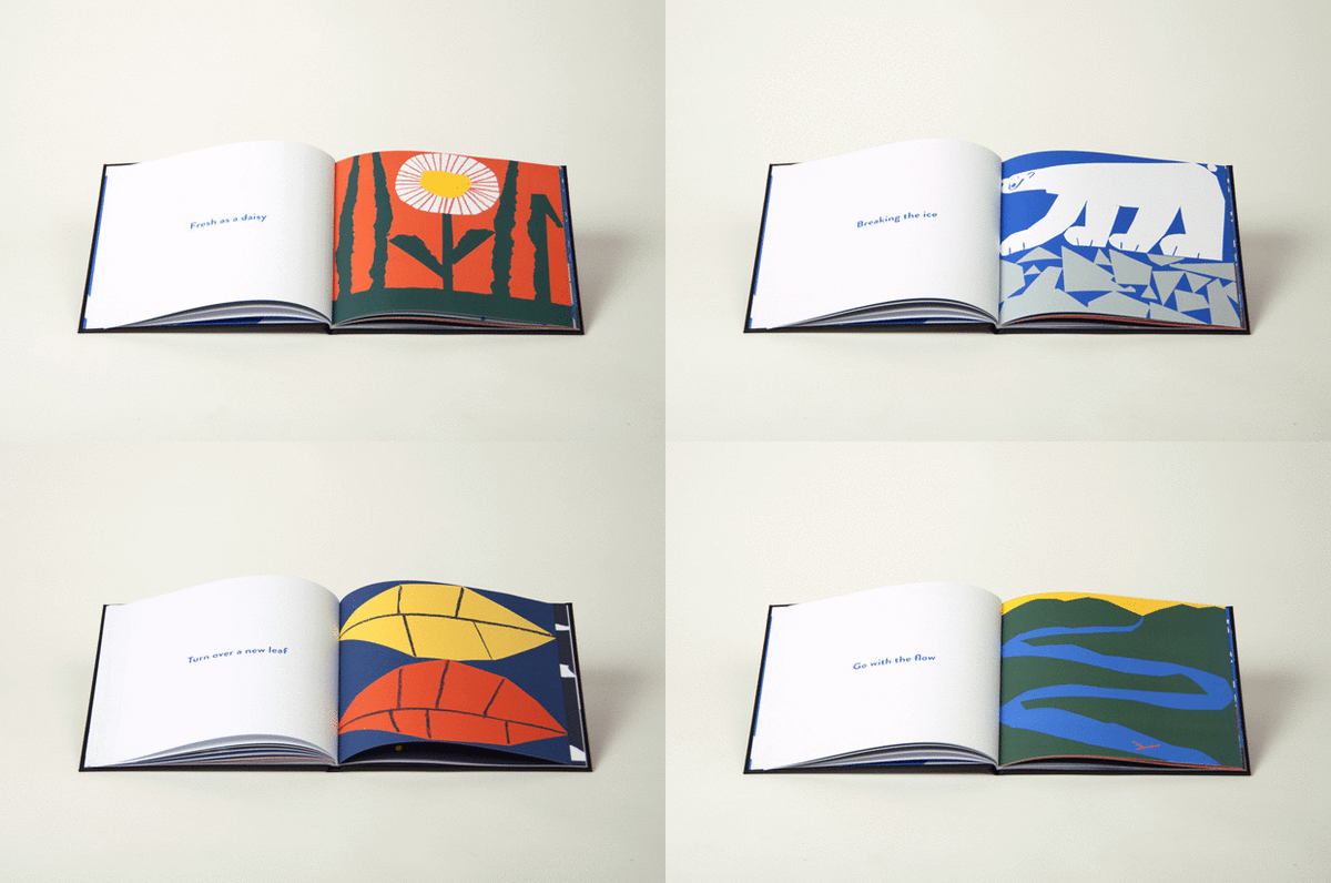
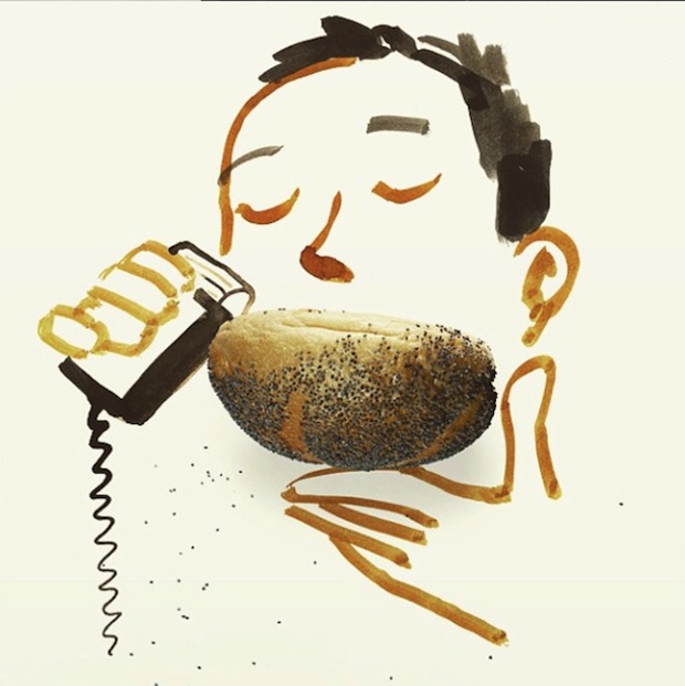
Being totally surrounded by Christoph Niemann’s images, his distinctive style becomes apparent and it’s easy to see the broad appeal of his work. Rendered in bold lines and bright blocky colours, the images have personality. They walk a signature line between cartoonish and conceptual: like a visual one-liner, a lot of thought is compressed into a simple sketch. Niemann is inspired equally by important current events and trips to the supermarket, which translates into an idiosyncratic body of work that is smart without being serious. He’s also just very funny.
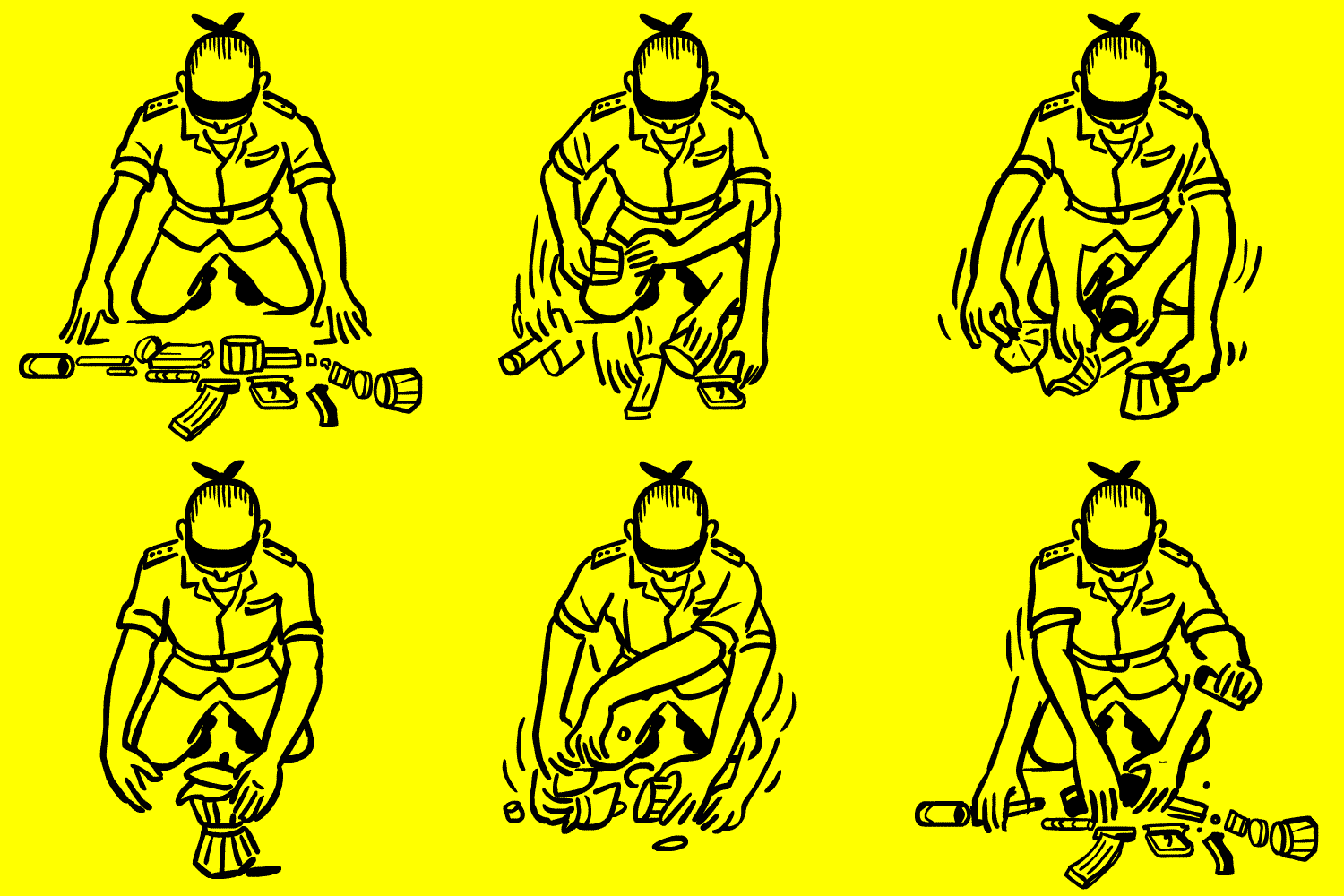
Not that Niemann gets to laugh at his own jokes. “The images are a lot more fun for the viewer than they are for me,” he admits. This is because the viewer doesn’t understand the process; the creator, on the other hand, is in complete control of the process and has spent about five hours probably deciding on what percentage of magenta he wants in the final proof. And there’s honestly nothing funny about five hours of magenta. It takes a lot of work to look this effortless.
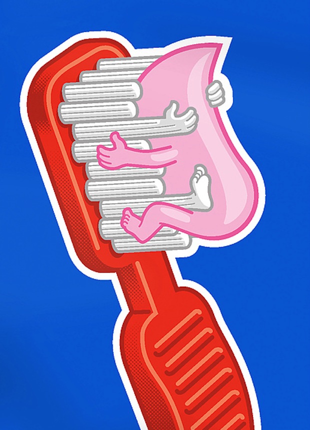
Niemann’s diligent, unfunny work ethic is informed by his selfless understanding of the profession: “I’m less interested in art that makes the artist happy.” He believes that the way a designer feels when creating doesn’t really determine the outcome of the work. “It’s like drawing when you’re drunk,” he laughs. “You think it’s great at the time and then ten minutes later you realise actually, no, it’s not.” Because of this, you’re not likely to find Niemann sitting in the lotus position waiting for inspiration to strike. Rather, he’s in the studio at 8:30am every morning, getting down to business whether the inspiration is ready or not. For Niemann “design is a nine-to-five job, but it’s also 24/7: I stick to a strict work schedule, but I also never stop thinking about it.”


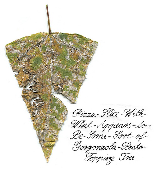
Having a schedule allows Niemann to structure his day around a few golden hours of creative thinking (the rest is “sending emails and colouring in”). He muses, “I’ve never had more than five consecutive hours of super-productive thinking. And that was my best day ever.” Christoph has designed through the huge shift from analogue to digital design, and technology has made his job much faster and slower. An animation, for example, which used to take a week and a team of professionals and a budget, is now a day’s work for a designer with the right software. But at the same time “you need to stay off the internet for more than five minutes at a time.”
The digital watershed has also made the designer’s job less location-specific. When Niemann started out, “you really needed to be where the work was at. Now you just need to be able to email to where the work is at.”
This probably comes in handy to Niemann, who would otherwise have to commute to New York City from his home in West Berlin, where he moved in 2008 with his wife and two kids. Having lived in New York for eleven years prior, Niemann felt like he was falling into a routine and saw his trans-Atlantic relocation as an important disruption. He found the New York City creative industry to be extremely stressful and exciting, but, eventually, “you get used to being freaked out all the time, and then it’s time to move.”
He chose Berlin because “it seemed cool.” He’s stayed for six years because “it turned out it is cool.” Whereas New York is a productive, focussed environment, Berlin is relentlessly artistic and risky, less concerned with whether something’s feasible or a secure business plan. This unfussed, unfettered environment has opened up new avenues of creative possibility: “I’m starting to run without thinking about where I’m going.” In Christoph’s life and work, the unexpected journey to an unknown destination is always the most worthwhile trip.
Niemann: Drawing the Line
Until 10 November 2015
MAK, Vienna
mak.at
christophniemann.com


