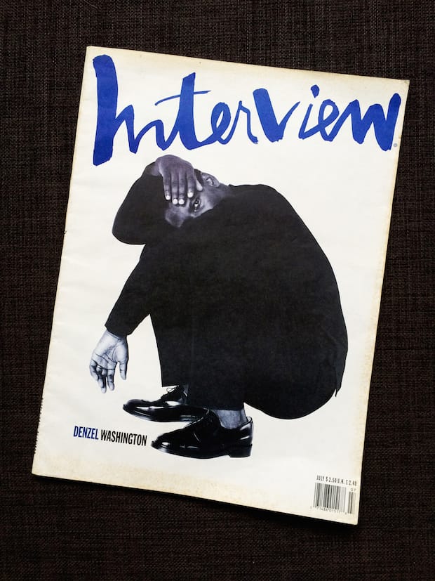
This cover of Interview magazine might have been shot by fashion royalty Herb Ritts, but it was its rebellious cut-and-paste aesthetic that won over a young Hayley Louisa Brown, the creative director of new hip hop magazine BRICK.
When this issue of Interviewwas released, I was fifteen months old. I think I discovered it sixteen years or so later as an art student, wasting time in the college library to avoid having to make a presentation to my class. I hate public speaking. So anyway, the library subscribed to a bunch of magazines that I would regularly take a pair of scissors to before returning them nonchalantly to the shelf. I still have a series of stills from a Kanye West video that I cut out of Creative Review up on my notice board – I’m looking at them right now. But this day, the day of the presentation, I was down one of the quieter aisles looking for a legitimate reason to have missed class – some kind of ‘valid’ research - when I came across Herb Ritts’s book Notorious.
From there I spent a long time uncovering as much of his work as possible, which lead to this Denzel cover. I’d only known contemporary Interview at the time, which I wasn’t a huge fan of, and this cover opened me up to a whole new world. I find all of Interview’s early Nineties covers to be so punk. Regardless of how high profile the photographer or the talent on the cover, they never seemed intimidated by it and continued to have such character, an obvious love for colour and pushed elements of typography. One of my favourite examples of this (and a close contender for this feature) is the Keanu Reeves & River Phoenix cover from November 1991. The way the rainbow of coloured type forms a caricature goatee on Keanu’s face and an arched eyebrow on River. It’s so fun.
The Denzel cover is the antithesis of that, being almost monochromatic in its entirety. The flatness of the black clothes he’s wearing, combined with the odd, hunched pose, has a real zine feel to it. I adore the subtle elements of weirdness such as the absence of any shadow under his feet – that cut and paste disregard for Ritts’s lighting. It throws back to a very DIY approach and to me there’s something inanely punk about the one colour of ink with the black and white and the handwritten masthead. It conjures up memories of Punk zine Slash and suggests the print budget wasn’t big enough for more colours. It was one of my main reference points for the first edition of BRICK.
That I found this cover through its photography, before I had any idea of the magazine’s legacy or even who Fabien Baron was, makes this an obvious choice to me. I loved it before I realised it was by anybody important. You know how sometimes people are into stuff because it’s by a certain designer or it’s popular or they think they ought to? I didn’t have a clue, it was a very naïve appreciation – and it might actually be good that I didn’t own a physical copy of this until a few years ago because the teenage me would have torn that cover straight off and stuck it to the wall.
brickthemagazine.com
Hayley Louisa Brown
It’s quite a rare thing in photography to be able to balance a certain softness of tone and expression while retaining an element of edge, but it’s something that photographer Hayley Louisa Brown nails every time. Specialising in fashion photography, and creating cover images for music magazines (she shot rapper Naz for magazine Clash) she founded Brick earlier this year in response to the lack of UK-based publications intelligently responding to the genre. Working as creative director as well as shooting some of the key imagery, her design approach was to create a magazine that ignored Hackneyed hip hop tropes in favour of a clean, minimal aesthetic. The inaugural issue features interviews with Wiz Khalifa, Joey Bada$$ and Cam’ron.
Interview
Founded in 1969 by Andy Warhol and British journalist John Wilcock, Interview magazine was a popular culture magazine that included artists, musicians, and philosophers and was initially distributed to New York’s in-crowd. Former editor Ingrid Sischy described Warhol’s editorial style as reportage of a vibrant creative community: “Often Andy's interviews were like happenings. Half the world drops by and becomes a part of the interview.” Sischy ran the magazine for 18 years after Warhol’s death before the magazine was relaunched in 2008 with Fabien Baron and Glenn O'Brien at the helm.

