Chris Rehberger, founder of Berlin-based studio Double Standards and co-founder of record label Perlon, tells us about his discovery of IMMERSE, a sleek music magazine with plenty of attitude. It was one of my obsessions on Saturdays when I was living in London: starting the day really early and traveling from Angel to Leicester Square. I would have a coffee and set off window-shopping to the many bookstores on Charing Cross Road long before they had unlocked their doors for the day – not that I had the money to spend on all the beautiful books and magazines I would’ve loved to have owned. It was my intention to just go for an informal stroll, one could call it. Of course, most of the time I spent more pounds than I should have, but who needs to eat anyway?
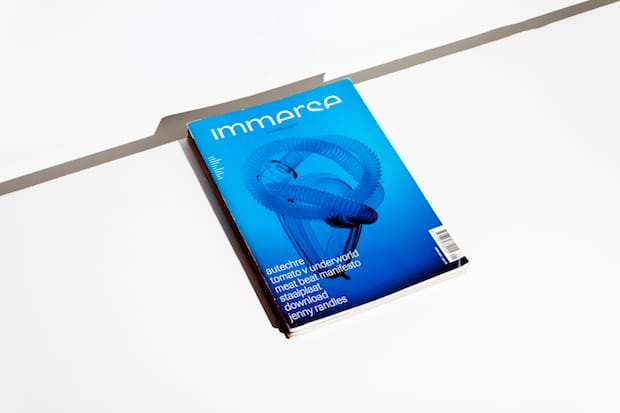
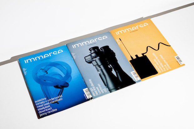
One day (it must have been autumn 1996), this thing jumped off the shelves right at me. It was a bright, shining blue cover with an oxygen mask for a main image, a logo almost cut in half but still legible, and super small type saying:
“Techno
Ambient
Atmospherica
Industrial
Noise
Jazz
Electronica
Fortean
Graphics
Film.”
Well, IMMERSE had me already at that point. Especially as we had just started talking about what – a year later – became our record label, Perlon Records.
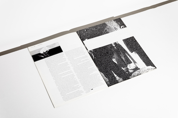
I was fascinated by the fact that it was playing hide and seek. There were different layers of information on every level. The closer you got, the more information was revealed. “This is actually how a good poster should work,” I thought.
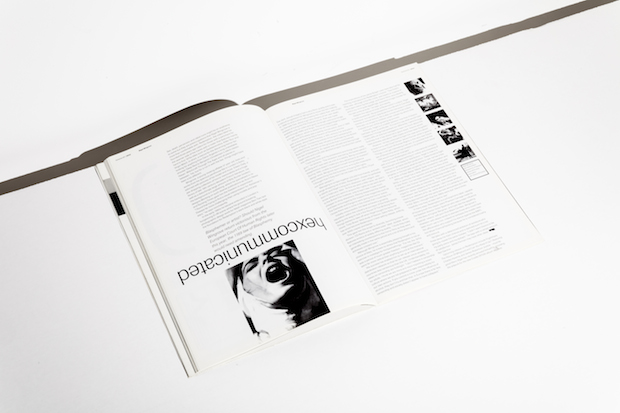
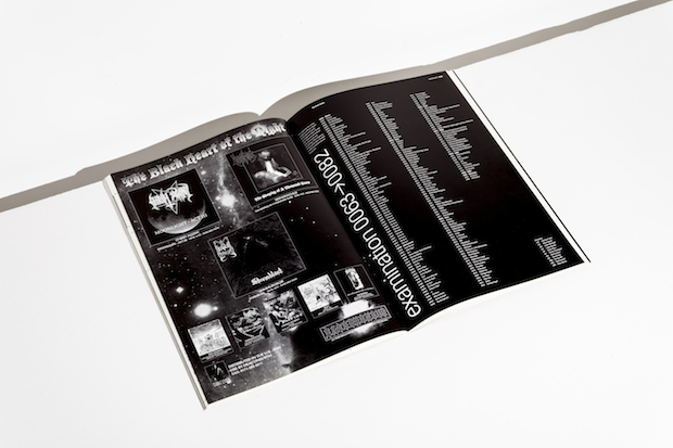
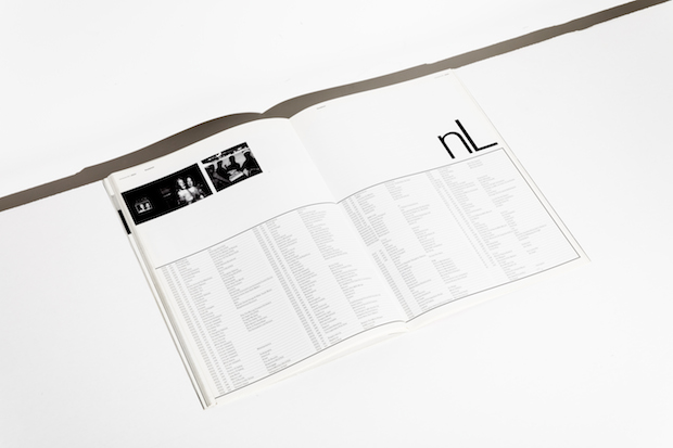
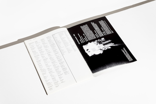
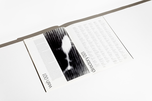
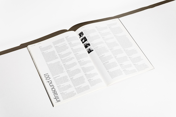
What really impressed me was what happened to me when I opened the magazine. You have your expectations when flipping through music magazines, but this was much better than anything I had seen before. It was all neat, small, black and white type, no-fussing-around typography– although, I wouldn’t have used that typeface myself. Ever since I started studying back in 1987, I always was more of an Akzidenz Grotesk kind of person. Still, it was mind blowing seeing this printed, in the flesh.
I was time-traveling: IMMERSE was a nicely crafted, printed, properly bound version of the punk fanzines I used to nick from my older brother. He would import zines from all over the place when I was eight years old and I always wanted to read their very explicit texts and certainly examine the no-less-explicit images.
These punk fanzines were usually only a stack of stapled black and white copies. They had colour-imbued paper for a cover with an image (which was also Xeroxed). IMMERSE was the much better version. Looking at it from a designer’s point of view, I felt instantly that somehow I was missing this attitude in many designs at that time, especially in editorial design.
Punks in suits.
The writing was fabulous, the layout marvellous, and then there was this one sentence in the imprint that embodied everything that I felt was right about this magazine. It read: “IMMERSE is published quarterly. Issue 02 hits the street once it has been printed.”
Issue 04 is still in the making, I hope.
doublestandards.net
Chris Rehberger
… founded Double Standards in 2001. To say the studio’s remit is broad would be a huge understatement. Its work ranges from editorial design for brands like Vitra to exhibition design for Redbull Music Academy and installations for Lacoste – it’s even put into production a set of colourful mirrors and a table. As well as running the practice, Rehberger is also a professor at Karlsruhe University of Fine Arts and Design.
Perlon
Rehberger co-founded Perlon Records with Thomas Franzmann and Markus Nikolai and has been responsible for all the graphics since its launch in 1996. Established in Frankfurt but now based in Berlin, the label deals in minimal techno, releasing the likes of Portable, Ricardo Villalobos and Shackleton largely on vinyl only.

