Illustration and design duo Gilles & Cecillie gives us the inside story on its weekly work for Le Monde – what's the secret to transforming food writing into visuals and keeping it fresh every single week?
Tell us the background of your weekly illustration for Le Monde's restaurant review...
Le Monde has a weekly magazine called M Le magazine du Monde, which is out every Saturday. The review is called Deuxieme Rideaux where restaurants and eateries in Paris, and occasionally in other cities depending on the theme of the magazine, are reviewed. We have been illustrating this article since the beginning of January 2015. We are really happy to work on this project – it is interesting, inspiring and every week we are eager to receive a new text and create new ideas.
What's the trick to turning a writer's words into an engaging illustration?
We pick the words and meanings which we find the most descriptive and inspiring and combine them to create a concept for the illustration.
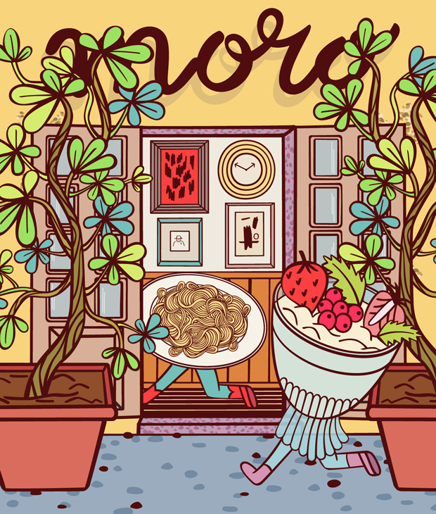
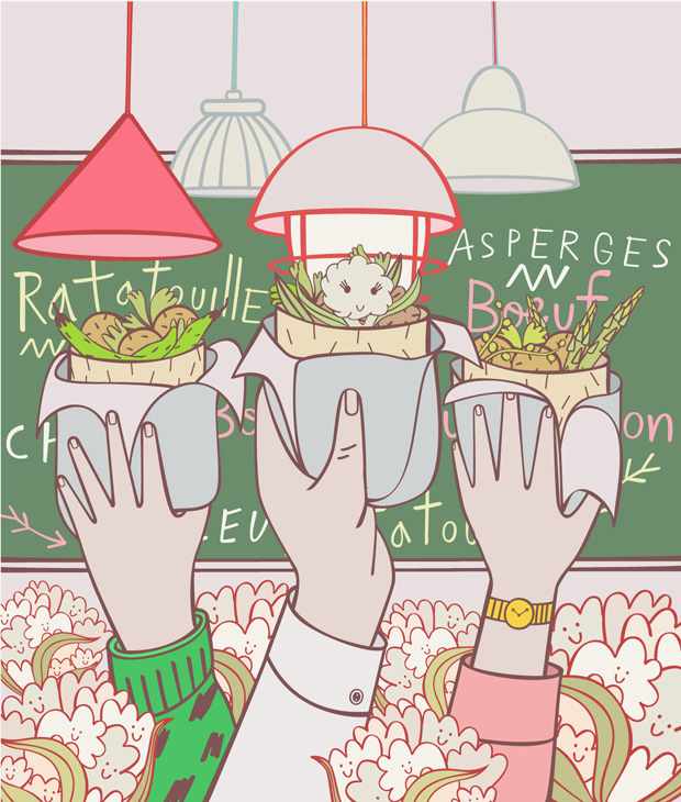
We want to have a variation in our outcome and include humour, situations, illustrate key words and taste.
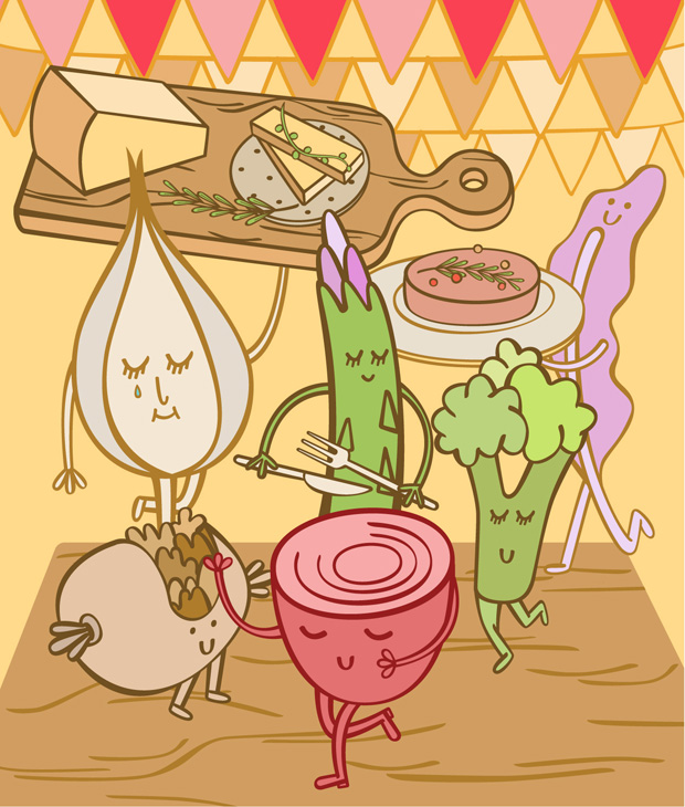
The result should be a dynamic and colourful illustration based on a story.
How do you keep things fresh when you're doing an illustration every week for such a long time?
We do our best to keep it exciting by focusing on different themes each time. Sometimes the interior of the restaurant can be very special, another time it is an exceptional taste to visualise, or an animated description of the atmosphere to draw.
It is great to be able to work with the same client for repeat work. We have the time to build a relationship with the editor, share our ideas and develop a visual expression.
What's the process of making one of these illustrations, from initial idea to final artwork?
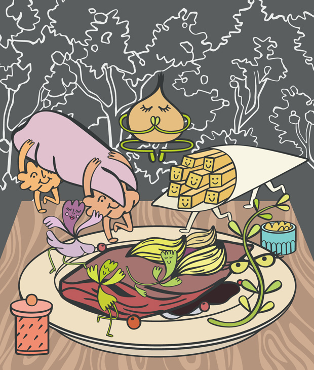
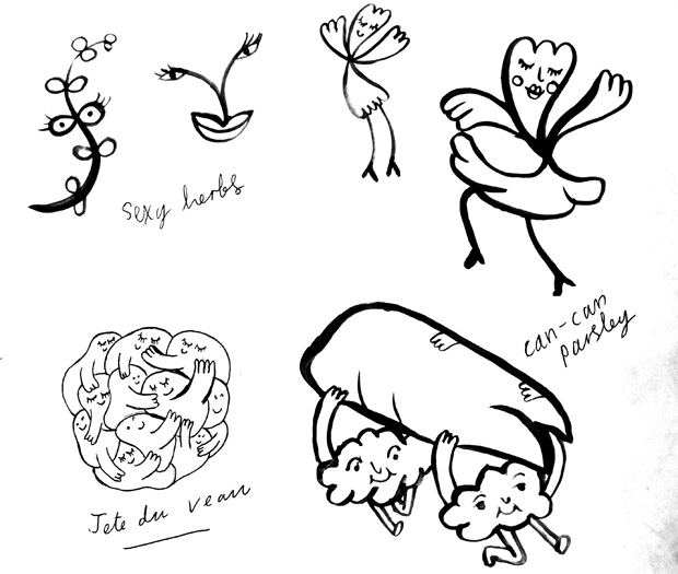
We have to be efficient and fast, since the time from receiving the text to delivery is very short. First, we read the text, jot down initial thoughts and ideas, before further researching.
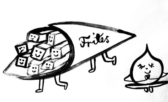
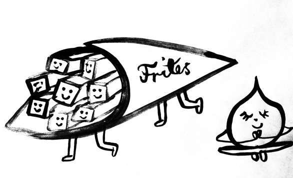
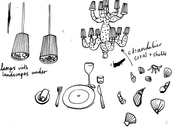
Then, we focus on content and composition, which we sketch with ink and brushes and share with the editor.
With the feedback in mind, we then work in Illustrator to make the final artwork.
What's your favourite from the series and why?
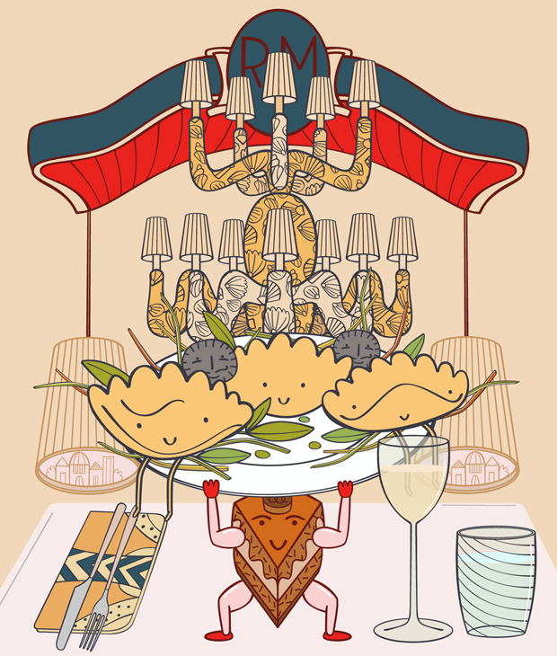
Gilles: My favourite is the illustration for Carpaccio. This is a high-end restaurant and is a place that could be intimidating. We managed to simplify greatly the setting and the image of that restaurant by focusing on a few interior details like chandeliers and the table settings, and to inject humour by giving life to the dishes.
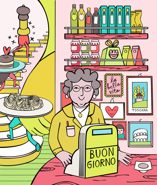
Cecilie: My favourite is the illustration for Pastavino. I love the pasta dishes and the tiramisu that runs up the stairs. Very much like the lady behind the till of the Italian deli as well. We travel a lot in general, and this feeds into our work. I feel we have managed to capture the atmosphere and interior details of typical Italian delis that often have postcards from their home country and photos of family members together with pasta and pannetone on the shelves.
