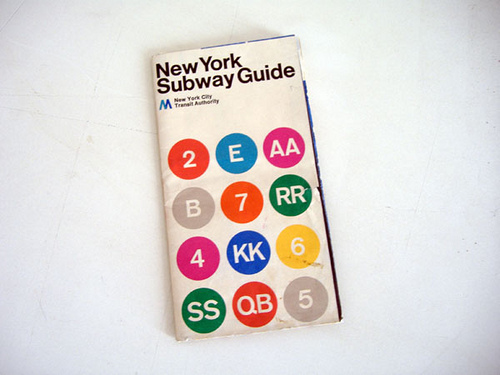
As a tribute to Massimo Vignelli who sadly passed away yesterday, we revisit this interview from 2010 with the man himself, where he discusses his much-loved design for the New York Subway Guide with Kerry William Purcell.
In September 2009, Transport for London (TfL) took the decision to remove the River Thames from Henry Beck’s celebrated Underground map. On the surface, this may not seem like a significant edit of the original design. In fact, in many ways, the removal of the Thames could be seen as entirely consistent with Beck’s decision to disregard the geographical reality of London in favour of producing a diagrammatic map that was simple to read and easy to understand. Yet, for many Londoners, the river serves as an important boundary and, as the writer Iain Sinclair once said, without it “our city would have no soul”. In this instance, removing the river was a step too far. The authority received many complaints, and after Boris Johnson, the Mayor of London, became aware of the omission, he called for it to be reinstated immediately.
The relationship of a map to the topography it seeks to represent has always been a contentious issue. From the earliest maps of the world through to today’s hand-held GPS devices, the way a town, city or country is represented two-dimensionally is imbued with social, political and cultural significance. Yet, the issues surrounding the creation of underground or subway maps present the designer with a rare set of problems. Unlike the streets above, a map of the subterranean world of the underground does not need to be geographically true. To approach it in such a way would only result in a work of enormous complexity, inscrutable to any but the most determined of passengers. Yet the map does need to make sense of the labyrinth of intersecting lines and services that criss-cross the city, as well as providing a point of departure that will enable the passenger to find their destination above ground. In short, such a map needs to be both factual and artificial, a work of imagination and reason, an act of creative cartography.
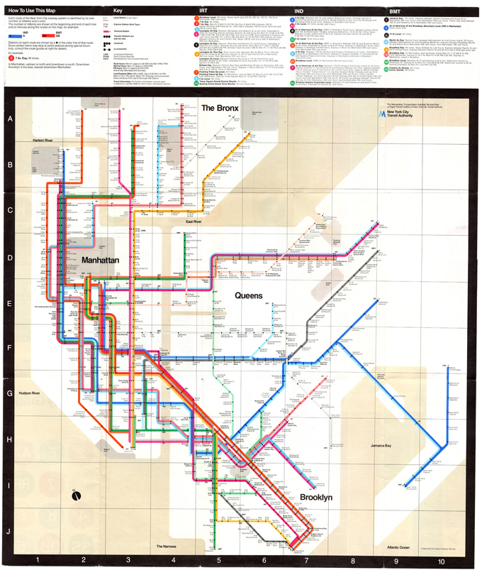
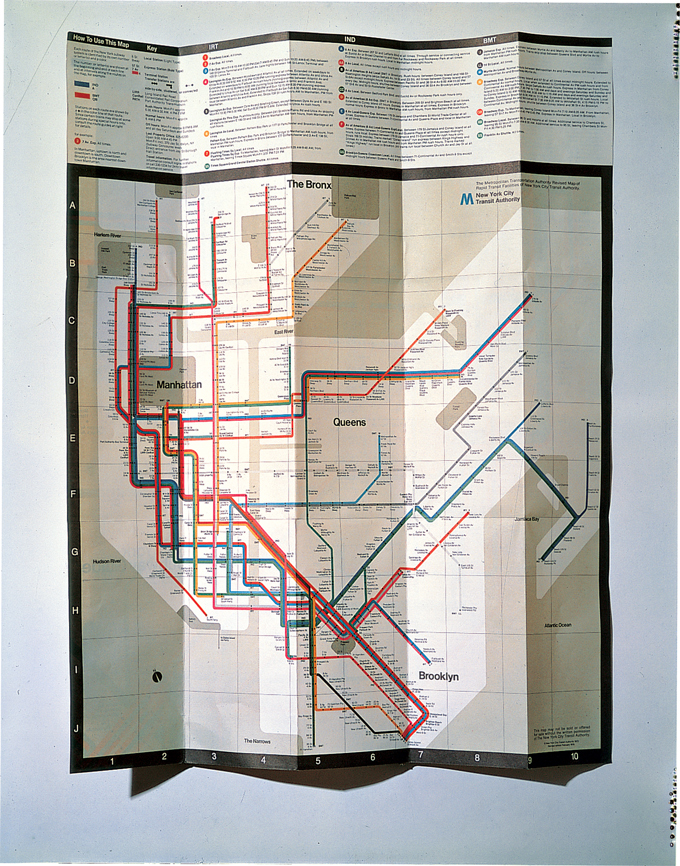
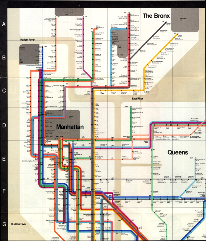
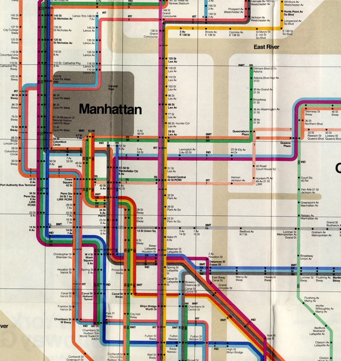
Many of the questions sparked by the attempted redesign of the Beck map are familiar to the designer Massimo Vignelli. Author of the celebrated 1972 New York subway map, Vignelli looked to Beck’s original design as a way of making sense of the amalgam of lines and local and express trains that characterise the New York transit system. “The London map is the only map that has inspired me in the creative sense, the others have inspired me on not what to do,” Vignelli says when we meet in his Manhattan studio. “That’s because it is not a map. That’s why it’s good. What we needed was a diagram and we did a diagram, not a map. The diagram – or subway map – could not do all the things. You need a diagram about the subway, and then you need a geographical map, you know, with the streets. But if you try to put two things together, it’s a disaster.”
Yet Vignelli did have to address the problem of establishing a correlation between the subway and the geography of the city. His own River Thames moment came when he decided to remove any reference to Central Park in his design: “We did take out Central Park because it was so much of a problem, because of the compression you need for putting in information.” However, such a move was seen as too severe, so Vignelli took the decision to “compress the park from a rectangle shape to a square shape”. He admits that many New Yorkers were “shocked” by this. Ultimately, “people know that that isn’t the way. And if they see it that way, they don’t trust the map anymore. But if you don’t have it, it’s great.” In retrospect, one imagines Vignelli would have liked to have taken this one step further. In 2008, Men’s Vogue produced a limited-edition signed reprint of the subway map. Yet, as the whole nomenclature had changed since he first produced the map, when first approached by the magazine Vignelli only agreed to do it if he could produce a new one. “So we did one,” Vignelli notes, “and it had some kind of schematic geography, with the water, because New York is full of islands and peninsulas etc. At one point they ran out of blue ink and just added a white background. If I had seen that from the beginning, I would have eliminated the blue completely.”
You’re under ground, you couldn’t care less where the subway goes. You travel from point A to point B. If the subway goes in a straight line, you don’t know that. It doesn’t matter. We tried to be a close as possible to the cross-town lines etc, so we established a grid for all these things. There is a logic throughout. London is a city of villages, which have merged into the metropolis we know today. By contrast, Manhattan is famously an island of grids. As the designer Michael Beirut noted, because of this, Beck’s design brings a sense of order to London, while, in contrast, Vignelli’s design was always going to be overshadowed by the strict geometric order above ground. The question is: how do you produce a map that works with the certainties of a geographical system that people are familiar with (streets, avenues etc)? “What we did,” Vignelli notes, “is try to keep it as simple as possible. And as close as possible to reality, to a certain extent, within the boundaries of the system, within the boundaries of the grid we designed. We started with the real thing, with a real geographical map. Then we moved these things around according to the grid. You’re under ground, you couldn’t care less where the subway goes. You travel from point A to point B. If the subway goes in a straight line, you don’t know that. It doesn’t matter. We tried to be a close as possible to the cross-town lines etc, so we established a grid for all these things. There is a logic throughout.”
Along with the Central Park issue, one of the criticisms repeatedly levelled at Vignelli’s map was that it failed to connect the subway to geography above ground. This case was made by Michael Hertz, the designer (with the MTA [Metropolitan Transit Authority]) of the map that would eventually replace Vignelli’s in 1979. He noted that, for instance, New Yorkers knew that at “50th Street and 8th Avenue you must walk a long block east to Broadway whereas Vignelli clearly shows it as an intersection”. Yet what Hertz ignores is that Vignelli did try to bridge the gap between his diagrammatic map and the local area of the station. Like a diver coming up for air, he offered a variety of maps to aid the decompression from train to street. “We had a system map, which is the diagram,” Vignelli notes, “we had geographical map, a verbal map, and we did a fourth one which was a neighbourhood map. The system map they did. The neighbourhood map they did in some stations. They never did a geographical map. This was a mistake. Because if you come out of a station, you want to know what streets are around, that’s why you need a geographical map. But if you need just information related to the lines, how to get from point A to point B, that is the system map. The verbal map was just telling you verbally: if you want to go to Times Square, you take this train, go to Grand Central, and take the shuttle and so on. Therefore, we were really covering all the aspects, the diagrammatic, the verbal, the geographical and the local [neighbourhood map]. So they can’t accuse us of not conveying information.”Fifty per cent of the people are visual and fifty per cent are verbal. So, the visual people don’t have a problem with maps, but the verbal people don’t read maps, no matter what. Yet maybe in some way the current subway map perfectly mirrors the highly individualised society that is New York City. Vignelli’s map asked the passengers to forgo some of their own narrowly defined demands in favour of a design that could better serve the whole. Ultimately, to accept the drawing as a diagram and not a geographical map required a level of altruism that just was not there. For Vignelli, freedom in New York “implies a disrespect for the other, because it is a me-me-me culture. It is my freedom and to hell with you. There is no respect for the other. It is typical New York mentality, which is not rigorous enough. And it wants to have everything.” The result is a design where the passenger is being given too much information. As Waterhouse concurs, “The current map has everything they need, it’s just that it does it so badly. It’s absurd. Do you need helicopter routes on the map when you are underground?” Vignelli puts it more succinctly: “While we designed a map with a grid, they designed a map with greed.”
In truth, many of issues surrounding map design are challenged on a daily basis by the development of new navigation applications for the computer and, more significantly, the mobile phone. Maybe with the development of augmented reality apps such as Nearest Tube or the ability to tag specific places and routes on Google Earth, some kind of personal geography is challenging the traditional role of official maps. Vignelli is aware of these developments and has plans to make his own 1972 subway map available as an iPhone application. To journey across Manhattan with such a guide would at least make for a more visually enjoyable trip. Who knows, maybe a new London Underground map application, minus the River Thames, will also make a re-appearance in the future?
Massimo Vignelli, 1931-2014
This piece first appeared in Grafik 181, January 2010