
When it comes to reading online, the technologists want us staring straight ahead, but James Bridle argues we should let our gaze wander and follow him down the wikihole...
Web design, like any other kind of design, follows trends. It’s calmed down in recent years as we recover from the shimmering liquid logos and deep reflections of the Web 2.0 surge — things are flatter now, a little blockier, but they seem to have got a bit out of control on the scrolling front. It’s quite easy to get lost, bouncing from one section to another, triggering other events over there, detached in space from the very idea of the page. Perhaps we’re OK with this. Perhaps the line of the text is no longer a central metaphor we need to cling to. Perhaps it never should have been.
The term “multimedia” was coined by artist Bob Goldstein in 1966 to describe mixed media sound-and-light shows — what Variety later termed “discothèque fare”. It took thirty years to evolve into the computer-oriented term we know today, but in any context it retains that flashy (or Flash-y) connotation. Interactive access to video, still pictures, sound, and, of course, text. And so when the digital revolution reached the level of the word itself, first on CD-ROMs and then on web pages and book pages, it was natural to assume that this interactivity, this multimedia, would envelop it, bear it up, deliver it from the drudgery of black text on a white background and make it sing and dance and do backflips in order to…do what exactly? To better entertain? To better inform? To communicate more clearly and sharply and at light speed and upside-down to a seriously awesome soundtrack?
It’s turned out of course that this isn’t what we want from the text. Multimedia is not additive: it does not improve on the word itself, because language is the best and clearest form of communication we have. Note: communication. If you want to be swept up in an emotional experience that will make your heart sing and your eyes leak, then watch a movie, listen to a song. If you want some control over that narrative, if you want to interact with it, then we have made many kinds of games for you, the real bearers of interactive experience. But if you want to receive that experience in a manner which does not pre-bake your path or your response, but allows you to enact and animate it inside your own head, in your own imagination, which opens itself up to you in the way that only raw language can do, then really you should stick to text.
This contention is, I believe, borne out by the general trend in how we read, or at least how we would like to read. The web has become an architecture for redesigning the text in front of you, reformatting it to your exact specifications — or to none, in the case of the most popular apps. Instapaper, Pocket and Readability all offer a “read it later” system that allow the user to extract and save the content of any article for later appreciation — a great boon as we see the resurgence of “longform” writing on the web, or, as many of us have always called it, the essay. But the real value of these apps is how they remove all the crud of web design around a good piece of writing, and return it to something like its natural form: black(ish) text, white(ish) page, well-spaced, good line length, appropriate frequency of hyphenation. (Betty Binns’ classic Better Type is your guide here. Published in 1950, it remains the greatest resource on the texture of the text, still so hard to codify.)
Each of these apps contains a few dangerous and untrustworthy options. Both Instapaper and Pocket, for example, allow you to read white text on a black background . Often touted as better for reading in the dark, or simply easier on the eyes, this assertion is misleading. An extensive study by Bauer and Cavonius all the way back in 1980 — which was instrumental in the push from green-on-black CRT monitors to the more legible tech we enjoy today — showed that reading was 26% more accurate when dark characters were used on a lighter background. In part, this is due to astigmatic halation, the effect produced when the iris opens too wide (in response to a dark background) and any deformation of the lens is accentuated, resulting in a fuzzy focus on the letters themselves. This is Science. (And I’m not even going to discuss Pocket’s sepia option.)
Instapaper
also includes an option called “tilt scrolling”, which allows the text to pan automatically up the page as you tilt the device, a somewhat disconcerting effect, particularly for anyone with the tendency to nod off while reading in bed. But it’s part of a larger trend to animate the text itself, rather than the eye, which centres, ultimately, on the smallest and fastest movements that the human body makes: saccades.
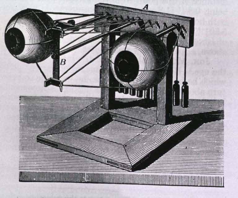
Saccades were discovered by French opthalmologist Émile Javal in the 1880s, when he placed a mirror next to his book in order to observe eye movement during silent reading — and found it consisted not of a smooth flow along the line, but a rapid succession of discrete movements, a tiny stuttering from focal point to focal point. When reading, we’re not even aware of them, but we’ve learned a lot about them in the years since Javal, from the structure of the fovea — the high-resolution centre of the retina, which covers only one to two degrees of vision — to the neurological processes which produce them, bypassing the brain’s usual time-consuming pathways to trigger the muscles directly. Saccades are one of the best ways for measuring brain activity — and some people want to do away with them altogether.
“Rapid serial visual presentation” (RSVP) is a technique to increase reading speeds by removing the need for saccades, by placing each word in turn directly into the focal space, like a flashcard. RSVP has been around for a long time, since the 70s at least, and does indeed vastly increase reading speeds from the general average of around 220 words per minute (wpm) — even more than other techniques such as skim-reading and, yes, running your finger along the text.
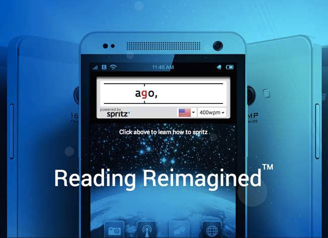
The latest development in RSVP is powered by a company called Spritz, which adds another acronym to the mix: ORP, or “Optimal Recognition Point”. This is the precise focal point of each of those saccades, the spatial locus within each word where the eye — and mind — rests and begins to process the meaning of the word. Spritz claims that the 80% of reading time spent not processing information but physically moving the eye is a combination of both moving to the next word and finding its ORP. By presenting each word in turn, each one aligned precisely with its ORP, they claim to make reading at over 1000 wpm possible.
Strange cognitive factors like repetition blindness and attentional blink start to come into play at high speed... There’s a problem here though, and it’s the problem we often hear claimed, without much evidence, for digital reading in general. As reading speed increases, comprehension rates drop rapidly — as much as twenty percent for an increase to just 650 wpm. Strange cognitive factors like repetition blindness and attentional blink start to come into play at high speed as well. These widespread but poorly understood mental effects mean that important words or phrases are skipped by the brain if they are repeated too often in the text (for example, if they are the subject of that text), or if they follow another which exerts a strong emotional effect (for example, if it’s a good story).
There’s something in this process which seems to mirror the development of technology itself: ever greater speeds at ever smaller degrees; acceleration and miniaturisation. As the technology quickens, it becomes less comprehensible, disappearing into computer code and black boxes, from the transistor to the smartphone. The scale of the text, of the network, seems to demand we too race ever faster to keep up with it, even as we understand less and less. As RSVP moves the focus of text design from the line, to the word, to the letter, it moves ever further from the idea of design at all, and from general comprehension. Calculations at the electron level start to slam up against calculations performed at the level of the neuron — but Moore’s Law doesn’t seem to apply to the brain.
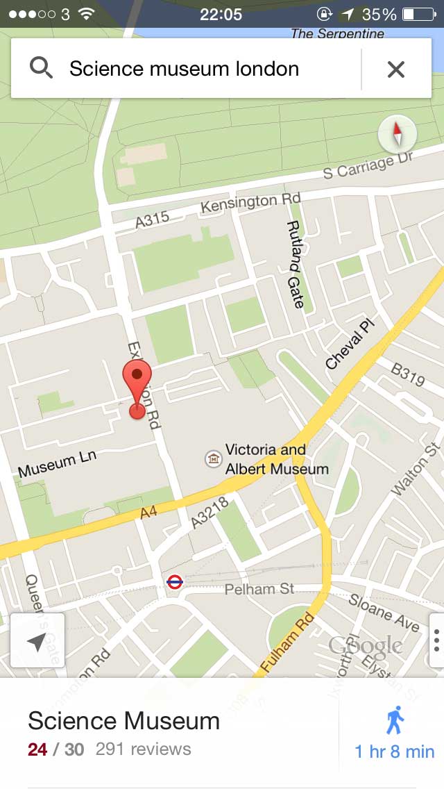
The text has depth, it has verticality, it lives in its own expanding light cone... The rush of RSVP reminds me of nothing so much as a poor implementation of perhaps the greatest piece of contemporary digital design for handling mind-numbingly vast quantities of information: the slippy map. Slippy maps are the digital maps you use every day, allowing you to pan across the world’s surface, and zoom deep into and far out of it, an elegant interface to a near-infinite landscape. But RSVP’s a poor implementation because text, however we may imagine it, is not linear, and it never has been. Just as the tiles of the slippy map are near-instantly rendered as we move over them, slotting into place before we are even aware of them, creating the illusion of a continuous plane seen through the narrow gap of the browser window, so the mind continually enacts understanding, rather than passively receiving it. That understanding is composed of many multi-layered understandings which go far beyond the text itself, into memory and association, into anticipation and extrapolation. The text has depth, it has verticality, it lives in its own expanding light cone; a true hypertext, of which the world wide web is our best, but still incomplete, approximation. The great gift of electronic text, like most networked experiences, is not what it makes newly possible, but what it reveals, often from new and previously unseen angles.
When I think about what text is “really” like, what reading is really like, when it’s not just the physical act of reading, but the mental and imaginative act of thinking through text, I think of delightful experiments like Joe Davis’s telescopic text, which expands the phrase “I made tea” into a 200-word reminiscence with each click on a word: the world expands, the mind expands to fill it. Or I think of Wikipedia, a fungible synecdoche for the whole internet, a multi-dimensional text where every blue word triggers another text, another memory, and the eternally-questing eye, saccading like a fit as the neurons fire, follows each of these possible ideas, future references, down unnumbered wikiholes forever. The line is a lie: this is the truth of text, immanent in the network we have built for it. booktwo.org