Over a five year period, Pouya Ahmadi designed a series of stunning typographic posters for the Experimental Film Society. Here he takes takes us through the design process, reveals the thinking behind his approach and picks out some of his favourite pieces.
The Experimental Film Society (EFS) is an independent, not-for-profit entity based in Dublin/Ireland specialising in avant-garde, independent, and no/low budget filmmaking. Its aim is to produce and promote films by its members, a dozen filmmakers scattered across the globe, whose films are distinguished by an uncompromising, no-budget devotion to personal, experimental cinema. It is responsible for rescuing and preserving many of its members’ films, which otherwise might have been lost forever. Pouya Ahmadi has designed a series of promotional posters for the feature films directed by EFS filmmakers, mainly Rouzbeh Rashidi, who is the founder of EFS. The project started with the identity in 2010 and came to an end in 2015. We caught up with Pouya to find out more…
Can you tell us a bit about your background and how you first became involved with EFS?
I am originally from Tehran, where I have spent most of my life through my early twenties. After I graduated from the University of Tehran with a BFA in visual communication, I moved to Basel (Switzerland) to attend the masters program in Graphic Design and Image Research at The Basel School of Design (UIC/HGK). In 2010, while I was studying there, I was approached by Rouzbeh Rashidi who is the founder of Experimental Film Society to redesign the identity of the organization. Rouzbeh founded EFS in 2000 in Dublin (Ireland) to promote the films by its members across the globe, and since then has been creating and producing experimental films. When Rouzbeh approached me with the project, I was already working on multiple video art pieces which immediately interested him. We chatted about cinema quite a few times and realis ed that we share many interests. Both Rouzbeh and I have very peculiar and strong opinions when it comes to cinema and the fact that we both agreed on ideological level was a huge step in initiating the collaboration.
Were you given free reign or were there restrictions placed on what you could do?
Quite early on in the process, Rouzbeh and I had a long discussion regarding the scope of the project and his expectations. He introduced me to some of the work that he was doing at the time and some earlier pieces that he produced in the past few years. I was rather intrigued by the atmosphere in those films, the majority of which, had very unusual rhythm – sequences of black and white grainy shots with no dialogs. They were quite strange and yet unique. Rouzbeh does not believe in writing script for his films. For him, everything must happen simultaneously during the process of shooting the film on mise-en-scene, to a degree that the process of filmmaking becomes a daily ritual for him; a true experimentation with camera.
Rouzbeh’s approach in cinematography is very bold and deconstructive directed at the heart of cinema – self-referential per se. When we discussed the potential direction for the identity, it was clear immediately that I will have to somehow take on a similar approach in defining the visual identity. The logo can hardly reflect the entirety of the organization as complex as it is, and to that end, we decided that the posters were the appropriate pieces to introduce and shape the identity in a progressive manner.
Therefore, I refused to emphasize the role of the logo in the poster series. Rather, each poster is designed in a way that they redefine the identity over time. They each are responsible for showing the viewer one aspect of the organization. And really, if you look at the films that are produced by EFS, you will see that there is absolutely no limitation whatsoever for the films, other than an obscure sense of curiosity for challenging oneself in the realm of moving images. And that’s exactly what I admire about the entity – the fact that it surpasses any modes of compensation for the viewer, as if it has nothing to lose.
So, to answer your question, yes, I was given absolute freedom in the spirit of experimentation similar to that of the entity itself. I would say each poster in a way became a personal challenge for me of escaping my own definitions of what a poster is.
Most film posters are mainly photographic, what inspired you to choose a primarily typographic approach?
Exactly what you just mentioned; the very expectation of “what film posters should look like” was the biggest challenge for this series to take on. Of course, there are great examples of typographic film posters out there that were able to get away with using type as the primary focus of the piece, but they are certainly on the minority side.
There were multiple factors that led me towards the path I took with the identity – the former being one of the main reasons. Also, knowing that Rouzbeh is affiliated with the Remodernist film movement, I decided to do a more in-depth research on the premise of the original manifesto to be able to put things in perspective.
The main argument of the Remodernist film manifesto is the return to emotional and spiritual meaning in cinema – the praise for imperfect aesthetics, and the complete redefinition of narrative structure towards a more subjective cinematography. These ideas are derived from the ideologies of masters of modernist cinema such as Andre Tarkovsky, Robert Bresson, Michelangelo Antonioni, and Bela Tarr, to name a few. Diving into the world of early modernists, both designers and filmmakers, one can easily see the fundamentals of modernism carrying across disciplines. If you compare the works of Armin Hofmann and Robert Bresson, for instance, you realize that they resemble each other in many levels; the rhythm, the pauses, even the frame compositions. What fascinates me about early modernist designs is the general type treatment across the board – the very idea of type as an object that occupies space.
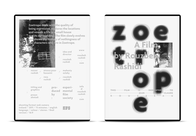
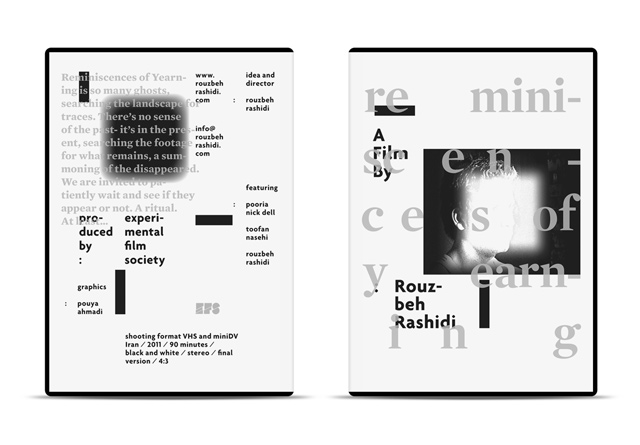
However, in the case of EFS posters, I was more interested in treating the letterforms as personas. The very interaction of the type with the images and other typographic elements on the page defines the type itself. Therefore, both type and image, used in each poster, are treated very similarly in the way they speak to one another.
There is always a hidden dialog back and forth between the letterforms and the snapshots taken from the film, and it is more obtrusive at times than others. So, in a way, these posters are a derivative of modernist movement but with a very critical systematic approach – a Remodernist turn, perhaps.
How has your design approach changed over the years?
In chronological order, one might argue that the earlier posters are more radical or deconstructive in comparison to the later designs. While that might be a fair argument in terms of the visual intricacy of the work itself, to me, they have more in common in the approach than the visual outcome.
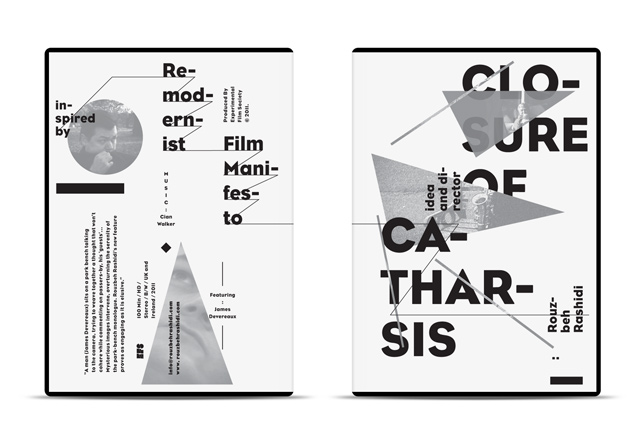
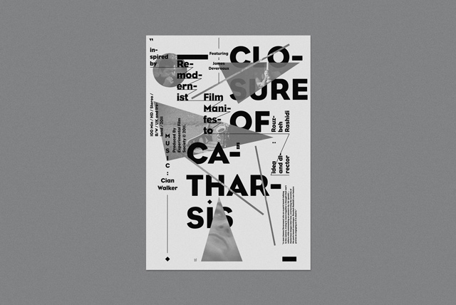
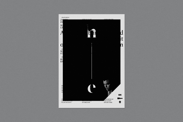
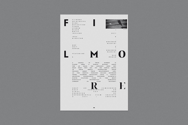
Each poster has a direct association with the concept of the film that it represents. In the case of Closure of Catharsis, for instance, the subject matter, a man (James Devereaux) sits on a park bench talking to the camera, trying to weave together a thought that won’t cohere while commenting on passers-by, his ‘guests’… Mysterious images intervene, overturning the serenity of the park-bench monologue. The constant collision of the mysterious images interrupting the spoken words is what drives the structure of the poster. In contrary to that, in Filmore, another feature film by Rouzbeh Rashidi, a couple in their garden is filmed from a single, distant angle for an hour. The audience does not hear what they say. Yet the subtle shifts in their bodily interaction speak volumes about their relationship and, as the erotic tension builds between them, Filmore develops into a subtly gripping experience. The typography of the poster is a direct reflection on this very concept. The custom type used for the title that subtly metamorphoses from san-serif to serif letterforms visualises the emotional build up throughout the film and the very small tracked body type represents the barely audible conversation between the couple.
So, again, to answer your question, I would say that the approach to this project has been strictly metaphorical. Some ideas might have been internalised and digested better than others but the typography has been stringently used to shape the structure of the posters based off of those concepts.
How were the posters printed and distributed?
All the posters were designed in 100 x 70 cm format. Due to budget concerns, most of the posters have been printed in limited editions digitally or silk-screen. Some of the others were risographed in smaller sizes. They have been displayed at the venues (film festivals, smaller screening rooms and theatres) and been also distributed digitally on respective websites and social media.
Can you pick out any particular favourites?
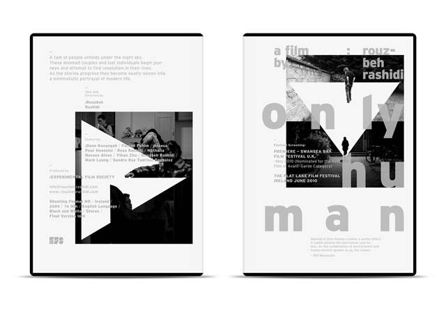
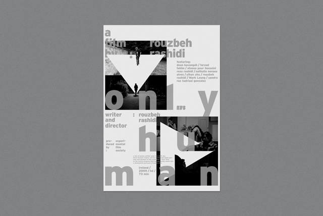
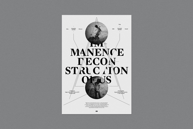
If I were to pick three, I would pick He, Only Human, and Immanence Deconstruction of Us. To me, He is the most honest poster in the series. The film is about a troubling and mysterious portrait of a suicidal man. Rouzbeh juxtaposes the main character’s apparently revealing monologues with scenes and images that layer the film with ambiguity. I believe that it is one of the boldest and highly experimental film that Rouzbeh has directed so far. Only Human is a tale of doomed couples and lost individuals trying to find resolution in their lives. It’s a purely objective view on a highly subjective matter of human’s eternal void and unfulfillment. And lastly, Immanence Deconstruction of Us, is a self-referential piece directed right at the viewer, questioning their perception of time, persona, and their position as spectator versus actor of the very film they are watching.
What do you think makes a successful film poster? Are you a collector?
I am in general more drawn to critical and metaphorical approach in design. I believe that is what is missing in this genre of poster design. The majority of film posters that are out in the world tend to desperately get use of a large snapshots from a film, combined with some highly stylised type or lettering on top. I consider all this category of posters catastrophic. My problem with those type of posters is that you can basically take the image and replace it with any snapshot from any other film in the history of cinema, and it would not change a thing. They are nothing more than a template. I would not even call them design.
I think a successful film poster should reflect the designer’s point of view on the film itself, and not a mere juxtaposition of snapshots and typography. It has to challenge the viewer’s expectations and most importantly, reflect on the film overall concept. It has to be clear of any sorts of symbolism and purely stylistic lettering. To me, those two approach are immediately set for failure. Therefore, I hardly ever collect any film posters.
Why did the partnership come to an end?
Rouzbeh and I have had a really long collaboration and we reached a point where I realised that I am spending quite a lot of time on each poster; roughly about three to four months. However, Rouzbeh has been aggressively directing and producing films – much faster than the time I would spend on creating the posters. We decided that I take a break from the project, as I hardly had time to focus on it for personal reasons as well. We are, however, thinking on collaborating on an entire new series that will hopefully release in the months to come. The new series will most likely take on a completely different approach to the design and production of the set.
What’s next for you?
I generally don’t set goals for myself, which is counterintuitive to many. If I have a vision for something, I immediately react on it. It has to come to me naturally. Otherwise my mental system will refuse to accept it as an opportunity.
Pouya Ahmadi is a design director at Studio/lab (a Chicago-based design studio) and an adjunct professor at UIC School of Design. See more of his work at pouyaahmadi.com