
The Hayward Gallery’s MIRRORCITY showcases twenty of London’s top digital artists. We caught up with Andreas Lechthaler and Studio Hato, the designers behind the exhibition, to examine how they dealt with this challenging show.
What was the original brief and did it change at all?
Andreas Lechthaler: At the beginning, the exhibition was about the work of twenty artists from London who in some way represented their city. Later on themes started emerging; the exhibition came to be about boundaries, in-between-spaces and transitions. Having worked at the Hayward before, I feel as though it's a space that doesn't work very well if you just build white walls. Rather than having a series of different box-like spaces, we created more fluid transitions, using curtains as visual dividers. We had twenty different artists, so they all needed an individual space, but in terms of light and sound, an open space is challenging. It was interesting to work with less rigid materials in general, but this show particularly asked for it.
Tell us about the concept.
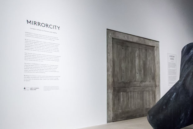
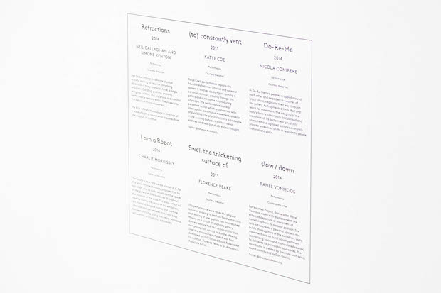
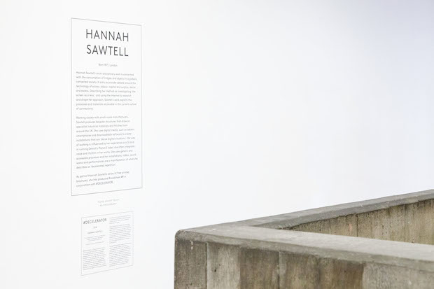
Ken Kirton, Studio Hato: For the exhibition graphics we wanted to look at the idea of augmented reality applications in which labels pop up in different windows – that’s why the captions are at multiple levels. Andreas had designed semi-transparent sheets that divide the rooms so we wanted to play with the idea that you could see data planes all around you, like Google Glass, but in a very low-tech way. It's a strange exhibition from the Hayward's perspective because it's their largest group show for a very long time. Because of that there were a lot of captions. Some were super-short, and some people wanted a lot of text to contextualise their work. The system that we put in place had to be quite dynamic
Did this project involve sourcing any new materials or using any new processes?
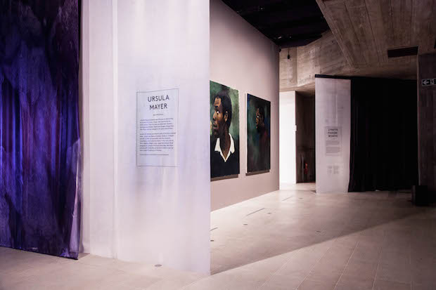
AL: The materials we've used are really quite unusual but also quite rich. The curator and I felt like it would be good to work with architecture that has its own personality and creates an atmosphere. The curtains feel enclosed, and a little bit Twin Peaks. We had to decide to de-colourise the red curtain and make it grey to avoid detracting from the artworks. We also used silicon screens. I found it a very interesting architectural material to work with, because it allows light through, but is not transparent, so it creates a proper separation between spaces. The idea to double-up the silicon layers was a play on the idea of the ‘flip side’: perhaps there's something on the other side that you don't expect. There should be a slight confusion, but not too much, about where you actually are in the exhibition.
KK: We originally wanted to print on the curtain material but with such a large footfall, there was the worry that it might scratch off. We then decided to use a transparent vinyl, which we printed on, and carried that language throughout the entire show space.
Did this project present any particular challenges, and if so how were these overcome?
AL: Projections are always difficult. It very much depends on each artist how they want their work to be presented. I'm generally interested in non-black box spaces – these are more possible now as the quality of projectors improve. It's a balance between how bright the room can be without taking something away from the projection.
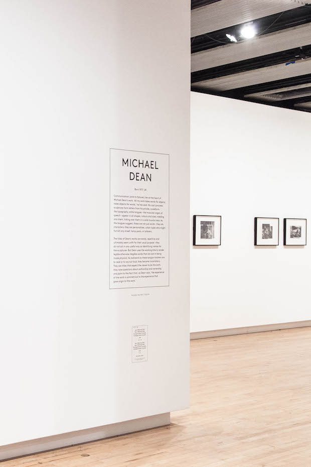
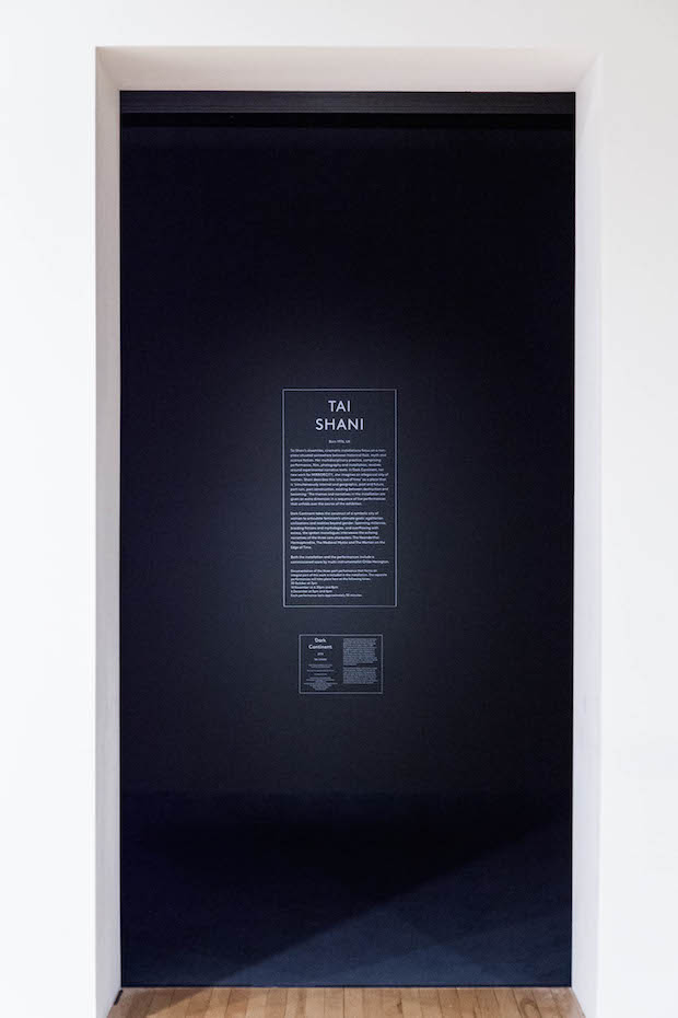
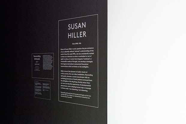
KK: For us the initial challenge was getting the typeface right. It's quite hard when you’re working with a word like ‘mirror’, which describes what the show is about. You don't really want to do anything reflective, like reflecting letters. It just gets a bit corny and far too illustrative. We used a typeface from Lineto, a collective of type designers based in France, Germany and Sweden. The typeface is called LL Brown, and what’s nice about it is that it’s based on Gill Sans. I like the idea that someone outside of London has drawn something as a reflection of London (the city where Gill Sans was original produced). It also had a really simple italic, which we didn't think was too illustrative of a mirror. On the tombstones, the typography references old sci-fi cover books in terms of the hierarchy of the text and the format.
What do you think has worked particularly well?
AL: The silicon. We were worried that you would perceive it as too clinical. Visually it just blends in with the walls, and it ages really well. With clear plastics you see finger prints very quickly but this material has a natural pattern that is very forgiving. I was also very pleased with Hato's work. The graphics really gave a lightness to it all. The reflection and the elegant black outline worked really well, especially in terms of the vinyl – even on the silicon. The graphics definitely helped in bring out the idea of the ‘flip-side’, and meant that the curtains felt separate to the artwork.
KK: What Andreas had done and what we proposed were quite simple solutions. It just allowed the artworks to be shown at their best. We were impressed at how well printing on to the clear vinyl worked. A lot of people hadn't realised that there was an extra layer.
What was the client's feedback?
AL: The feedback from the Hayward team was good. It was a bit more mixed in terms of the artists – it’s not the neutral background they might be used to. But at the Hayward, the way we work means that the architecture is not a given, we work collaboratively.
KK: It’s the biggest exhibition we've taken on for quite a while. It’s definitely confirmed to us that it’s an area we want to expand further into. We'd also explore the digital side of exhibitions, that's a space where our digital wing Hato Labo would operate in in the future.
andreaslechthaler.com
studiohato.com
MIRROCITY
Hayward Gallery, London
Until 4 Jan 2015
southbankcentre.co.uk
MIRRORCITY
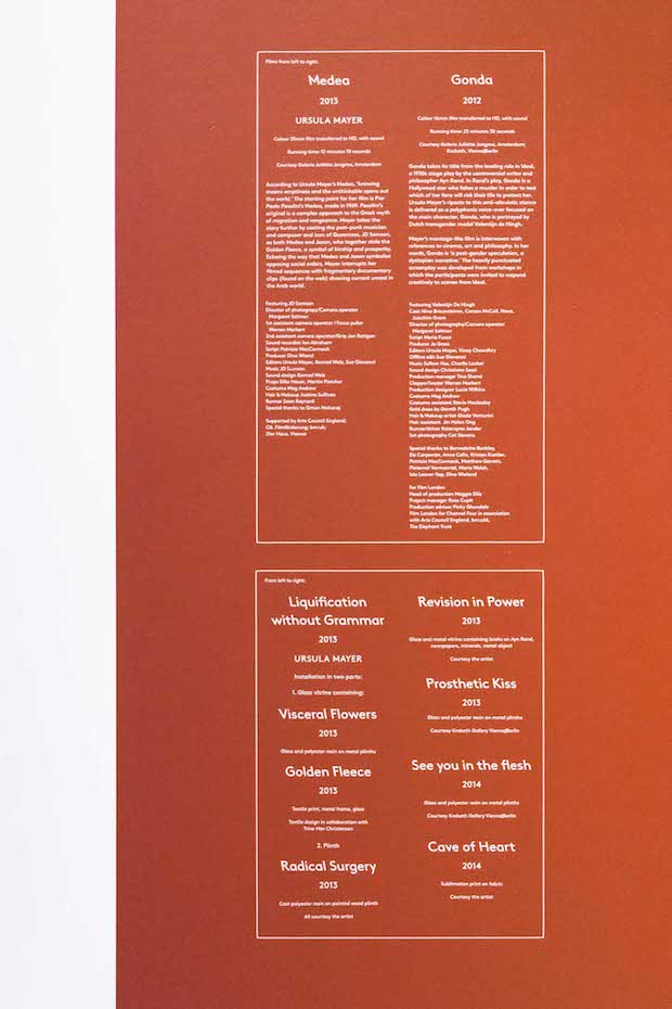
features work by Mohammed Qasim Ashfaq, Anne Hardy, Ursula Mayer, Katrina Palmer, Laure Prouvost, Hannah Sawtell, Lindsay Seers, John Stezaker and Lynette Yiadom-Boakye, Emma McNally, Helen Marten, Daniel Sinsel, Susan Hiller and Michael Dean. New commissions are by LuckyPDF, Karen Mirza and Brad Butler, Tim Etchells, Lloyd Corporation, Pil and Galia Kollectiv, Aura Satz, Tai Shani and Volumes Project.


