
The striking covers of Pelican Books’ heyday were done with rapidograph pens, scissors and clever thinking. Ian McLaren recalls his time as a cover designer for Pelican under Germano Facetti in the 1960s and 70s.
So, Penguin Books have had a rethink, and reintroduced the Pelican imprint for non-fiction titles. When the Pelican series books were last in print Penguin had an enviable reputation for the graphic work produced for the covers. So it is a great disappointment to see this new series. What a wasted opportunity. With all the flexibility and ‘effects’ available to today’s designers through digital technology, it is really very saddening to see that they have not sought to match what was produced with the humble rapidograph pen, and scissors etc. The new series looks like an anaemic attempt to create a ‘brand’. It certainly makes no attempt to illustrate the contents of the books.
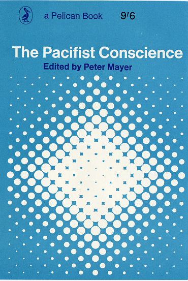
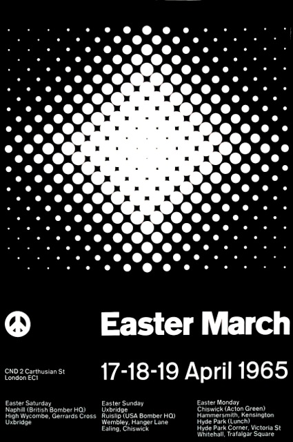
During 1965 I designed a poster for CND’s Easter March from Aldermarston to Trafalgar Square. Later that year I was happily surprised to receive a letter from Germano Facetti, who at the time was the art director for Penguin Books, offering to purchase the image. Although I was delighted to be asked, I was very uneasy at recycling an image intended for one purpose and applying it to another. So I tried to persuade Germano that it would be better to produce something specific for the book, but he was resolute. This set the tone for a relationship which lasted until I left during 1970 to work in Munich. At no time during the six year period I worked for Penguin did I either meet Germano, or speak with him on the telephone (nor indeed any of his colleagues). All of the work was conducted by post, with collection times playing a critical part in the workflow. Today we think of remote working as a recent phenomenon. It is not.
Penguin was a joy to work for at the time. Germano had instituted a strong visual identity, thanks in part to the grid designed by Romek Marber for the Penguin crime series. The Pelican series used this same grid, with “Pelican Blue” as the house colour, and the Pelican symbol. A splendid description of this scheme, with numerous associated examples of the period, appeared in Typographica 5. An extended reprint containing a later clarification from Germano, and an introduction by Richard Hollis, has been produced recently by the Penguin Collectors Society (1). One delightfully persuasive briefing letter from Germano asked me to produce something for a particularly obscure topic. He sweetened the pill by referring to it as “another ripe plum” for me. I had some prior experience of working on the production of Penguin covers while a student, when Richard Hollis, who taught me lithographic printmaking, asked me to assist him. The economics of printing then was governed by the technology, with each colour adding an additional cost. So most Pelicans were designed using only black, Pelican blue, and the white of the paper. Unlike digital printing current today, lithographic inks (other than black) are transparent, hence when two colours are overprinted they produce a third. In covers which I designed later I delighted in substituting a colour other than black, so that one could overprint it with the blue to produce a third colour. Creative use of ‘overprinting’ in this way has tended to be lost with the introduction of current digital printing.
The book for which Germano bought the CND poster image was The Pacifist Conscience (2). The poster was intended for display partly on London Transport’s underground stations. As LT’s policy was not to accept any posters which included imagery which they deemed ‘political’, I aimed to produce an informative poster, with an abstract image evoking either a gathering together, or an explosion. This first cover set the tone for my relationship with Germano. I appeared to have been typecast, as I got the distinct impression that whenever he had a particularly knotty or arcane subject, which defied visualisation, I would be asked to produce at the drop of a hat what I term a ‘Vaseriley’, ie an optical art image similar to the work of Victor Vaserely or Bridget Riley. I had great difficulty convincing Germano that I was capable of anything else, which was frustrating. I recall vividly one delightfully persuasive briefing letter from him asking me to produce something for a particularly obscure topic. He sweetened the pill by referring to the assignment as “another ripe plum” for me. The pace of the work was such that I was working on three or four titles at any one time. The work for Penguin by and large was fun. (3)The artwork process may seem today to be tedious, but I found it to be a valuable discipline... One had to have a clear idea of the form of the artwork when conceiving an image. Usually, but not in every case, one received either a synopsis of the book’s content, and sometimes a copy of the hardback edition on which the Penguin edition was based. After submission of a ‘drawing’ of the proposed design (in colour, at actual size), one went on to produce the necessary production drawings. These had the grandiose title ‘artwork’; (the origin of the current use of the term ‘digital artwork’). I chose to produce them at a scale 50 per cent larger than the final printed size. Each colour had to be drawn in opaque ink or photopaque, as a separate sheet, on a translucent plastic material which was dimensionally stable; hence the name ‘colour separated artwork’. Any type had to be specified precisely and sent to a trade typesetter. It required a minimum of twenty-four hours before one received the type. One then pasted this in the exact position, together with any drawing and/or photographic imagery. A wonderfully flexible rubber adhesive was used for this, produced by Cow Ltd, and called ‘Cow gum’ – sadly now forbidden by the Health and Safety Executive. Although the artwork process may seem today to be tedious, I found it to be a valuable discipline, which could inform the creative process. One had to have a clear idea of the form of the artwork when conceiving an image.
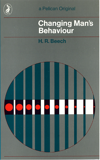
Although accurately ‘registered’ colour printing can be unsightly, I revelled in using the process creatively to obtain the maximum from being obliged to Pelican blue. In the case of Changing Man’s Behaviour in place of a black printing I substituted the grey used in the background. This combined with the blue produced the vertical bars. The brown of the area surrounding the red was produced by overprinting the red, plus the blue and grey. My original drawings would have measured approximately 180mm by 110mm. So you can imagine my reaction several decades later when I entered a pretentious art gallery in Glasgow to be confronted by a painting several metres square which was a badly executed copy of my design. Remonstrations with the artist‘s tutor at Goldsmith College (whom I knew personally) remained unanswered. Sadly that is not the only instance where my work has been misappropriated, but that is another story.
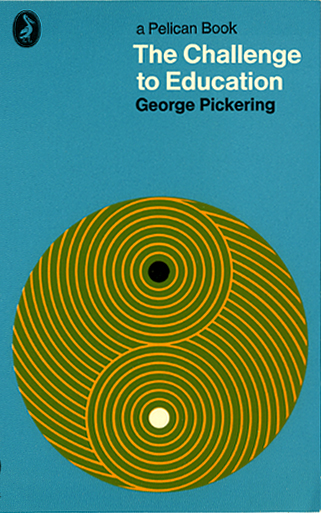
The Challenge to Education was another example using overprinting. In this case, the green circle is produced from the overprint of Pelican blue and a yellow. This was a breakthrough, as it was the first where I was permitted a third printing (ie colour) in addition to Pelican blue. Today of course, one could be more inventive, and introduce gradated tones, which might strengthen the image. Without wishing to appear a grumpy luddite, in my experience digital technology is not necessarily always all that it claims to be. Recently I was asked to produce something based on the image for the CND poster referred to earlier. The artwork for the poster was produced at actual size in less than a day, using equipment which today would cost no more than £150 (some of which I can still use today, without paying for updates). Producing a digital alternative was exasperating. It took more than three times as long, using equipment costing over £1,000, which I have been obliged to update more frequently than I care to remember.
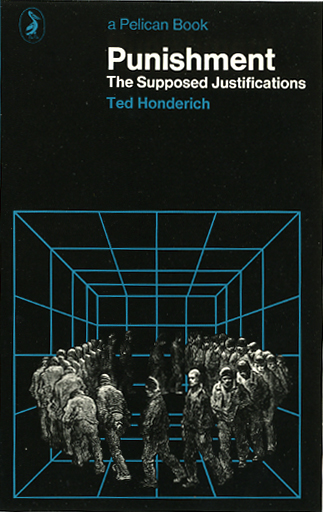
Punishment was probably the first cover where I was able to persuade Germano that I was capable of pictorial imagery. In this instance I combined a classic Doré print with a geometricised ‘prison’ background.
The design for The Abuse of Power was a less happy story. My initial submission was based on a photomontage of two news photographs. The background image was from a recent Sunday Times Magazine, which described the firepower of the American military in Vietnam. Onto this I superimposed a newspaper photo of a buddhist monk immolating himself publicly, and added a patch of red over this. It was a striking graphic statement, but presumably was felt to be too forceful for Penguin’s sensitive readers. I received a polite letter of thanks, and was paid for what I had intended as only the background image, and asked to prepare the artwork.
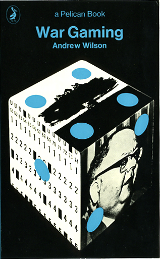
Happily I had no difficulty obtaining consent for the design for War Gaming. The book concerned the introduction of computer based scenarios by organisations such as the Brookings Institute to simulate possible outcomes of atomic warfare. I used photographic images in conjunction with a dice with blue dots. (A confession: the photograph of the atomic bomb explosion was another instance of recycling part of an earlier CND project). In this case the artwork presented a problem, because of the difficulty of drawing precise ellipses for the blue dots of the dice; and for these to register with the black plate. The only way I could resolve this was to build a solid cube (with 30mm square sides). Onto this I pasted the photographs on three sides; and the circles on the other three sides. Then photographed it twice, once for each set of three faces. The two photographs were then superimposed accurately to form the artwork.
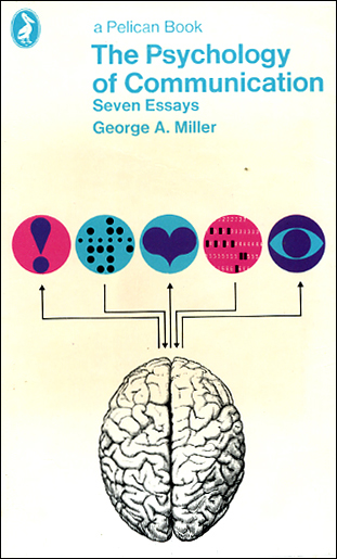
Perhaps by the time The Psychology of Communication came along Germano had become acclimatised to my producing alternatives to my ‘Vaserileys’. This design went through smoothly. Also, by this time the use of a third printing was becoming less exceptional, hence the pink background to two of the circles.
Asylums and Stigma were unusual because I was asked to prepare matching designs. My initial proposal used a Pelican blue background, but Germano changed this to white, which strengthened their appearance as a set. Subsequently Gerald Cinnamon asked me to design two companion titles by the same author (Goffman) in the Allen Lane, Penguin Press series.
I have fond memories of working on Pelicans, and am sure I am not alone in welcoming the reintroduction of the Pelican imprint. But the new cover designs appear to have a very limited vision, and are wasting the goodwill deriving in part from the design policy associated with the Pelican name. The marketing department seem to have dominated the design. Are Penguin’s current readers too young to be aware of the design heritage of the Pelican imprint? I doubt whether Germano would be impressed. And poor old Tschichold must be spinning in his grave. 1 Available from Jim Robinson, PCS, Cahill Gordon Reindel LLP, Augustine House, 6a Austin Friars, London EC2N 2HA.
2 I was gratified to read in the Guardian’s recent review of the reintroduction of Pelican imprint that “The Pacifist Conscience” was considered one of their more important titles.
3 As I was in partnership during part of this time, some of the covers I designed are credited to Briggs & McLaren. I designed all of the Penguins credited to the partnership.